matplotlib을 활용한 다양한 그래프 그리기
- 1. Scatterplot
- 2. Barplot, Barhplot
- 3. Line Plot
- 4. Areaplot (Filled Area)
- 5. Histogram
- 6. Pie Chart
- 7. Box Plot
- 8. 3D 그래프 그리기
- 9. imshow
1 | import matplotlib.pyplot as plt |
1 | plt.rcParams["figure.figsize"] = (9, 6) # figure size 설정 |
1. Scatterplot
reference: <plt.scatter> Document
plt.scatter( x, y, s=None, c=None, cmap=None, alpha=None )
- s: marker size
- c: color
- cmap: colormap
- alpha: between 0 and 1
Data 생성
1 | # 0~1 사이의 random value 50 개 생성 |
array([0.65532609, 0.19008877, 0.72343673, 0.63981883, 0.07531076,
       0.67080518, 0.93282479, 0.04750706, 0.81240348, 0.40032198,
       0.59662026, 0.25797641, 0.37315105, 0.6266855 , 0.50732916,
       0.55803591, 0.63610033, 0.88673444, 0.99751021, 0.03723629,
       0.07695327, 0.44247   , 0.5245731 , 0.41263818, 0.8009583 ,
       0.57238283, 0.58647938, 0.9882001 , 0.88993497, 0.5396632 ,
       0.24683042, 0.0838774 , 0.0826096 , 0.89701004, 0.78305308,
       0.21027637, 0.93441558, 0.05756907, 0.6299839 , 0.05833447,
       0.24247082, 0.9057054 , 0.1585265 , 0.45569918, 0.85597115,
       0.43875418, 0.96962923, 0.17476189, 0.68713067, 0.832518  ])
1 | # 0 부터 50 개의 value 생성 |
array([ 0,  1,  2,  3,  4,  5,  6,  7,  8,  9, 10, 11, 12, 13, 14, 15, 16,
       17, 18, 19, 20, 21, 22, 23, 24, 25, 26, 27, 28, 29, 30, 31, 32, 33,
       34, 35, 36, 37, 38, 39, 40, 41, 42, 43, 44, 45, 46, 47, 48, 49])
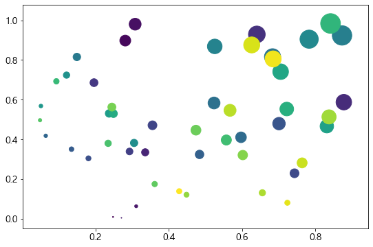
1-1. x, y, colors, area 설정하기
plt.scatter ( x, y, s = , c = )
- s: 점의 넓이. area 값이 커지면 넓이도 커진다
- c: 임의 값을 color 값으로 변환
1 | x = np.random.rand(50) |
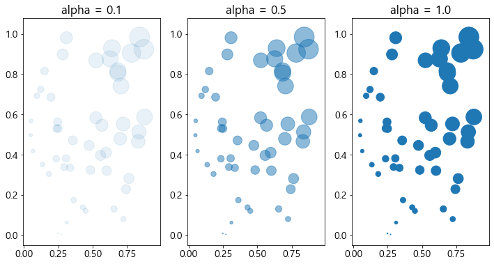
1-2. cmap과 alpha
- cmap에 컬러를 지정하면, 컬러 값을 모두 같게 가져갈 수도 있다
- alpha값은 투명도를 나타내며 0~1 사이의 값을 지정해 둘 수 있으며, 0에 가까울 수록 투명한 값을 가진다
1 | plt.figure(figsize=(12 ,6)) |
2. Barplot, Barhplot
reference: <plt.bar> Document
plt.bar(x, height, width = 0.8, align = ‘center’, alpha = …, color = … )
- x: The x coordinates of the bars
- height: The height(s) of the bars
- width: The width(s) of the bars (default: 0.8)
- align: Alignment of the bars to the x coordinates:
{‘center’, ‘edge’}
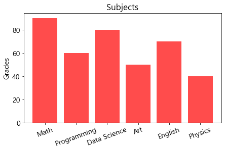
2-1. 기본 barplot 그리기
1 | x = ['Math', 'Programming', 'Data Science', 'Art', 'English', 'Physics'] |
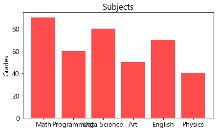
문자열이 겹히는 현상 발생했다. 이를 해결하는 방법은 2가지다:
-
문자열 화전: plt.xtick(rotation = …)
-
barh(수평바 그래프) 사용
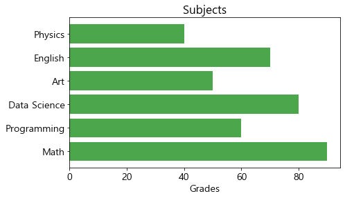
1 | x = ['Math', 'Programming', 'Data Science', 'Art', 'English', 'Physics'] |
2-2. 기본 Barhplot 그리기
barh 함수에서는 xticks / ylabel 로 설정했던 부분을 yticks / xlabel 로 변경함
1 | x = ['Math', 'Programming', 'Data Science', 'Art', 'English', 'Physics'] |
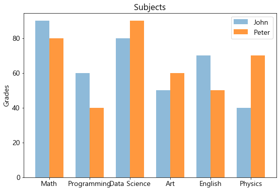
2-3. Barplot에서 비교 그래프 그리기
reference: Grouped bar chart with labels
(1) barplot
1 | x_label = ['Math', 'Programming', 'Data Science', 'Art', 'English', 'Physics'] |
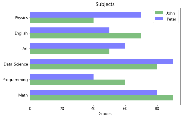
(2) barhplot
1 | x_label = ['Math', 'Programming', 'Data Science', 'Art', 'English', 'Physics'] |
3. Line Plot
plt.plot ( x, y, label=…, color=…, alpha=…, marker=…, linestyle=…)
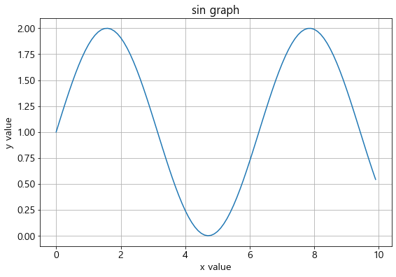
3-1. 기본 lineplot 그리기
1 | x = np.arange(0, 10, 0.1) |
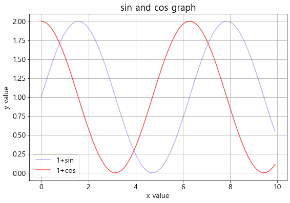
3-2. 2개 이상의 그래프 그리기
- label: line 이름 (legend에 나타남)
- color: 컬러 옵션
- alpha: 투명도 옵션
1 | x = np.arange(0, 10, 0.1) |
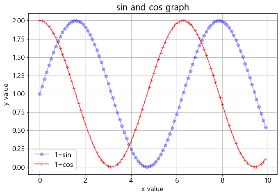
3-3. 마커 스타일링
- marker: 마커 옵션
1 | x = np.arange(0, 10, 0.1) |
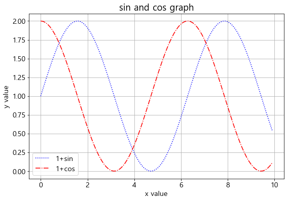
3-4. 라인 스타일링
- linestyle: 라인 스타일 변경 옵션
1 | x = np.arange(0, 10, 0.1) |
4. Areaplot (Filled Area)
reference: <plt.fill_between> Document
plt.fill_between (x, y, color=…, alpha=…)
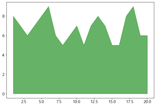
4-1. 기본 areaplot 그리기
1 | y = np.random.randint(low=5, high=10, size=20) |
array([8, 8, 7, 6, 5, 8, 6, 9, 8, 8, 5, 5, 6, 6, 5, 5, 6, 8, 9, 5])
1 | x = np.arange(1,21) |
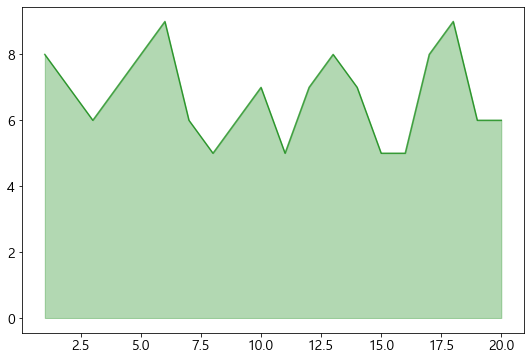
4-2. 경계선을 굵게 그리고 area는 옅게 그리는 효과 적용
1 | plt.fill_between(x, y, color='green', alpha=0.3) |
4-3. 여러 그래프를 겹쳐서 표현
1 | x = np.arange(0, 10, 0.05) |
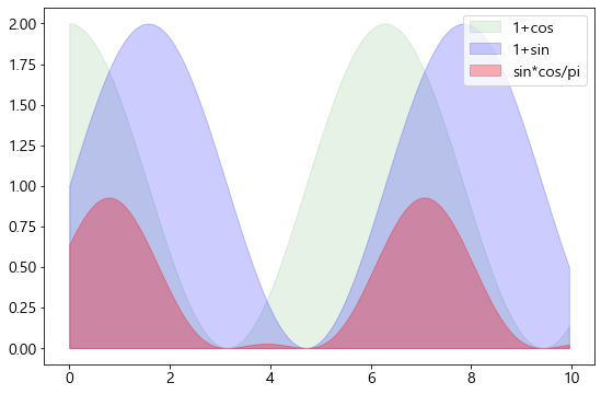
많이 겹치는 부분이 어디인지 확인하고 싶을 때 많이 활용됨
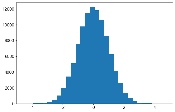
5. Histogram
reference: <plt.hist> Document
plt.hist (x, bins = …)
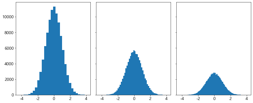
5-1. 기본 Histogram 그리기
1 | N = 100000 |
5-2. 다중 Histogram 그리기
fig, axs = plt.subplots (row, column, sharey = True, tight_layout = True)
axes[i].hist ( x, bins = …)
- sharey: 다중 그래프가 같은 y축을 share
- tight_layout: graph의 패딩을 자동으로 조절해주어 fit한 graph를 생성
1 | N = 100000 |
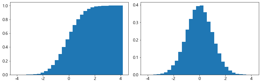
5-3. Y축에 Density 표기
- pdf(확률 밀도 함수): density = True
- cdf(누적 확률 함수): density = True, cumulatice = True
1 | N = 100000 |
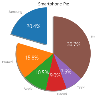
6. Pie Chart
reference: <plt.pie> Document
plt.pie( x, explode=None, labels=None, colors=None, autopct=None, shadow=False, startangle=None,…)
pie chart 옵션
- explode: 파이에서 툭 튀어져 나온 비율
- autopct: 퍼센트 자동으로 표기
- shadow: 그림자 표시
- startangle: 파이를 그리기 시작할 각도
리턴을 받는 인자
-
texts: label에 대한 텍스트 효과
-
autotexts: 파이 위에 그려지는 텍스트 효과
1 | labels = ['Samsung', 'Huawei', 'Apple', 'Xiaomi', 'Oppo', 'Etc'] |
7. Box Plot
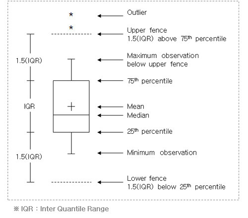
reference: <plt.boxplot> Document
plt.boxplot (data, vert=True, flierprops = …)
- vert: boxplot 축 바꾸기 (If True: 수직 boxplot; If not: 수평 boxplot)
- flierprops: oulier marker 설정 (Symbol & Color)
샘플 데이터 생성
1 | # Data Generation Process (DGP) |
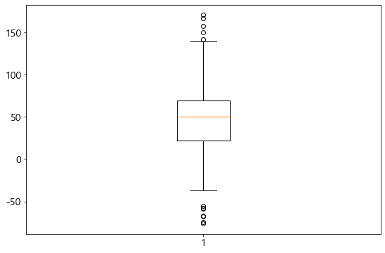
7-1. 기본 박스플롯 생성
1 | plt.boxplot(data) |
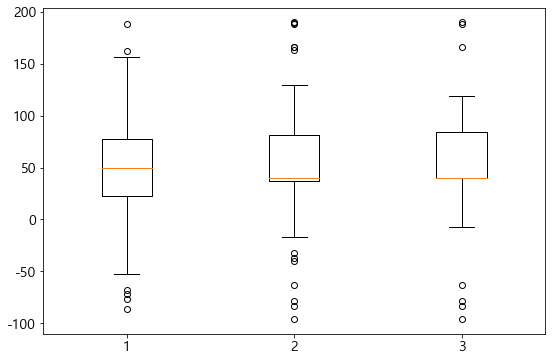
7-2. 다중 박스플롯 생성
- 다중 그래프 생성을 위해서는 data 자체가 2차원으로 구성되어 있어야 한다
- row와 column으로 구성된 DataFrame에서 Column은 x축에 Row는 Y축에 구성되어 있음
1 | # DGP |
1 | plt.boxplot(data) |
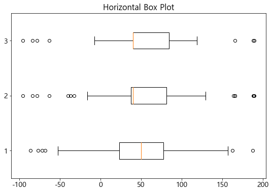
7-3. Box Plot 축 바꾸기
- vert = False 옵션을 사용
1 | plt.boxplot(data, vert = False) |
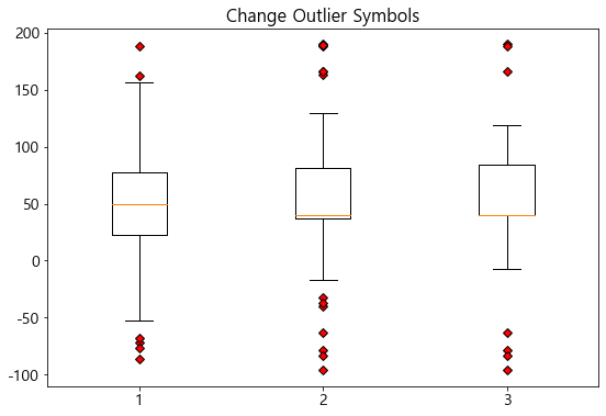
7-4. Outlier 마커 심볼과 컬러 변경
- flierprops = … 옵션 사용
1 | outlier_marker = dict(markerfacecolor = 'r', marker = 'D') # red diamond |
8. 3D 그래프 그리기
reference: mplot3d tutorial
3D 로 그래프를 그리기 위해서는 mplot3d를 추가로 import 해야 함
1 | from mpl_toolkits import mplot3d |
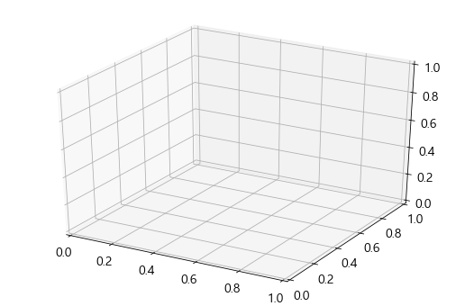
8-1. 밑그림 그리기 (canvas)
1 | fig = plt.figure() |
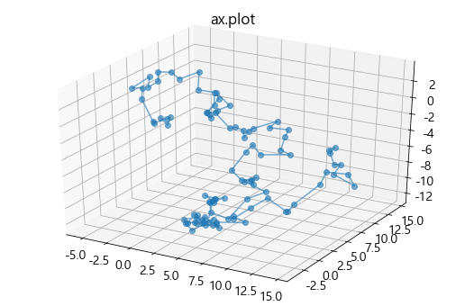
8-2. 3D plot 그리기
Axes = plt.axes(projection = ‘3d’)
- Axes .plot (x, y, z, color=…, alpha=…, marker=…)
- Axes .plot3D (x, y, z, color=…, alpha=…, marker=…)
1 | # projection = 3d로 설정 |
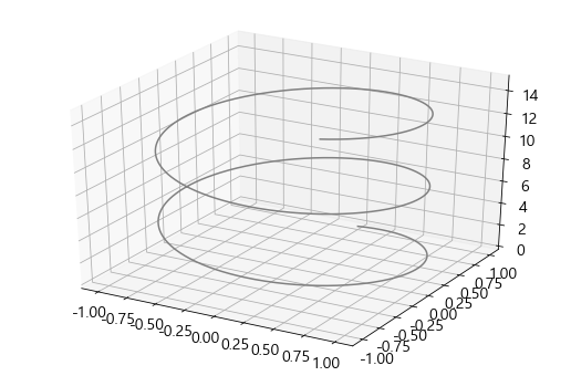
1 | # projection = 3d로 설정 |
8-3. 3d-scatter 그리기
reference: <Axes.scatter> Document
Axes = fig.add_subplot(111, projection=‘3d’) # Axe3D object
Axes .scatter( x, y, z, s=None, c=None, marker=None, cmap=None, alpha=None, …)
- s: marker size
- c: marker color
1 | fig = plt.figure(figsize=(10, 5)) |
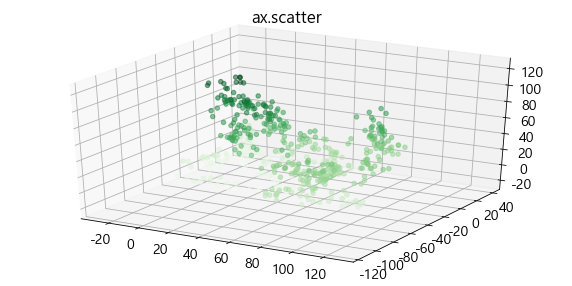
컬러가 찐한 부분에 데이터가 더 많이 몰려있음
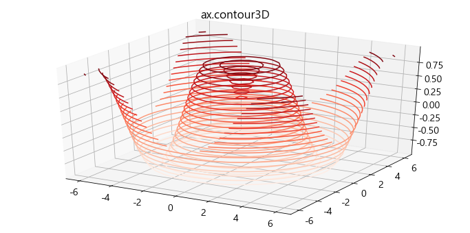
8-4. contour3D 그리기 (등고선)
Axes = plt.axes(projection=‘3d’)
Axes .contour3D (x, y, z )
1 | x = np.linspace(-6, 6, 30) |
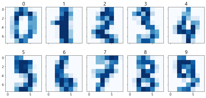
9. imshow
이미지 데이터가 numpy array에서는 숫자형식으로 표현됨
명령어imshow는 이 컬러숫자들을 이미지로 변환하여 보여줌
예제: sklearn.datasets안의 load_digits데이터
-
load_digits는 0~16 값을 가지는 array로 이루어져 있다 -
1개의 array는 8 X 8 배열 안에 표현되어 있다
-
숫자는 0~9까지 이루어져있다
1 | from sklearn.datasets import load_digits |
array([[ 0.,  0.,  5., 13.,  9.,  1.,  0.,  0.],
       [ 0.,  0., 13., 15., 10., 15.,  5.,  0.],
       [ 0.,  3., 15.,  2.,  0., 11.,  8.,  0.],
       [ 0.,  4., 12.,  0.,  0.,  8.,  8.,  0.],
       [ 0.,  5.,  8.,  0.,  0.,  9.,  8.,  0.],
       [ 0.,  4., 11.,  0.,  1., 12.,  7.,  0.],
       [ 0.,  2., 14.,  5., 10., 12.,  0.,  0.],
       [ 0.,  0.,  6., 13., 10.,  0.,  0.,  0.]])
지금 한 위치에 숫자 하나밖에 없어서 컬러는 흑백으로 나옴.
숫자가 클수록 black에 가깝고, 작을수록 white에 가까움
1 | fig, axes = plt.subplots(nrows=2, ncols=5, sharex=True, figsize=(12, 6), sharey=True) |