비지도 학습 (Unsupervised Learning)
1 | from IPython.display import Image |
1. 비지도 학습의 개요
비지도 학습 (Unsupervised Learning)은 기계 학습의 일종으로, 데이터가 어떻게 구성되어 있는지를 알아내는 문제의 범주에 속한다. 이 방법은 지도 학습 (Supervised Learning) 혹은 강화 학습 (Reinforcement Learning)과는 달리 입력값에 대한 목표치가 주어지지 않는다
-
차원 축소: PCA, LDA, SVD
-
군집화: KMeans Clustering, DBSCAN
-
군집화 평가
2. 차원 축소
- feature의 갯수를 줄이는 것을 뛰어 넘어, 특징을 추출하는 역할응 하기도 함
- 계산 비용을 감소하는 효과
- 전반적인 데이터에 대한 이해도를 높이는 효과
1 | from sklearn.preprocessing import StandardScaler |
2-1. 데이터 로드 (iris 데이터)
1 | iris = datasets.load_iris() |
1 | data = iris['data'] |
1 | data[:5] |
array([[5.1, 3.5, 1.4, 0.2],
       [4.9, 3. , 1.4, 0.2],
       [4.7, 3.2, 1.3, 0.2],
       [4.6, 3.1, 1.5, 0.2],
       [5. , 3.6, 1.4, 0.2]])
1 | df = pd.DataFrame(data, columns = iris['feature_names']) |
1 | df.head() |
| sepal length (cm) | sepal width (cm) | petal length (cm) | petal width (cm) | |
|---|---|---|---|---|
| 0 | 5.1 | 3.5 | 1.4 | 0.2 |
| 1 | 4.9 | 3.0 | 1.4 | 0.2 |
| 2 | 4.7 | 3.2 | 1.3 | 0.2 |
| 3 | 4.6 | 3.1 | 1.5 | 0.2 |
| 4 | 5.0 | 3.6 | 1.4 | 0.2 |
1 | df['target'] = iris['target'] |
1 | df.head() |
| sepal length (cm) | sepal width (cm) | petal length (cm) | petal width (cm) | target | |
|---|---|---|---|---|---|
| 0 | 5.1 | 3.5 | 1.4 | 0.2 | 0 |
| 1 | 4.9 | 3.0 | 1.4 | 0.2 | 0 |
| 2 | 4.7 | 3.2 | 1.3 | 0.2 | 0 |
| 3 | 4.6 | 3.1 | 1.5 | 0.2 | 0 |
| 4 | 5.0 | 3.6 | 1.4 | 0.2 | 0 |
2-2. PCA 차원 축소
참고: PCA 원리 관련 블로그
주성분 분석 (PCA, Principal Component Analysis) 는 선형 차원 축소 기법이다. 매우 인기 있게 사용되는 차원 축소 기법중 하나다.
PCA는 먼저 데이터에 가장 가까운 초평면(hyperplane)을 구한 다음, 데이터를 이 초평면에 투영(projection)시킨다. 주요 특징 중의 하나는 분산(variance)을 촤대한 보존한다는 점이다.
-
분산 보존
PCA는 데이터의 분산이 최대가 되는 축을 찾는다. 즉, 원본 데이터셋과 투영된 데이터셋 간의 평균제곱거리를 최소화하는 축을 찾는다.
-
PCA 실현 과정
- 학습 데이터셋에서 분산이 최대인 축(axis)을 찾는다
- 이렇게 찾은 첫 번째 축과 직교(orthogonal)하면서 분산이 최대인 두 번째 축을 찾는다
- 첫 번째 축과 두 번째 축에 직교하고 분산을 최대한 보존하는 세 번째 축을 찾는다
1~3과 같은 방법으로 데이터셋의 차원(특성 수)만큼의 축을 찾는다
이렇게 i-번째 축을 정의하는 **단위 벡터(unit vector)**를 i-번째 주성분(PC, Principle Component)이라고 한다.
>> sklearn에서 실현
[sklearn.decomposition.PCA] Documnet
-
n_components에 1보다 작은 값을 넣으면, 분산을 기준으로 차원 축소
-
n_components에 1보다 큰 값을 넣으면, 해당 값을 기준으로 feature를 축소
(1) 주성분 2개로 지정 (n_components = 2)
1 | from sklearn.decomposition import PCA |
1 | # 모델 선언 |
1 | df.head() |
| sepal length (cm) | sepal width (cm) | petal length (cm) | petal width (cm) | target | |
|---|---|---|---|---|---|
| 0 | 5.1 | 3.5 | 1.4 | 0.2 | 0 |
| 1 | 4.9 | 3.0 | 1.4 | 0.2 | 0 |
| 2 | 4.7 | 3.2 | 1.3 | 0.2 | 0 |
| 3 | 4.6 | 3.1 | 1.5 | 0.2 | 0 |
| 4 | 5.0 | 3.6 | 1.4 | 0.2 | 0 |
1 | data_scaled[:5] |
array([[-0.90068117,  1.01900435, -1.34022653, -1.3154443 ],
       [-1.14301691, -0.13197948, -1.34022653, -1.3154443 ],
       [-1.38535265,  0.32841405, -1.39706395, -1.3154443 ],
       [-1.50652052,  0.09821729, -1.2833891 , -1.3154443 ],
       [-1.02184904,  1.24920112, -1.34022653, -1.3154443 ]])
1 | pca_data[:5] |
array([[-2.26470281,  0.4800266 ],
       [-2.08096115, -0.67413356],
       [-2.36422905, -0.34190802],
       [-2.29938422, -0.59739451],
       [-2.38984217,  0.64683538]])
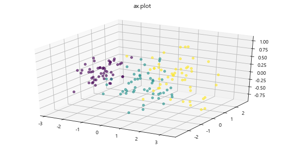
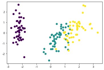
주성분에 따른 데이터 시각화
1 | import matplotlib.pyplot as plt |
1 | plt.scatter(pca_data[:, 0], pca_data[:, 1], c=df['target']) # c: color 기준 |
<matplotlib.collections.PathCollection at 0x201028bf148>

(2) 분산을 기준으로 차원축소 (n_components < 1)
1 | pca2 = PCA(n_components=0.99) |
array([[-2.26470281,  0.4800266 , -0.12770602],
       [-2.08096115, -0.67413356, -0.23460885],
       [-2.36422905, -0.34190802,  0.04420148],
       [-2.29938422, -0.59739451,  0.09129011],
       [-2.38984217,  0.64683538,  0.0157382 ]])
1 | from mpl_toolkits.mplot3d import Axes3D |
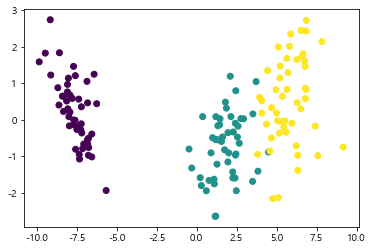
2-3. LDA 차원 축소
참고 블로그:
LDA (Linear Discriminant Analysis): 선형 판별 분석법 (PCA와 유사)
LDA는 클래스(Class)분리를 최대화하는 축을 찾기 위해 클래스 간 분산(between-class scatter)과 내분 분산(within-class scatter)의 비율을 최대화하는 방식으로 차원을 축소함.
즉, 클래스 간 분산은 최대한 크게 가져가고, 클래스 내부의 분산은 최대한 작게 가져가는 방식이다.
>> sklearn에서 실현
1 | from sklearn.discriminant_analysis import LinearDiscriminantAnalysis |
1 | df.head() |
| sepal length (cm) | sepal width (cm) | petal length (cm) | petal width (cm) | target | |
|---|---|---|---|---|---|
| 0 | 5.1 | 3.5 | 1.4 | 0.2 | 0 |
| 1 | 4.9 | 3.0 | 1.4 | 0.2 | 0 |
| 2 | 4.7 | 3.2 | 1.3 | 0.2 | 0 |
| 3 | 4.6 | 3.1 | 1.5 | 0.2 | 0 |
| 4 | 5.0 | 3.6 | 1.4 | 0.2 | 0 |
1 | # 모델 선언 |
1 | lda_data[:5] |
array([[-8.06179978,  0.30042062],
       [-7.12868772, -0.78666043],
       [-7.48982797, -0.26538449],
       [-6.81320057, -0.67063107],
       [-8.13230933,  0.51446253]])
시각화
1 | # LDA |
<matplotlib.collections.PathCollection at 0x20102cd5608>

PCA 결과와 비교
1 | # PCA |
<matplotlib.collections.PathCollection at 0x20102ba6908>
2-4. SVD (특이값 분해)
SVD (Singular Value Decomposition):
- 특이값 분해 기법이다
- PCA와 유사한 차원 축소 기법이다
- scikit-learn 패키지에서는 truncated SVD (aka LSA)을 사용한다
- 상품의 추천 시스템에도 활용되어지는 알고리즘 (추천시스템)
1 | from sklearn.decomposition import TruncatedSVD |
1 | df.head() |
| sepal length (cm) | sepal width (cm) | petal length (cm) | petal width (cm) | target | |
|---|---|---|---|---|---|
| 0 | 5.1 | 3.5 | 1.4 | 0.2 | 0 |
| 1 | 4.9 | 3.0 | 1.4 | 0.2 | 0 |
| 2 | 4.7 | 3.2 | 1.3 | 0.2 | 0 |
| 3 | 4.6 | 3.1 | 1.5 | 0.2 | 0 |
| 4 | 5.0 | 3.6 | 1.4 | 0.2 | 0 |
1 | svd = TruncatedSVD(n_components = 2) |
1 | svd_data[:5] |
array([[-2.26470281,  0.4800266 ],
       [-2.08096115, -0.67413356],
       [-2.36422905, -0.34190802],
       [-2.29938422, -0.59739451],
       [-2.38984217,  0.64683538]])
시각화
1 | # SVD |
<matplotlib.collections.PathCollection at 0x20102b2ed08>

PCA & LDA와 비교
1 | # PCA |
<matplotlib.collections.PathCollection at 0x20102ad7d88>

1 | # LDA |
<matplotlib.collections.PathCollection at 0x20102d43e08>
3. 군집화
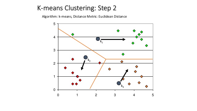
3-1. K-Means Clustering
군집화에서 가장 대중적으로 사용되는 알고리즘이다. centroid라는 중점을 기준으로 가강 가까운 포인트를 선택하는 군집화 기법이다
원리: 주어진 데이터를 k개의 cluster로 묶는 방식, 거리 차이의 분산을 최소화하는 방식으로 동작.
1 | Image('https://image.slidesharecdn.com/patternrecognitionbinoy-06-kmeansclustering-160317135729/95/pattern-recognition-binoy-k-means-clustering-13-638.jpg') |
사용되는 예제
- 스팸 문자 분류
- 뉴스 기사 분류
[sklearn.cluster.KMeans] Document
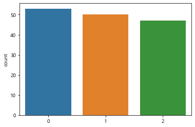
1 | from sklearn.cluster import KMeans |
1 | kmeans = KMeans(n_clusters=3) |
1 | cluster_data[:5] |
array([[3.12119834, 0.21295824, 3.98940603],
       [2.6755083 , 0.99604549, 4.01793312],
       [2.97416665, 0.65198444, 4.19343668],
       [2.88014429, 0.9034561 , 4.19784749],
       [3.30022609, 0.40215457, 4.11157152]])
1 | kmeans.labels_ |
array([1, 1, 1, 1, 1, 1, 1, 1, 1, 1, 1, 1, 1, 1, 1, 1, 1, 1, 1, 1, 1, 1,
       1, 1, 1, 1, 1, 1, 1, 1, 1, 1, 1, 1, 1, 1, 1, 1, 1, 1, 1, 1, 1, 1,
       1, 1, 1, 1, 1, 1, 2, 2, 2, 0, 0, 0, 2, 0, 0, 0, 0, 0, 0, 0, 0, 2,
       0, 0, 0, 0, 2, 0, 0, 0, 0, 2, 2, 2, 0, 0, 0, 0, 0, 0, 0, 2, 2, 0,
       0, 0, 0, 0, 0, 0, 0, 0, 0, 0, 0, 0, 2, 0, 2, 2, 2, 2, 0, 2, 2, 2,
       2, 2, 2, 0, 0, 2, 2, 2, 2, 0, 2, 0, 2, 0, 2, 2, 0, 2, 2, 2, 2, 2,
       2, 0, 0, 2, 2, 2, 0, 2, 2, 2, 0, 2, 2, 2, 0, 2, 2, 0])
1 | sns.countplot(kmeans.labels_) |
<matplotlib.axes._subplots.AxesSubplot at 0x201043c7fc8>
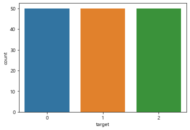
1 | sns.countplot(df['target']) |
<matplotlib.axes._subplots.AxesSubplot at 0x2010301bec8>
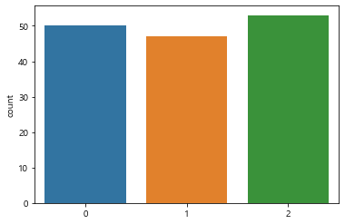
Hyper-parameter Tuning
1 | kmeans |
KMeans(algorithm='auto', copy_x=True, init='k-means++', max_iter=300,
       n_clusters=3, n_init=10, n_jobs=None, precompute_distances='auto',
       random_state=None, tol=0.0001, verbose=0)
1 | # max_iter: maximum number of iterations for a single run |
1 | sns.countplot(kmeans2.labels_) |
<matplotlib.axes._subplots.AxesSubplot at 0x20105525688>
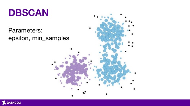
3-2. DBSCAN
밀도 기반 클러스터링
(DBSCAN: Dencity-Based Spatial Clustering of Applications with Noise)
- 밀도가 높은 부분을 클러스터링 하는 방식
- 어느 점을 기준으로 반경 x내에 점이 n개 이상 있으면 하나의 군집으로 인식하는 방식
- KMeans 에서는 n_cluster의 갯수를 반드시 지정해 주어야 하나, DBSCAN에서는 필요없음
- 기하학적인 clustering도 잘 찾아냄
1 | Image('https://image.slidesharecdn.com/pydatanyc2015-151119175854-lva1-app6891/95/pydata-nyc-2015-automatically-detecting-outliers-with-datadog-26-638.jpg') |
[sklearn.cluster.DBSCAN] Document
주의: 변환 시 fit_transform()대신 fit_predict() 를 쓴다
1 | from sklearn.cluster import DBSCAN |
1 | # eps: The maximum distance between two samples for one to be considered as in the neighborhoood of the other |
array([ 0,  0,  0,  0,  0,  0,  0,  0,  0,  0,  0,  0,  0,  0,  0,  0,  0,
        0,  0,  0,  0,  0,  0,  0,  0,  0,  0,  0,  0,  0,  0,  0,  0,  0,
        0,  0,  0,  0,  0,  0,  0, -1,  0,  0,  0,  0,  0,  0,  0,  0,  1,
        1,  1,  1,  1,  1,  1,  1,  1,  1,  1,  1,  1,  1,  1,  1,  1,  1,
        1,  1,  1,  1,  1,  1,  1,  1,  1,  1,  1,  1,  1,  1,  1,  1,  1,
        1,  1,  1,  1,  1,  1,  1,  1,  1,  1,  1,  1,  1,  1,  1,  1,  1,
        1,  1,  1,  1, -1,  1,  1, -1,  1,  1,  1,  1,  1,  1,  1,  2,  1,
        1,  1,  1,  1,  1,  1,  1,  1,  1,  1,  1,  1,  2,  1,  1,  1,  1,
        1,  1,  1,  1,  1,  1,  1,  1,  1,  1,  1,  1,  1,  1],
      dtype=int64)
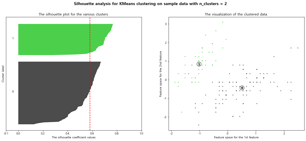
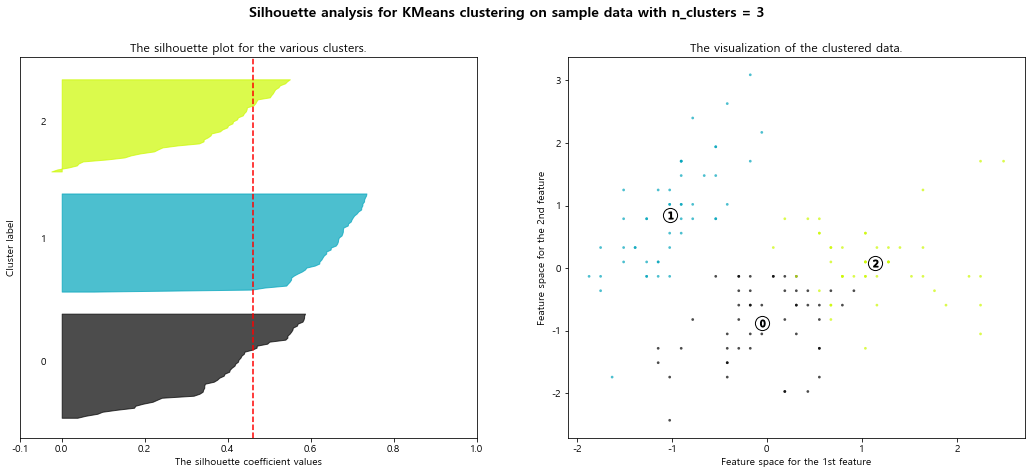
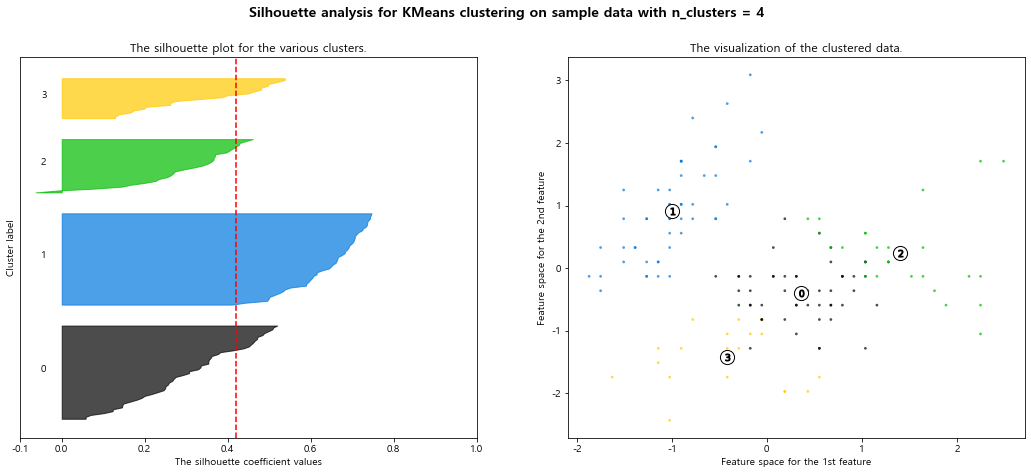
3-3. 실루엣 스코어 (군집화 평가)
클러스터링의 품질을 정량적으로 평가해 주는 지표
- 1: 클러스터링의 품질이 좋다
- 0: 클러스터링의 품질이 안좋다 (클러스터링의 의미 없음)
- 음수: 잘못 분류됨
1 | from sklearn.metrics import silhouette_samples, silhouette_score |
1 | data_scaled = StandardScaler().fit_transform(df.loc[:, 'sepal length (cm)' : 'petal width (cm)']) |
0.45994823920518635
1 | samples = silhouette_samples(data_scaled, kmeans.labels_) |
array([0.73419485, 0.56827391, 0.67754724, 0.62050159, 0.72847412])
silhouette analysis 시각화 Document
1 | def plot_silhouette(X, num_cluesters): |
1 | plot_silhouette(data_scaled, [2, 3, 4, 5]) |
For n_clusters = 2 The average silhouette_score is : 0.5817500491982808
For n_clusters = 3 The average silhouette_score is : 0.45994823920518635
For n_clusters = 4 The average silhouette_score is : 0.4188923398171004
For n_clusters = 5 The average silhouette_score is : 0.34551099599809465
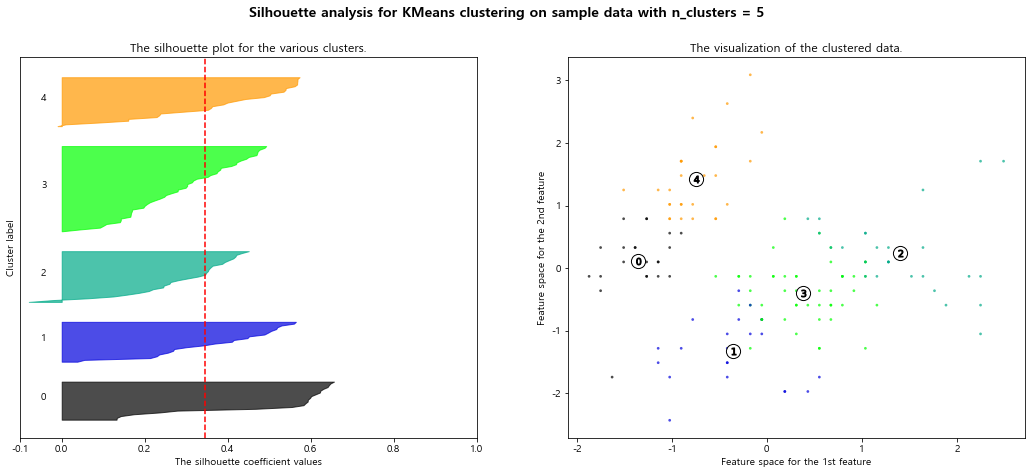
- 빨간 점선은 평균 실루엣 계수를 의미함