Build Common Views
- 1. Working with Dates to Visualize Time-Based Data
- 2. Create Custom Date Fields and Hierarchies
- 3. Comparing Multiple Measures in Views
1. Working with Dates to Visualize Time-Based Data
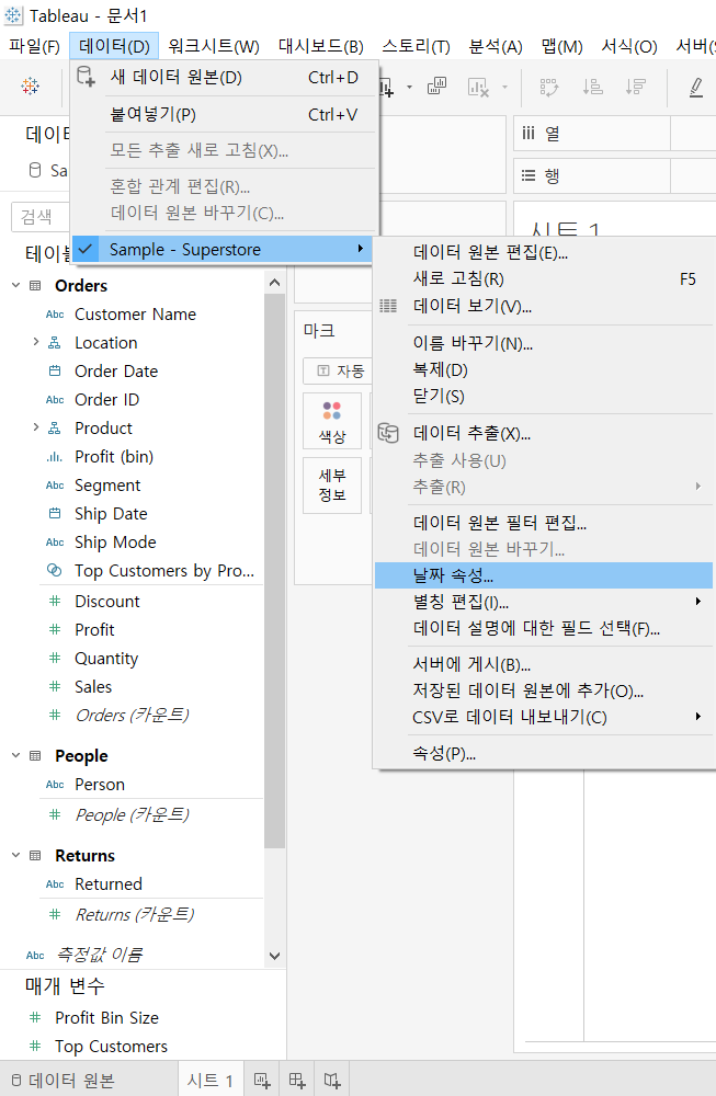
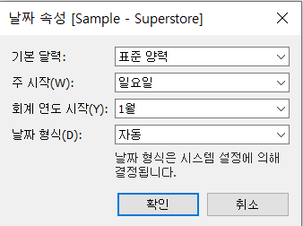
>> Change date field and calender defaults
-
[Data] --> Data Source Name --> [Date Properties]
2. Create Custom Date Fields and Hierarchies
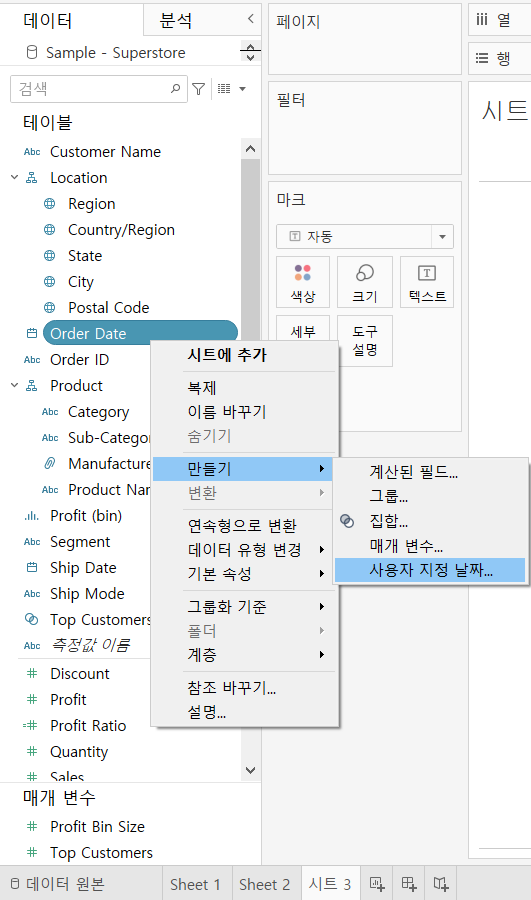
>> Create a custom continuous date value
-
[Data] Pane --> [Order Date] --> click the down-arrow
-
[Create] --> [Custom date]
-
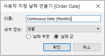
[Name] : “Continuous Date (Months)”
[Detail] : “Months”
[Date Value]
-
Click [OK]
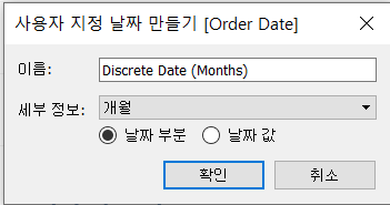
>> Create a custom discrete date part
-
[Data] Pane --> [Order Date] --> click the down-arrow
-
[Create] --> [Custom date]
-
[Name] : “Discrete Date (Months)”
[Detail] : “Months”
[Date Part]
-
Click [OK]

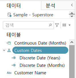
>> Create a custom date hierarchy
- Create a custom discrete date part field, “Discrete Date (Years)”
- Create another custom discrete date part field, “Discrete Date (Months)”
- In the [Data] pane, drag [Discrete Date (Months)] on top of [Discrete Date (Years)]
- In the dialog box, change the name of the hierarchy to “Custom Dates”
- Click [OK]
3. Comparing Multiple Measures in Views
[Measure Values] (측정값) and [Measure Names] (측정값 이름) fields are automatically created by Tableau.
They serve as containers for the measures in the [Data] Pane:
- [Measure Values] field: a measure that contains the values of the measures
- [Measure Names] field: a dimension that contains the names of the measures
- Note: it does not include measures, such as [Latitude], that do not aggregate the same way as other measures
With Measure Values and Measure Names fields, you can build certain types of views that involve multiple measures, enabling you to compare them.
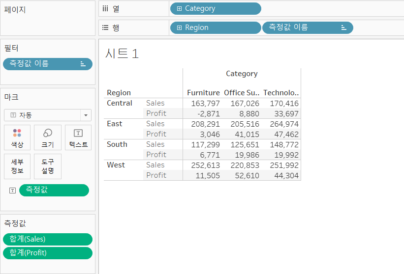
>> Create text tables with multiple measures
[개요]
- Text tables can contain up to fifty measures on Rows and sixteen on Columns
- Measures in text tables can have different units
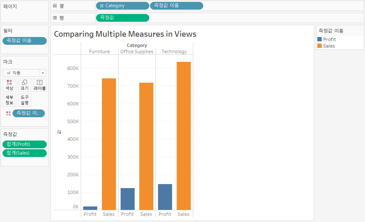
>> Make views with multiple measures on the same axis
[개요]
- You can add fifty measures to the same axis
- Measures that share an axis should have the same unit of measurement
- Measures that share the same axis use the same type of mark, such as bar
[실습]
- Add [Category] to [Columns]
- Add [Sales] to [Rows]
- Drag [Profit] from the [Data] pane to the [Sales] axis
- [Measure Values] and [Measure Names] will be added to the view automatically
- Drag [Measure Name] from the [Data] pane, to color on the [Marks] card.
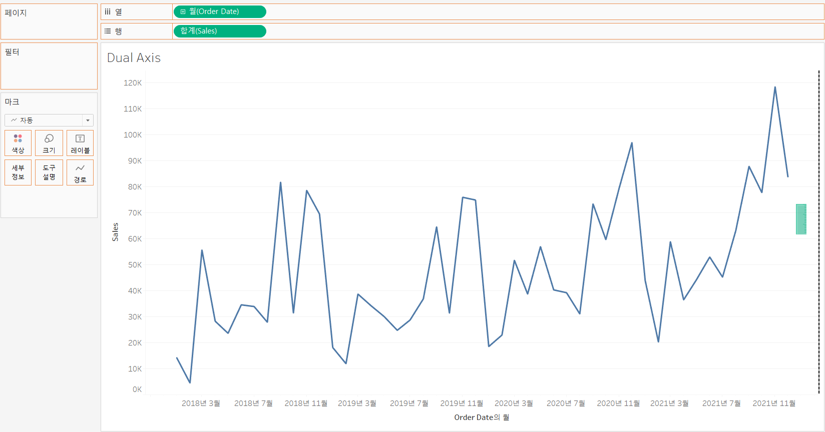
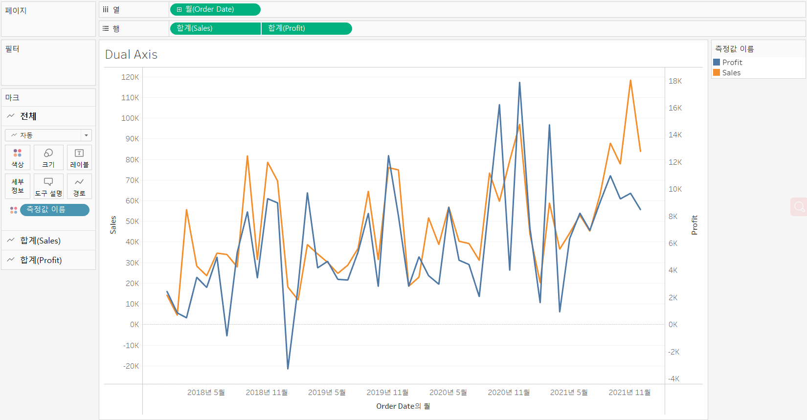
>> Build dual and combined axis charts
[개요]
-
Dual axis charts have two axes for the measures and one for the dimensions
-
Dual axis charts use two measures and one or more dimensions
-
Measures can have different units
-
Measures can use the same or different mark types
[실습]
-
Measures with same number format [Sales & Profit]
-
Set the dimension and the first measure in the view
[Columns] : Month(Order Date) (dimension)
[Rows] : SUM(Sales) (first measure)
-
Make a dual axis chart:
Drag [Profit] (second measure) from Data pane to the right edge of the view
until you see < a light green ruler icon > and < a black dotted line >
and drop the measure.
-
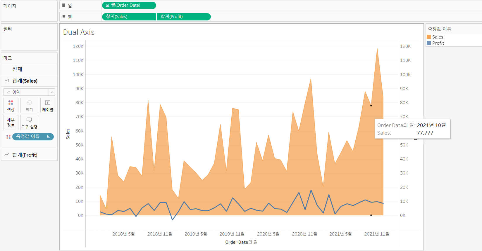
Change the mark type for each measure
-
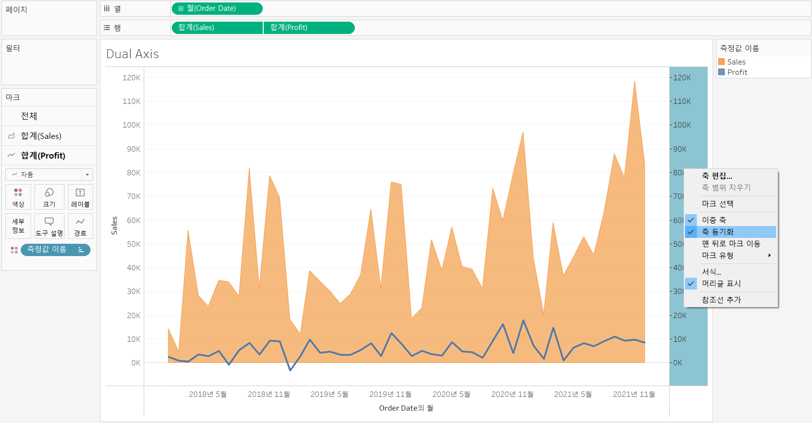
Set the scales same
Right-click the axis want to change --> Synchronize Axis
-
-
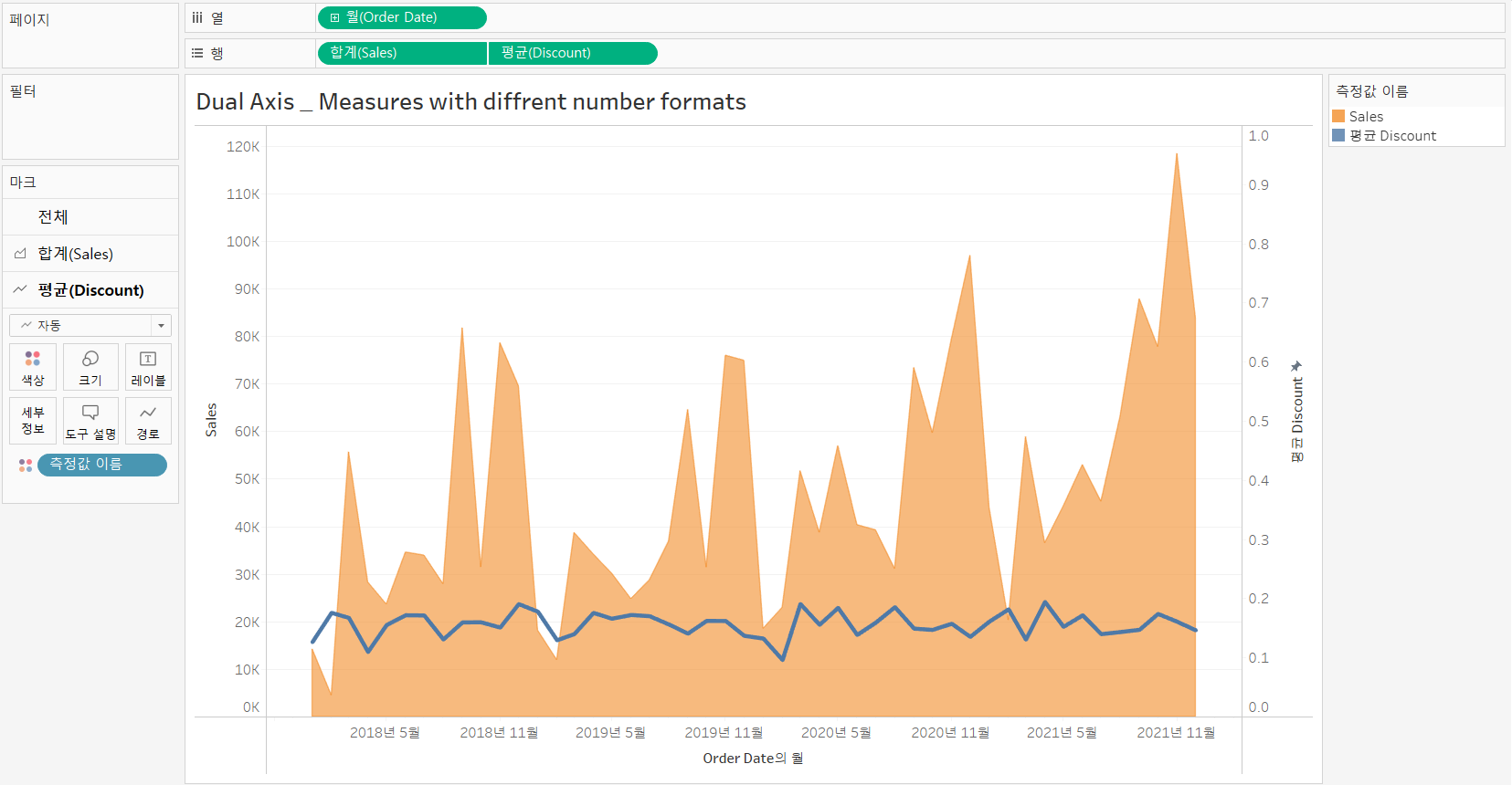
Measures with different number formats [Sales & Discount]
> Without [Synchronize Axis] (축 동기화)
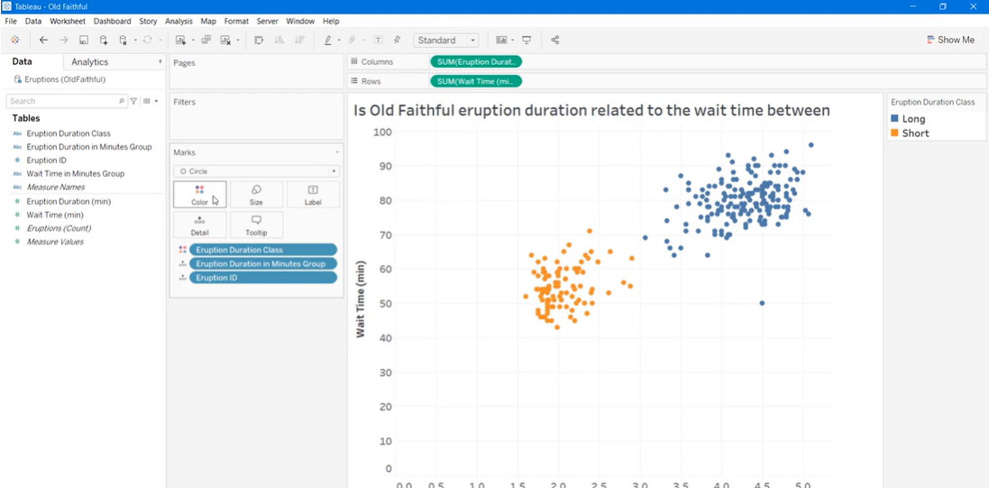
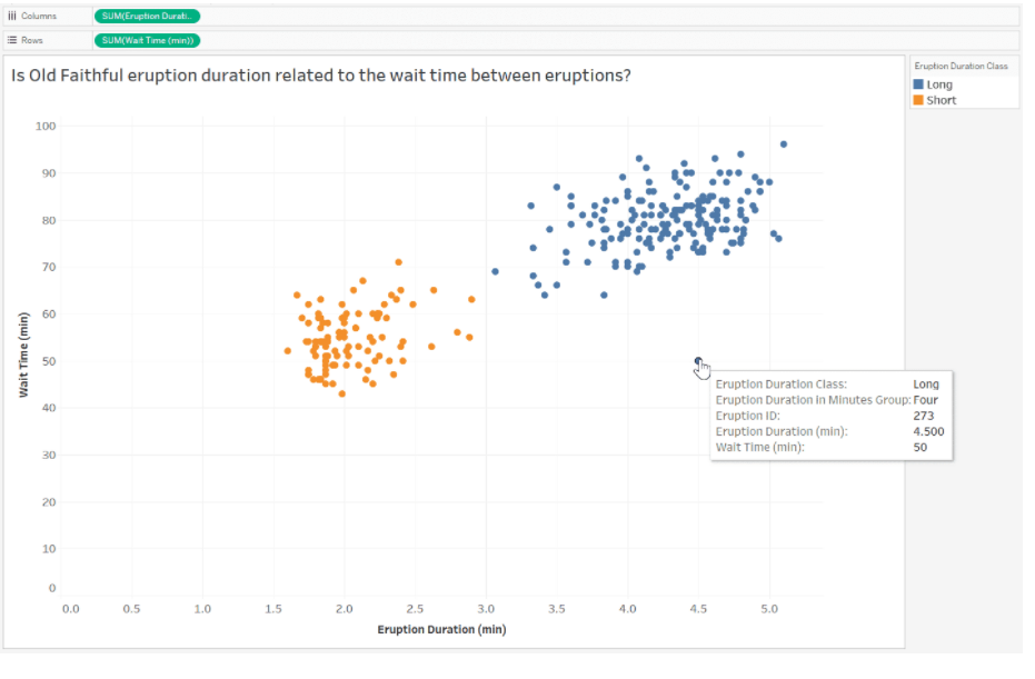
>> Using Scatter Plots To Show Relationships Between Measures
[What can we do with scatter plots?]
-
Evaluate data clusters
-
Identify correlations and trends
- Use correlations and trends to analyze data
-
Identify outliers
- Manage outliers
- Exclude an outlier from a view
- Add an annotation to an outlier
[Details]
- Build a scatter plot
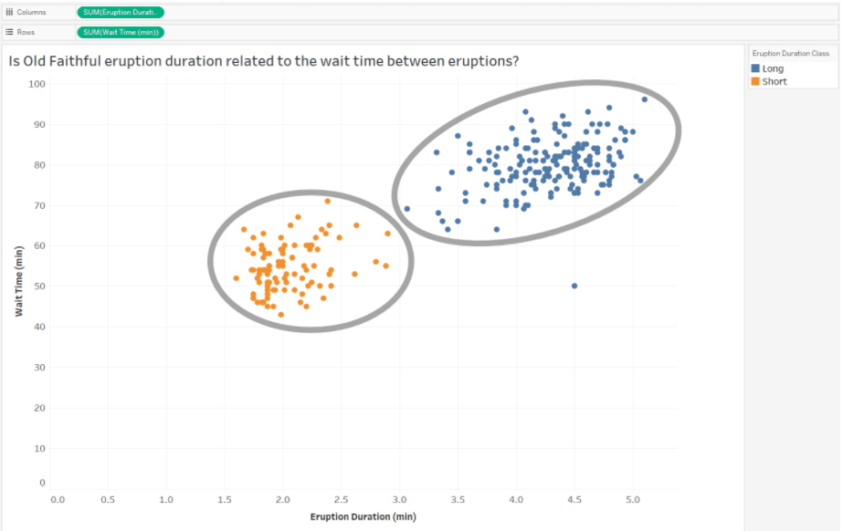
-
Evaluate data clusters
- Two clusters divided by the eruption duration classes, [long] and [short]
-
Identify correlations and trends
- Positive Correlation
- Negative Correlation
- No Correlation
-
Use correlations and trends to analyze data
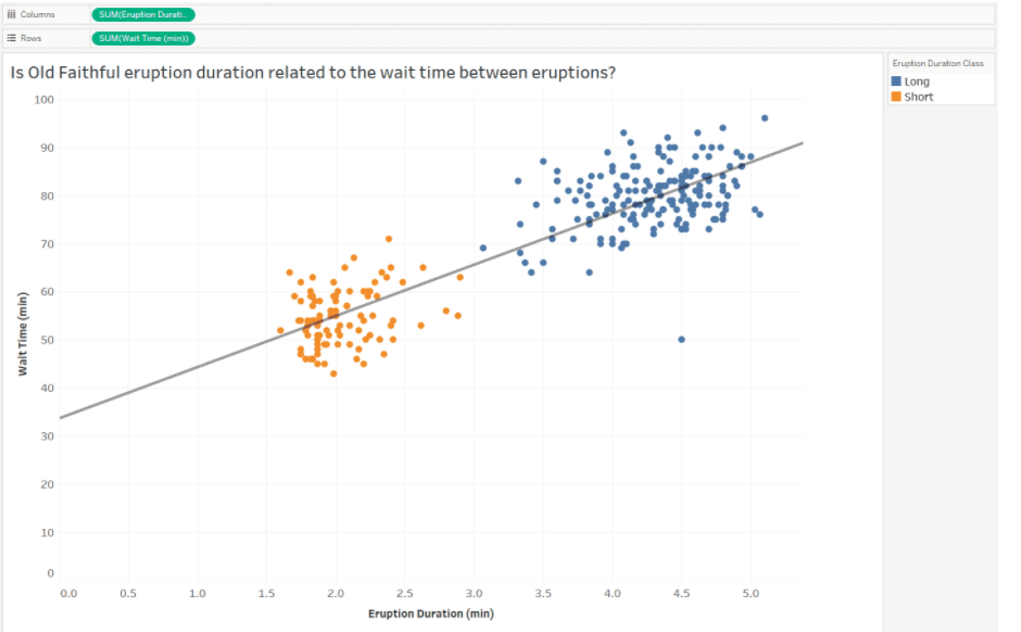
- Positive relationship between [wait time between eruptions] and [eruption duration]
- the longer the wait time between eruptions, the longer the eruption duration
-
Identify outliers
-
Exclude an outlier
-
Press [Ctrl] and select the outlier
-
On the tooltip that appers, click [Exclude]
-
-
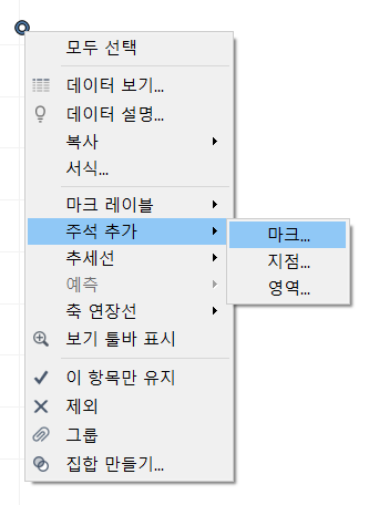
Add an annotation to an outlier
- Right-click the outlier
- Point to [Annotate] (주석 추가)
- Click [Mark]
- Use the [Edit Annotation] dialog box to create annotation
- click [OK]
-