Seasonality: Show Trends with Cycle Plots
1. Seasonality
Seasonality is any predictable change in a time series that repeats over a one-year period.
Discovering seasonality in our data is important because it helps us identify cyclic trends in our data that can help us with forecasting or making changes to our processes.
When you want to show seasonality over time, there are some options that can show a clear picture:
-
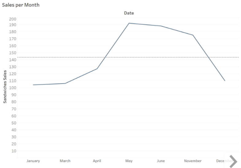
Single Line Chart: Shows seasonality over a one year period
-
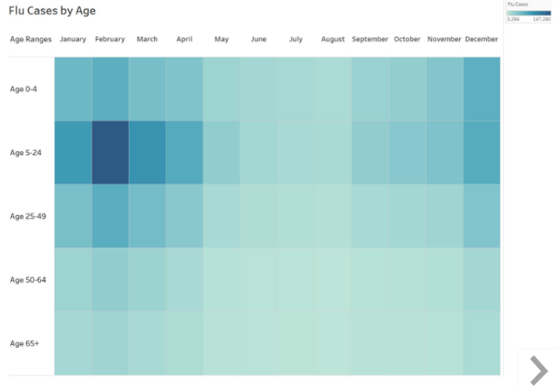
Highlight Table: Shows seasonality using various colors and shades
-
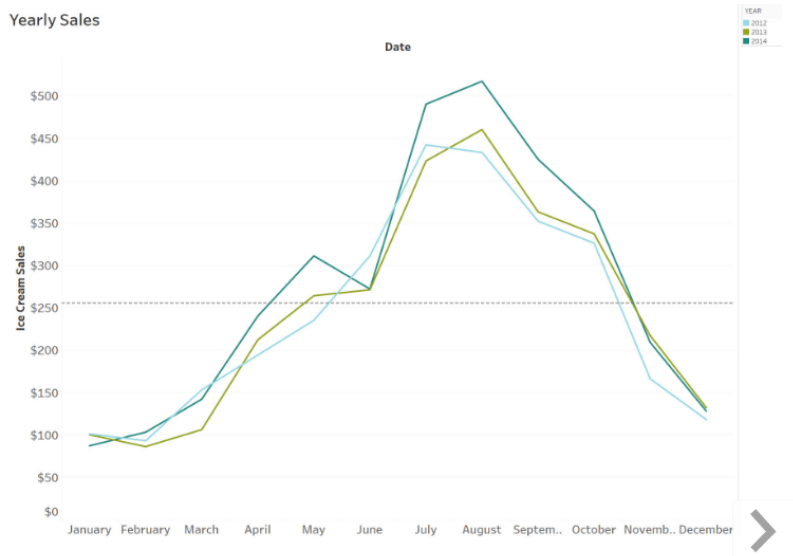
Multiple Lines Chart: Shows seasonality over several years using multiple lines
2. Cycle Plots
Except these, Cycle plots are another way to show seasonality.
Cycle plots are line charts that show the trends of two different time periods simultaneously (e.g. showing both month and year). The seasonal variations by month can be seen more easily with a cycle plot because it shows both the trend and the month-of-the-year effect.
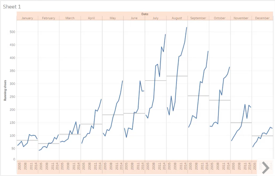
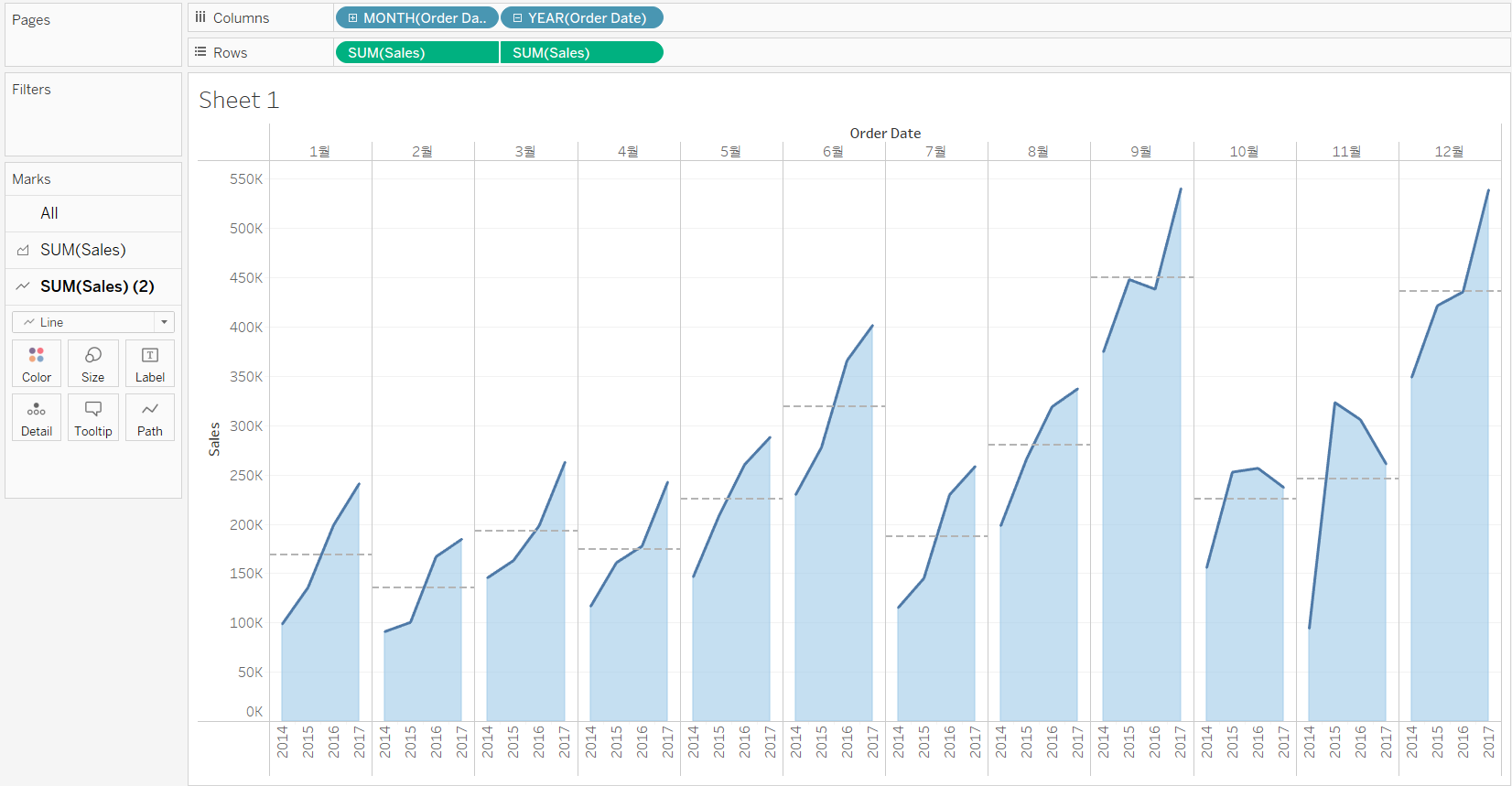
3. Create a Cycle plot
<< Goal >>
We have four years of sales data and have noticed peak sales during some months throughout the years. Does this indicate there is seasonality in our data? We would like to build a cycle plot to find out it.
<< Process >>
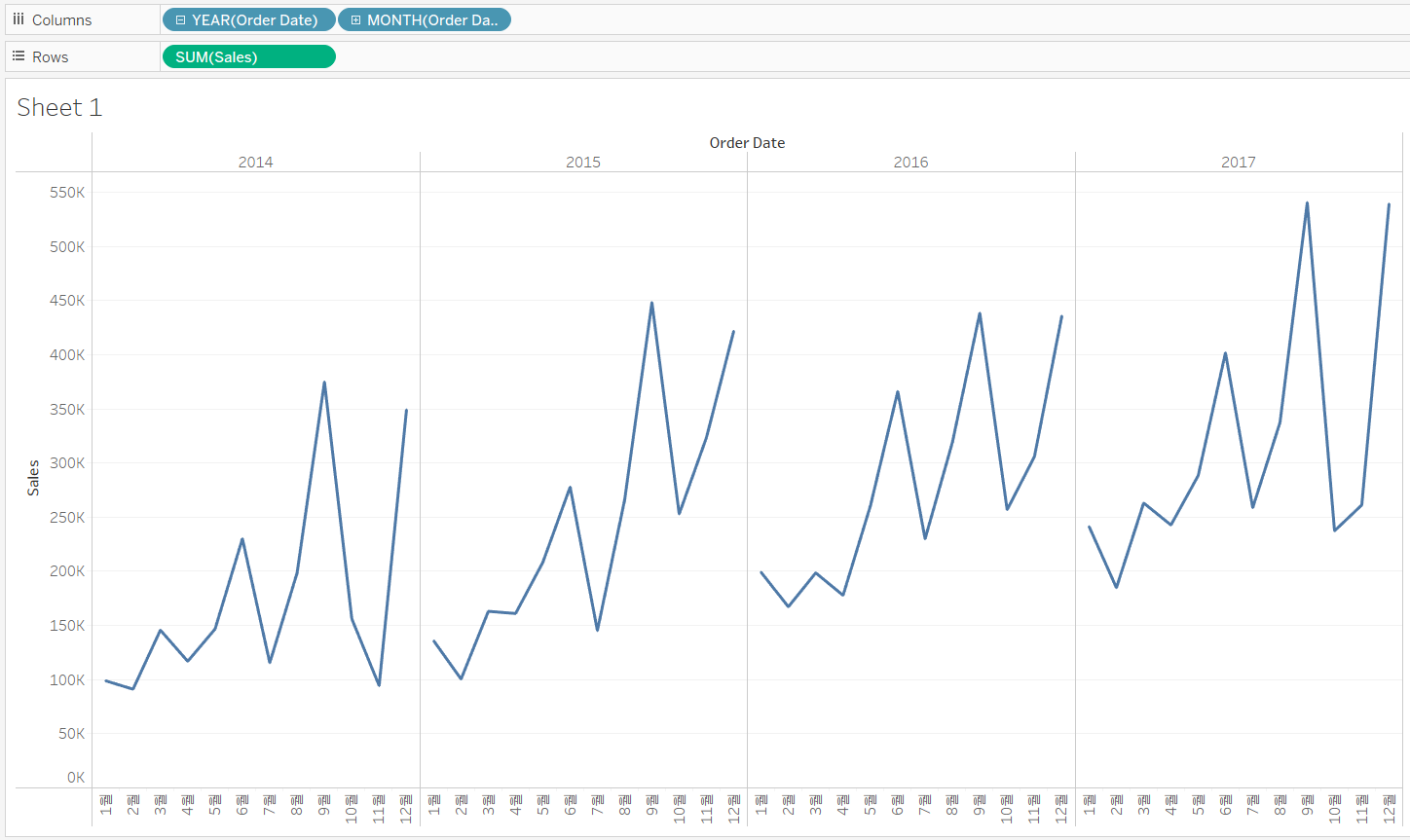
[STEP 1] Expand the Order Date in the view to show only discrete Year and Month
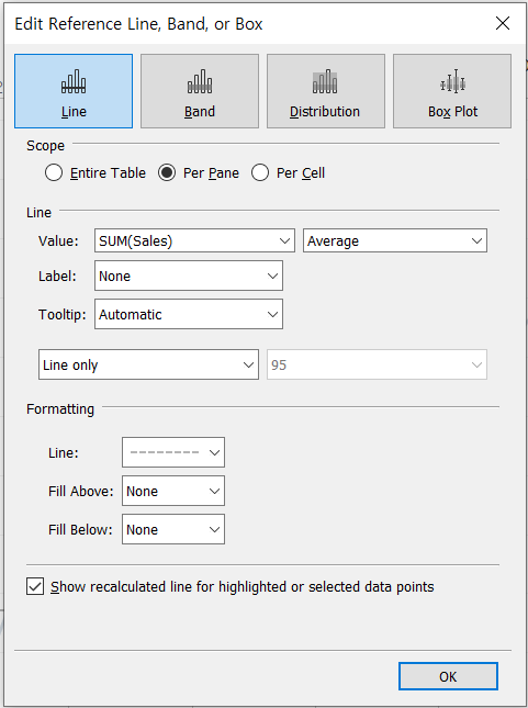
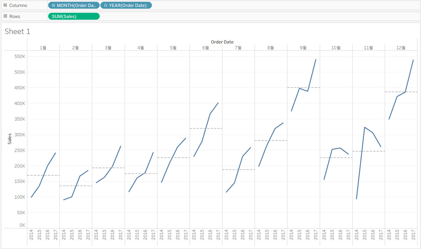
[STEP 2] Invert the order of YEAR and MONTH and add an average line per pane
[STEP 3] Change the marks to a light blue area
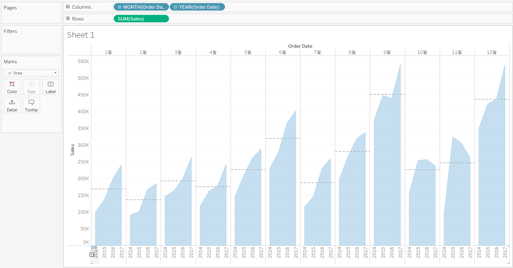
[STEP 4] Add a dark blue line to the marks using a synchronized dual axis chart