Time-Based Data
- 1. Using Sparklines to Show Trends Over Time
- 2. Using a Slope Chart to Tell a Before and After Story
- 3. Monitoring Quality Control with a Control Chart
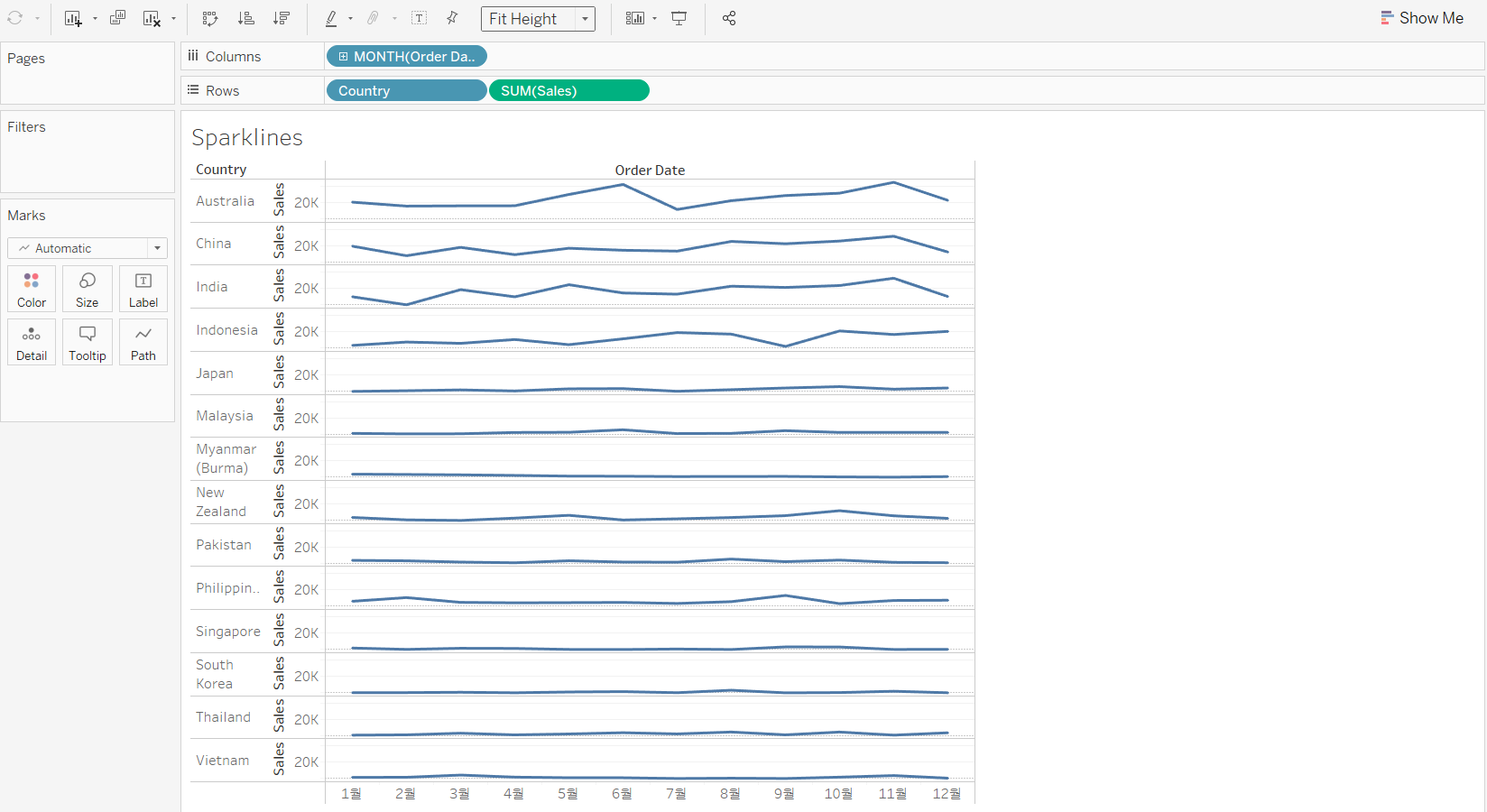
1. Using Sparklines to Show Trends Over Time
Sparkline charts are small line charts that displayed without axes and headers.
Sparkline charts present high level comparisons of data over a period of time. Also, they fit in a small area and are mostly used to show trends in a simple, condensed way.
>> Create a sparklines chart
<< Goal >>
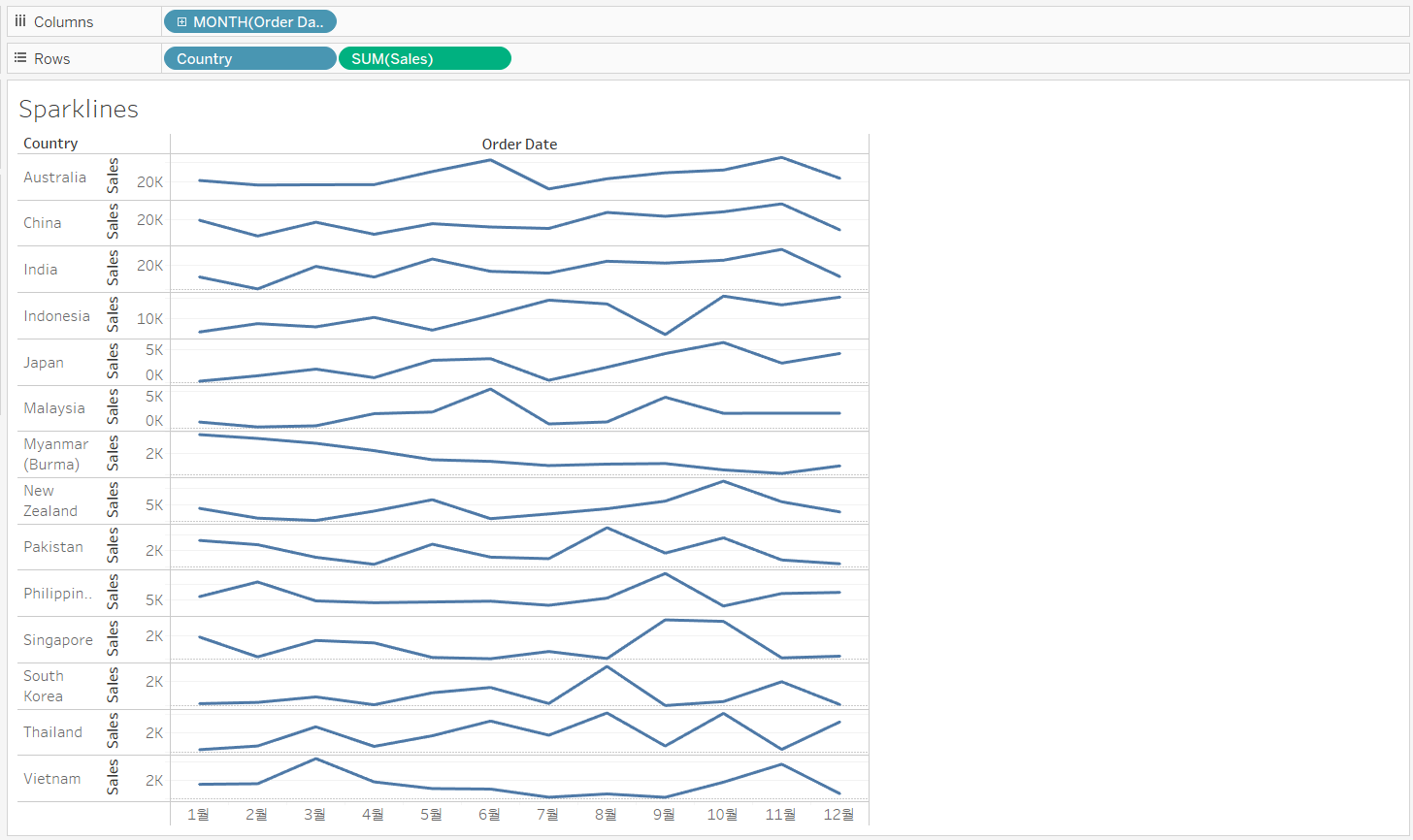
We want to analyze sales by country over time. We’ll create a chart with sparklines to view the general trend for each country at a glance.
<< Process >>
[STEP 1] Create a line chart
Build a view that displays Sales by Country against discrete month of Order Date and let the chart fit height.
[STEP 2] Use an independent axis range for sales
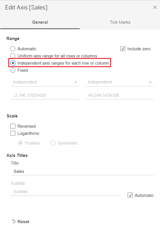
By default, the rows display the same range. To make the individual lines more distinct, we can set the Sales axis to display as independent ranges per row.
- Right-click the Sales axis --> [Edit Axis]
- [Range] --> select [Independent axis ranges for each row or column]
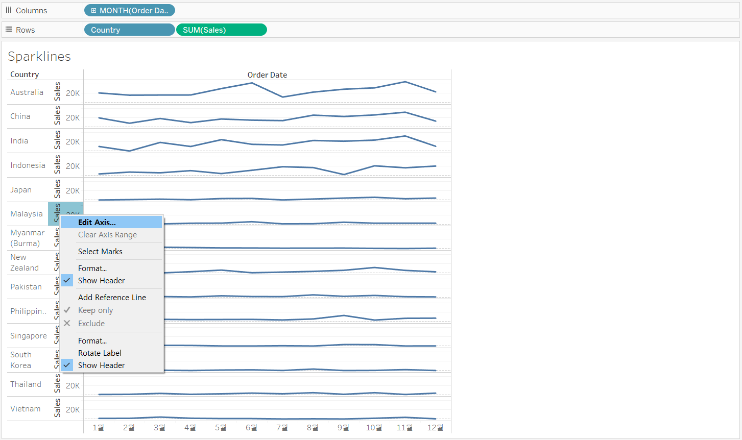
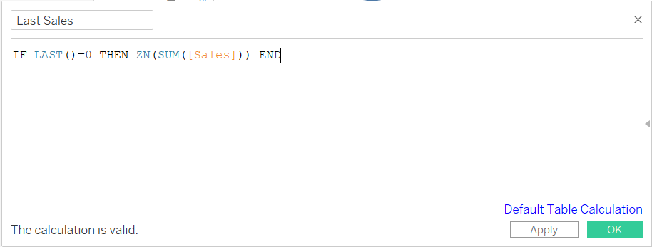
[STEP 3] Highlight the last data point for each country
-
Create a calculated field that calculates the last sales mark of 2016
-
This calculation finds the last row in each pane,
- If the value is not null, then returns SUM(Sales)
- If the value is null, then returns 0
-
-
Create a synchronized dual axis chart with “Last Sales” and “SUM(Sales)”
-
Hide the nulls from the view and change the circle marks color
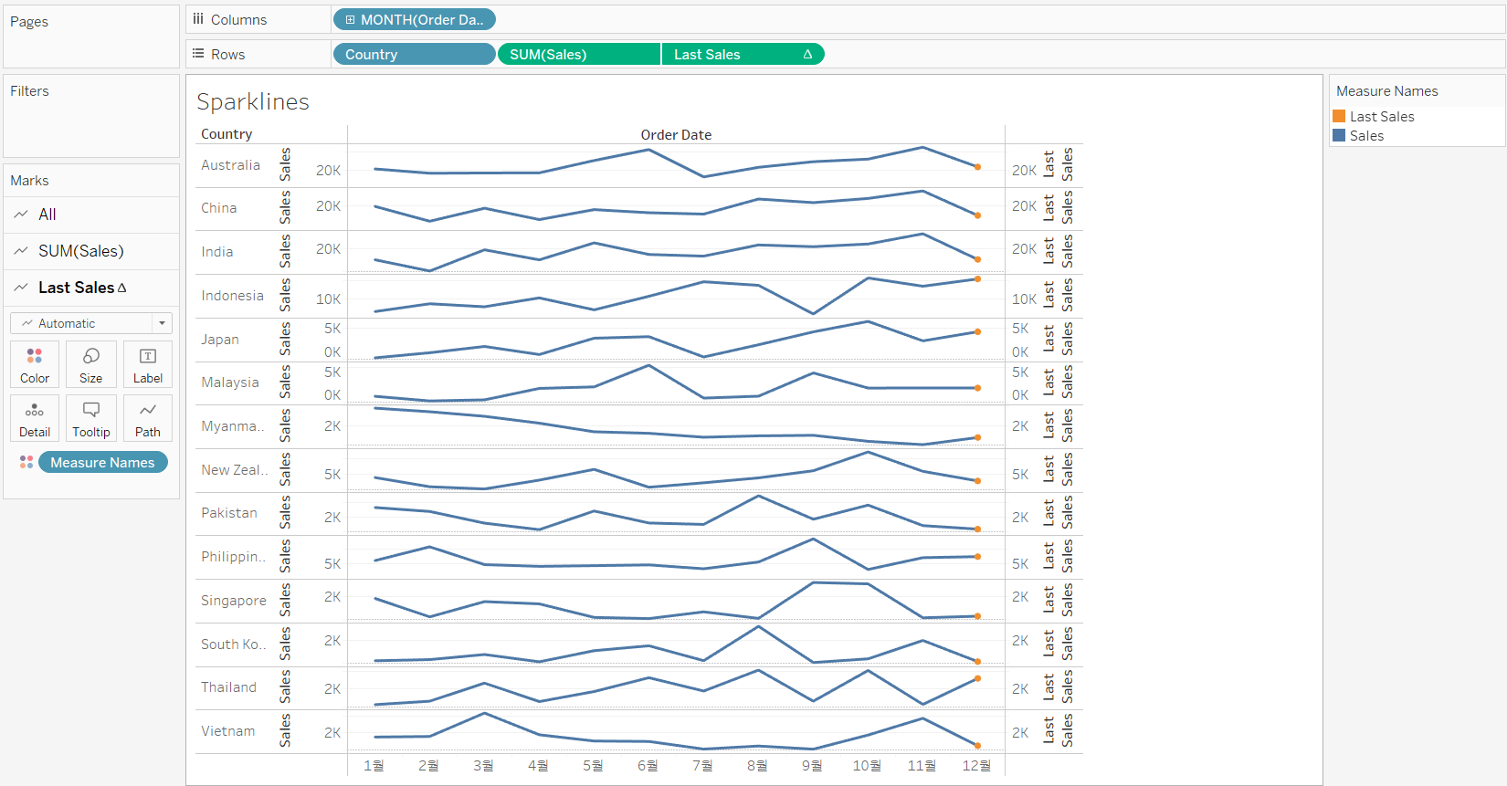
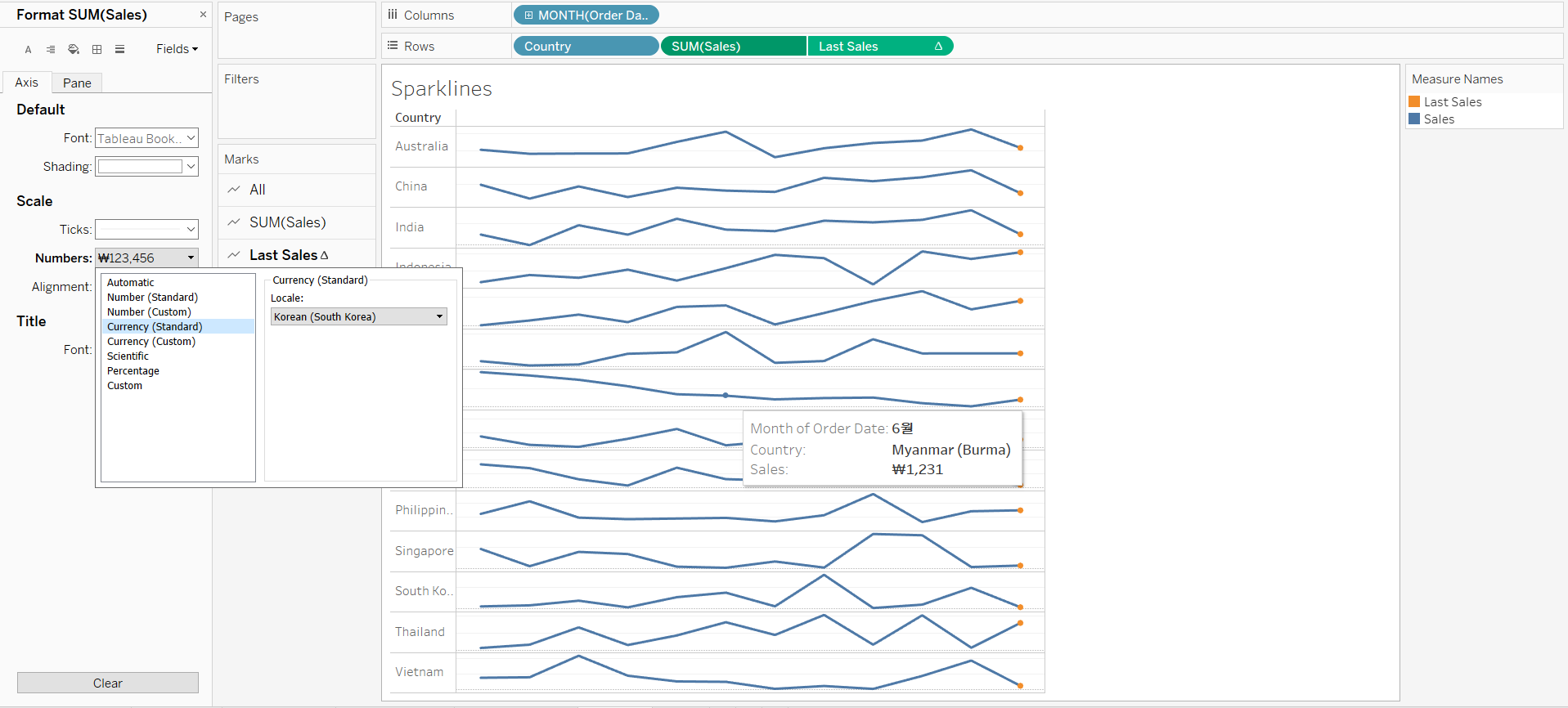
[STEP 4] Hide the axes and set default number to standard currency
- Hide the date and sales headers
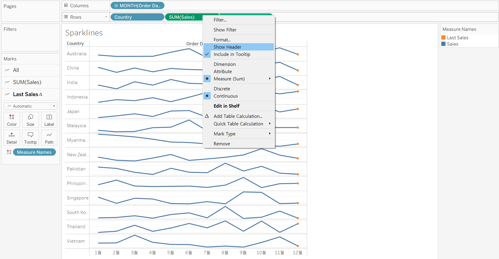
- Set default number to standard currency
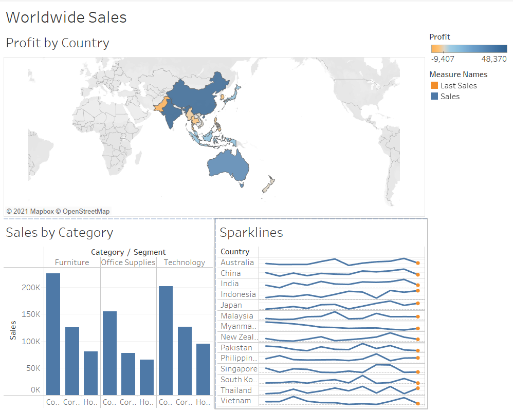
[STEP 5] Add the sparklines sheet to the dashboard
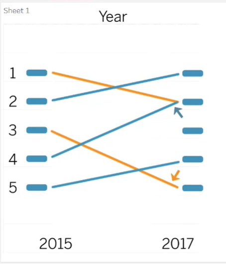
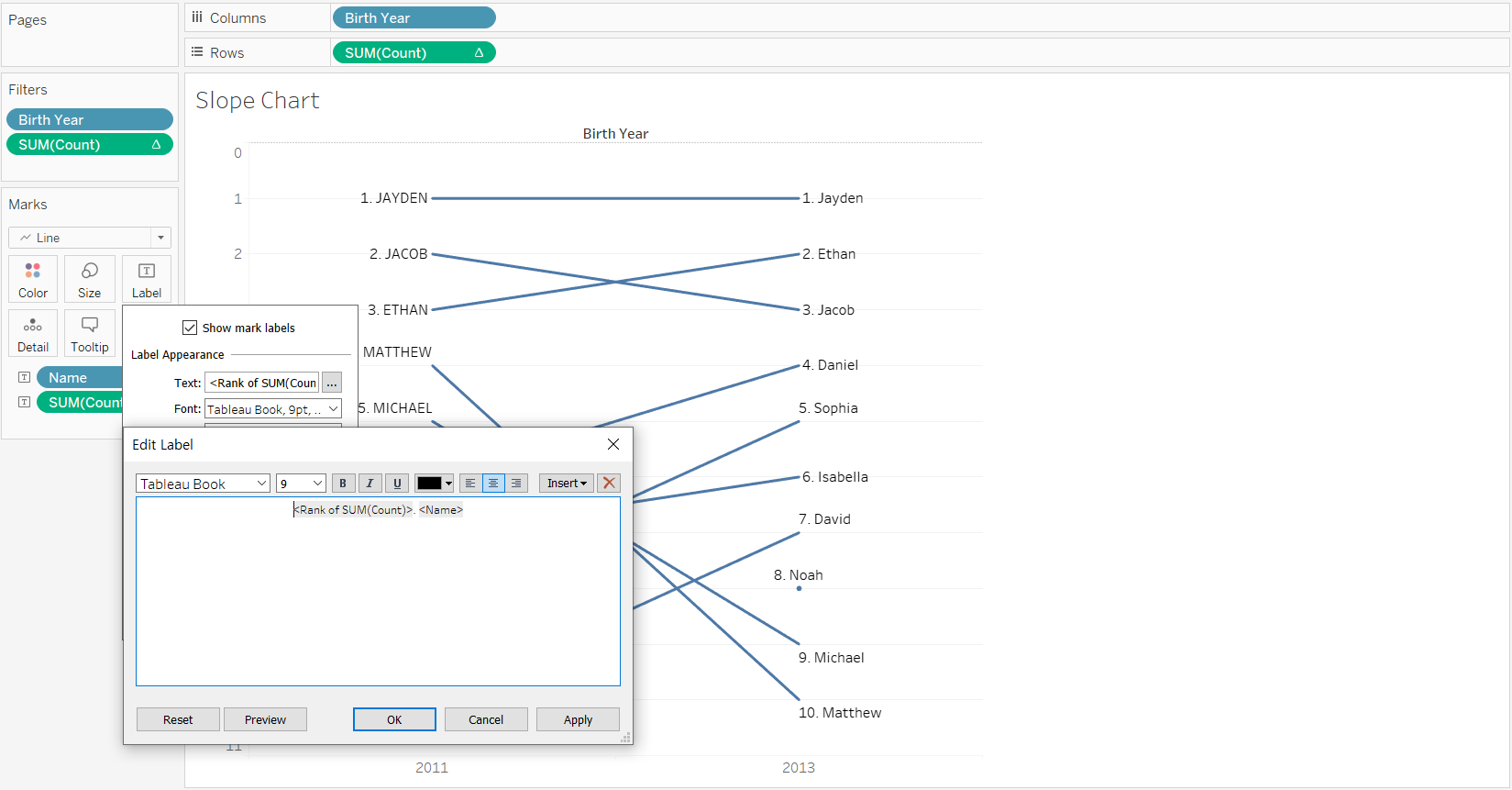
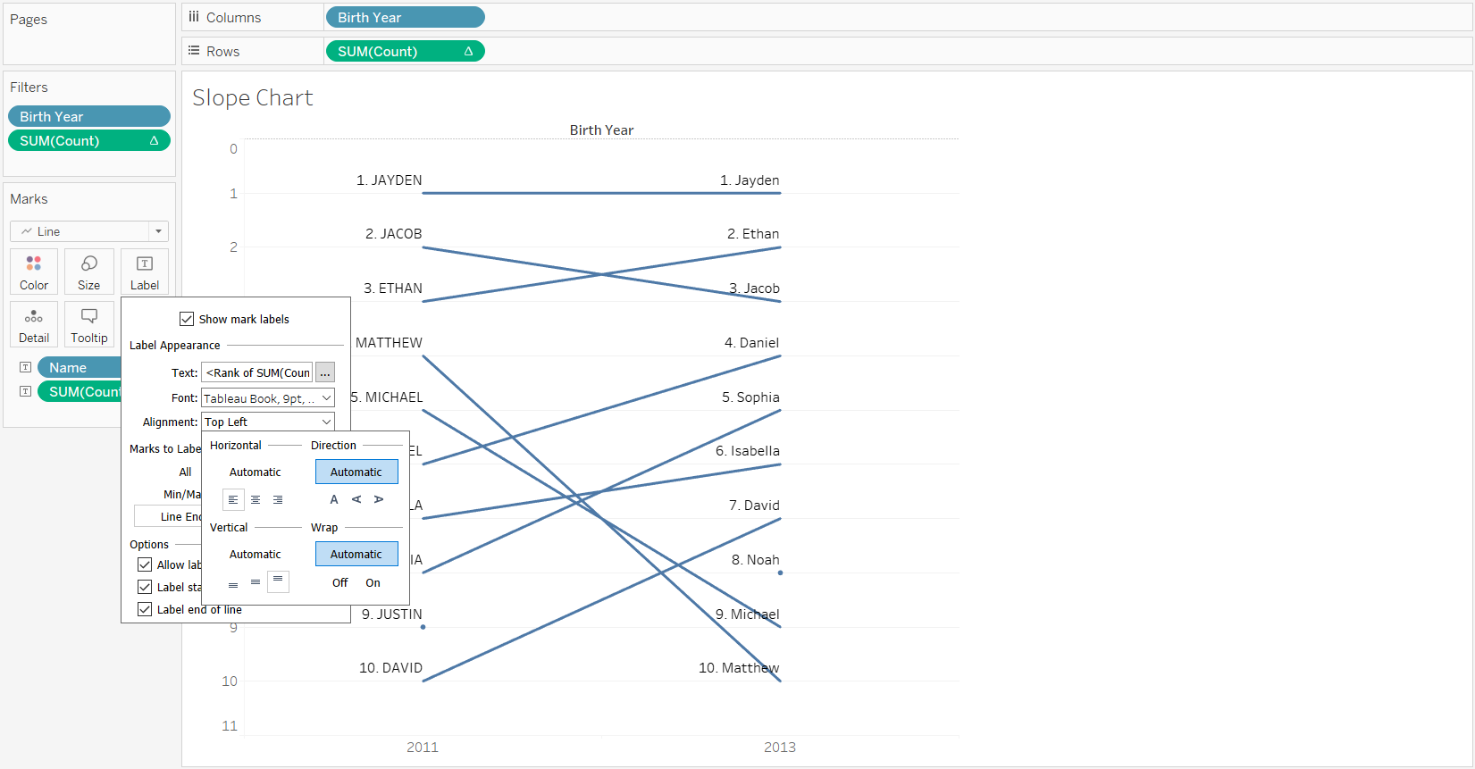
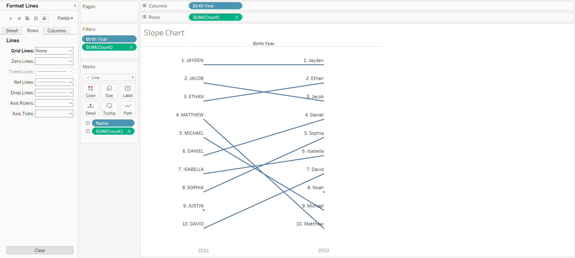
2. Using a Slope Chart to Tell a Before and After Story
When you have time-based data that is shown by rank, an interesting way to summarize change over time is by using a slope chart.
Slope charts show changes in rank or position for a dimension using a start point and an end point. You can use a slope chart when you want to show whether a particular dimension has increased or decreased between two points in time.
>> Create a slope chart
<< Goal >>
We want to know the rank of the top 10 names and see if these names have decreased or increased in popularity.
<< Process >>
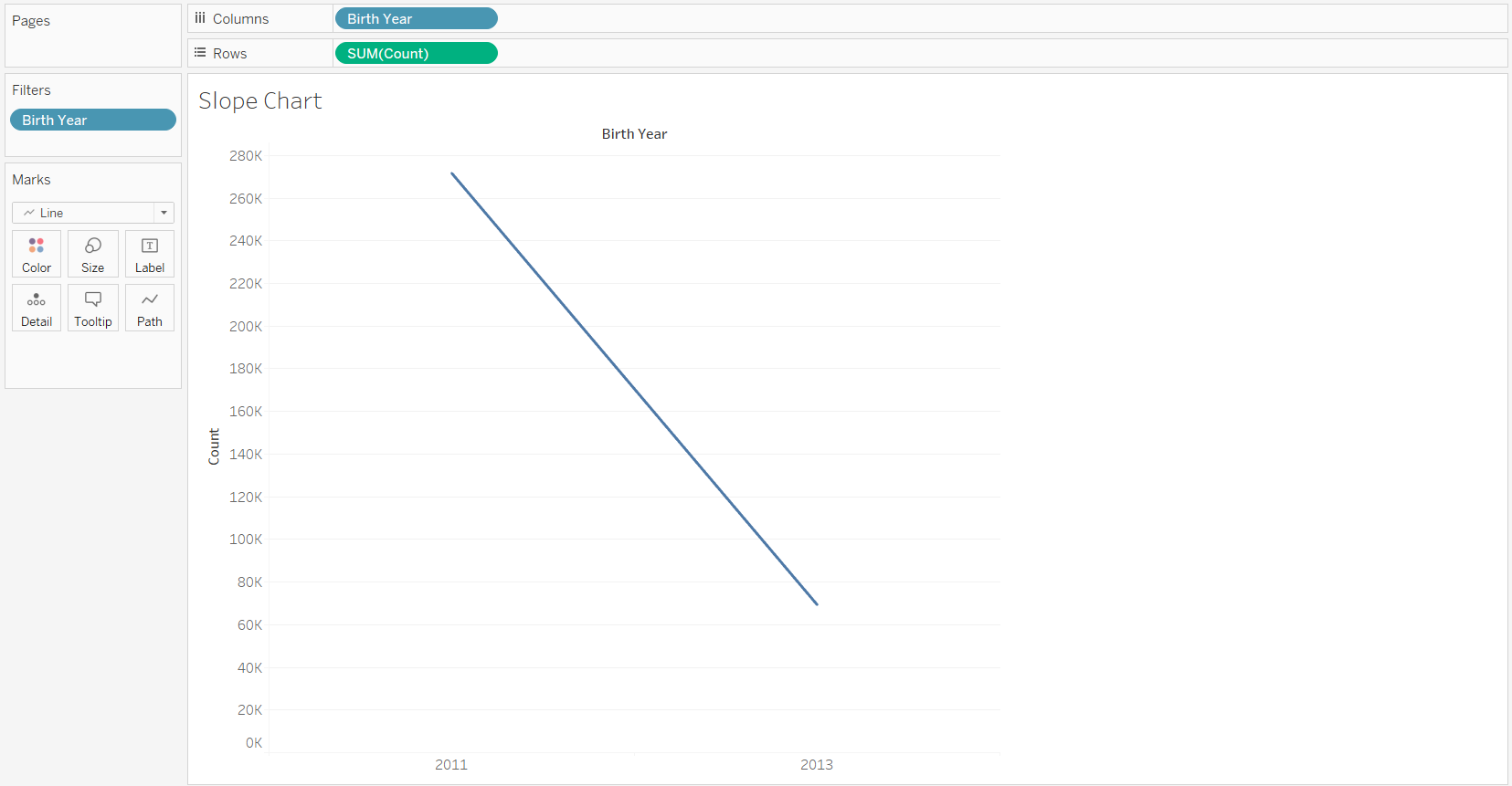
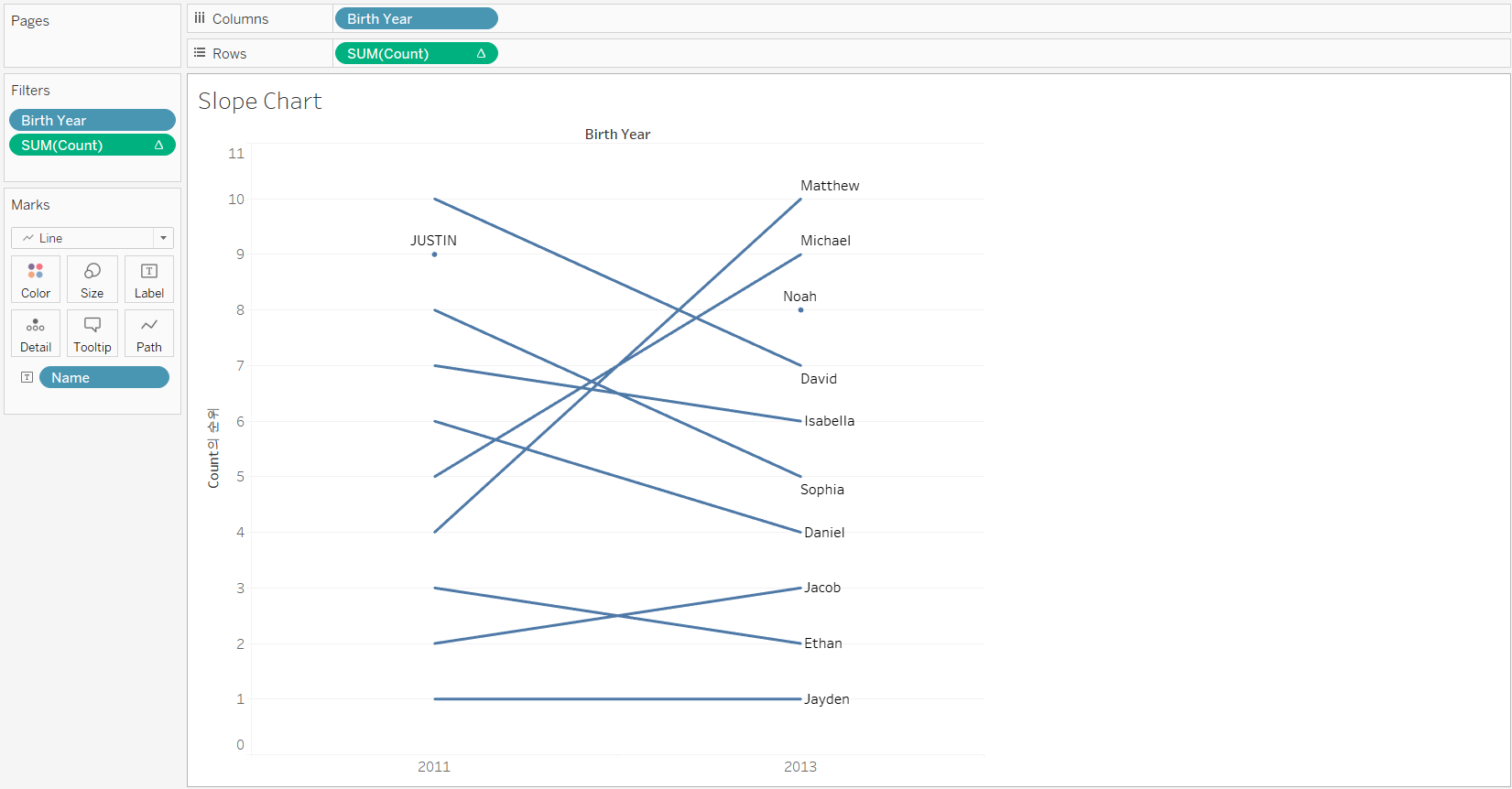
[STEP 1] Remain data of the two time points to compare
- Columns: Discrete [Birth Year] Rows: SUM(Count)
- Filter the Birth Year to 2011 and 2013, and widen rows in the view (Ctrl + ‘->’ arrow)
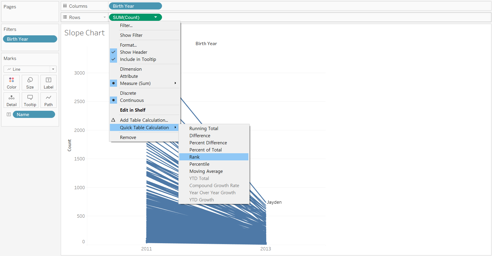
[STEP 2] Rank the names of two years by count
- Label the marks with Name
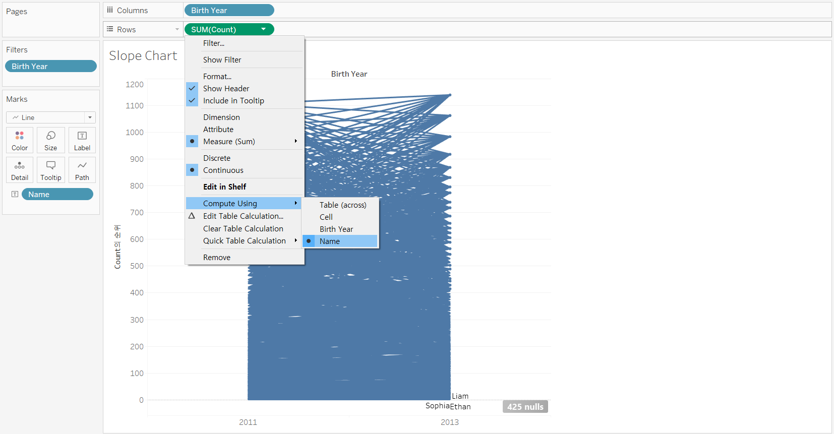
- Add a Rank quick table calculation, and compute using Name
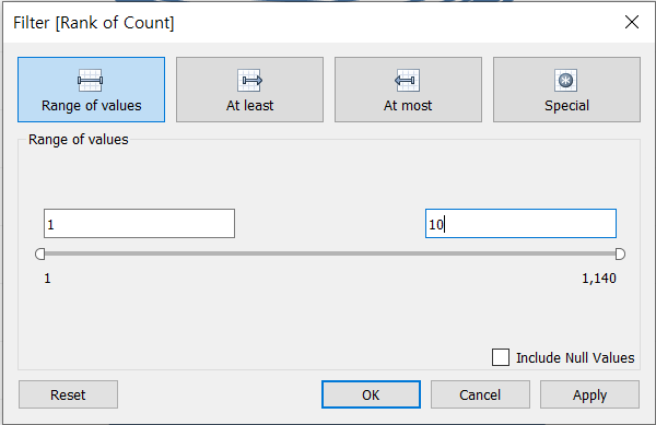
[STEP 3] Show only the top 10 names
- Ctrl + drag [SUM(Count)] rank calculation in Rows to Filters pane
- set the range from 1 to 10
-
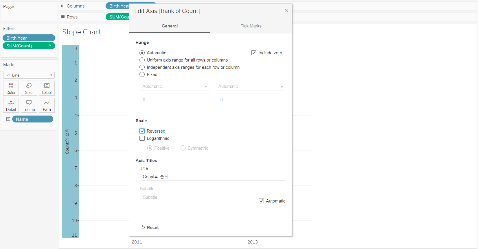
Reverse the rank of Count axis, and show line ends
-
Right-click the Count axis --> Edit Axis --> Scale: [Reversed]
-
On Marks card, click [Label] --> Marks to Label: Line Ends
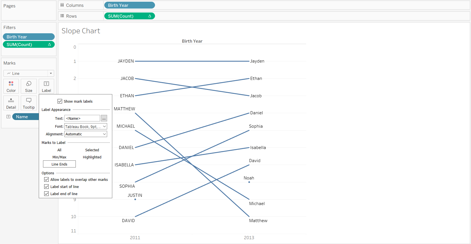
-
Edit the labels to display rank before name, and align the view to top left
-
[STEP 4] Hide the Rank of Count axis and the row grid lines in the view
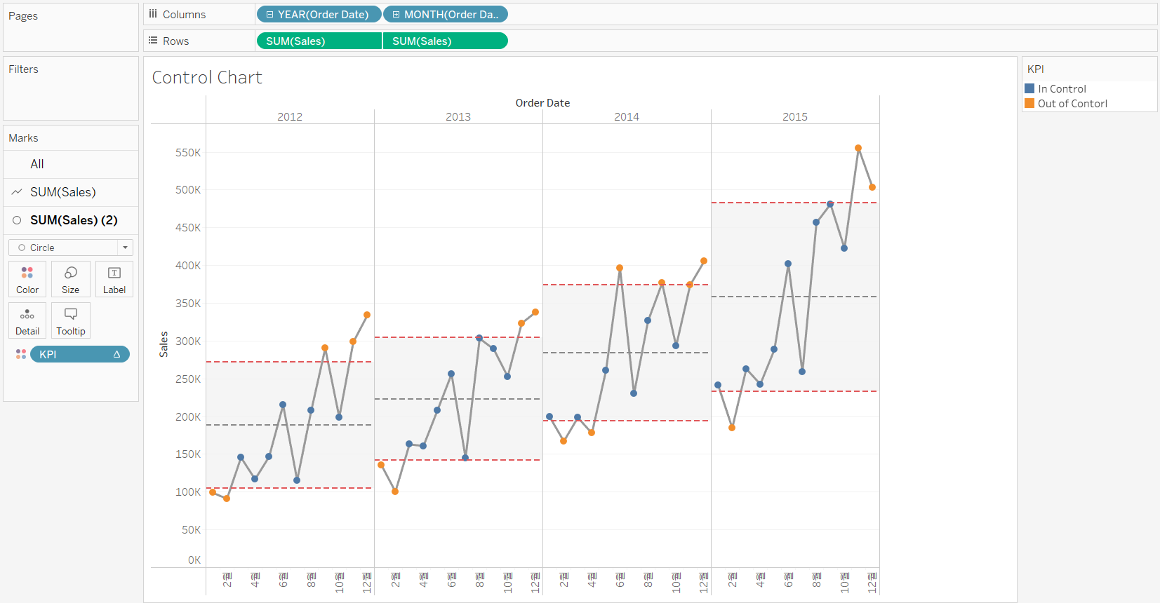
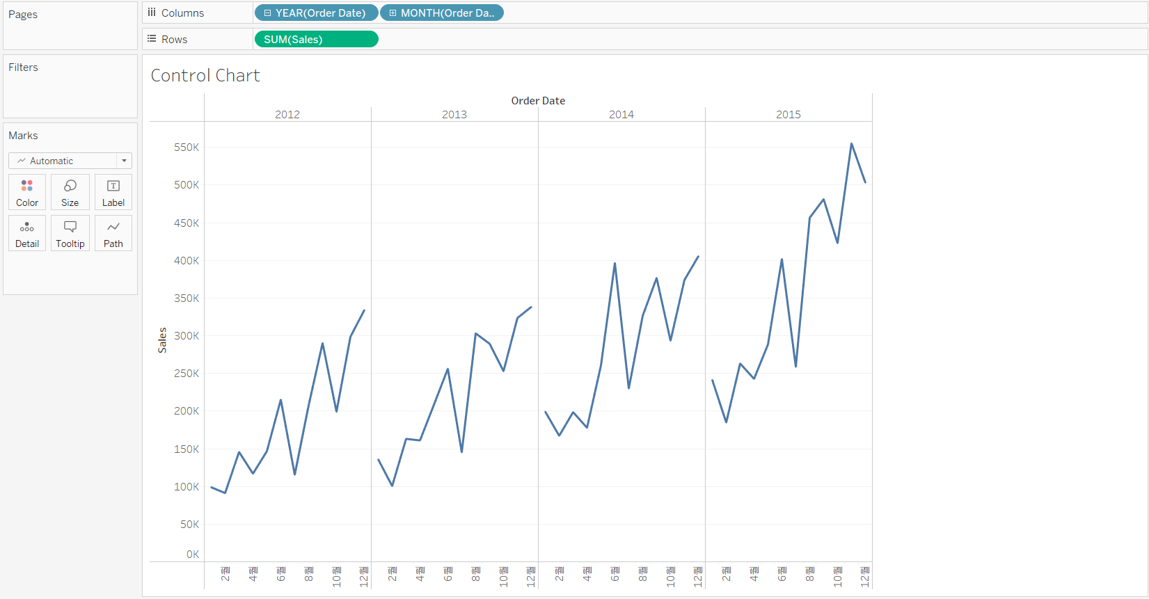
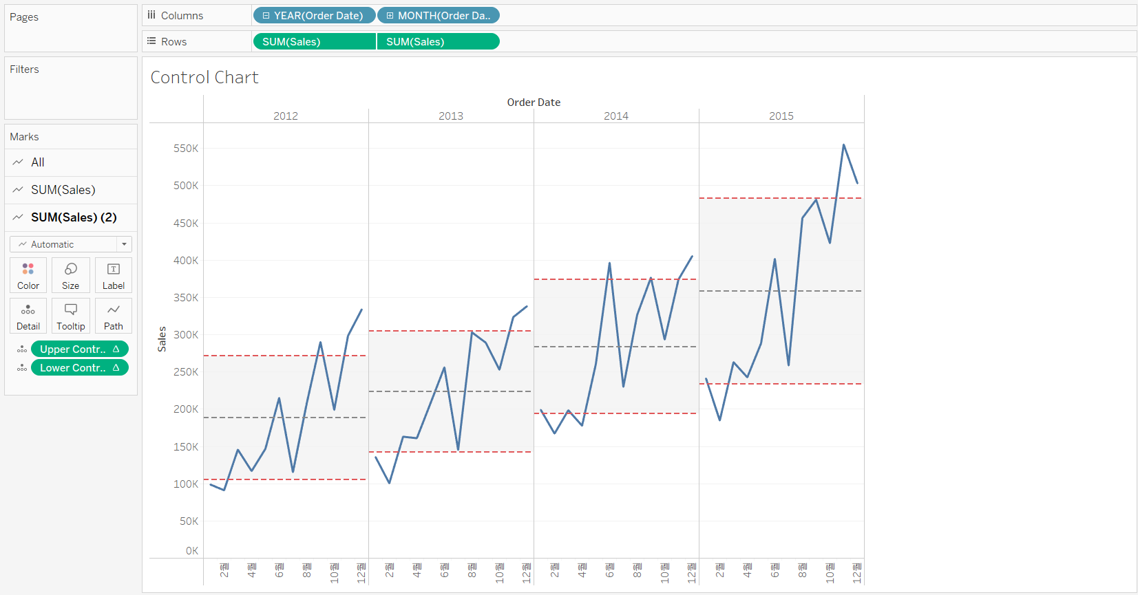
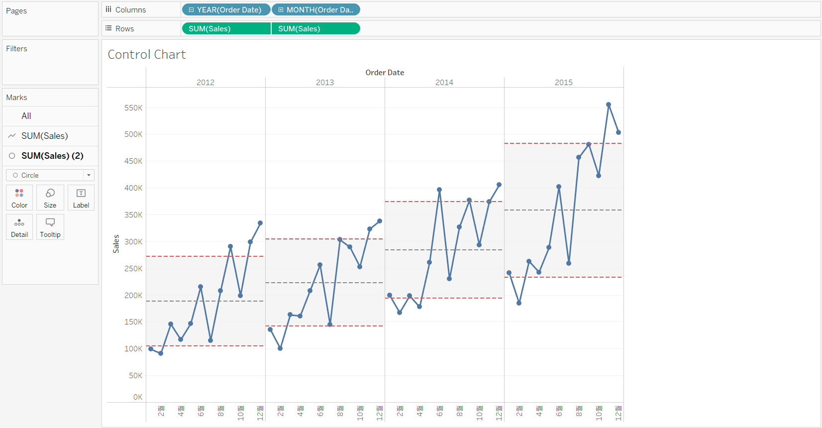
3. Monitoring Quality Control with a Control Chart
Control charts are used to study how a process changes over time. It is a statistical process control tool to determine if a manufacturing or business process is either inside or outside a predefined boundary.
Control charts are based on the line charts. By adding a mean line and an upper and lower control limits, which are typically based on the standard deviation, the simple line chart is transformed into a control chart. The control limits allow you to easily identify when the process is in or out of control.
>> Create a control chart
<< Goal >>
When analyzing company’s sales over the past few years, we want to know whether there are seasonal effects on sales: Are sales lower or higher than a predicted range during certain months?
<< Process >>
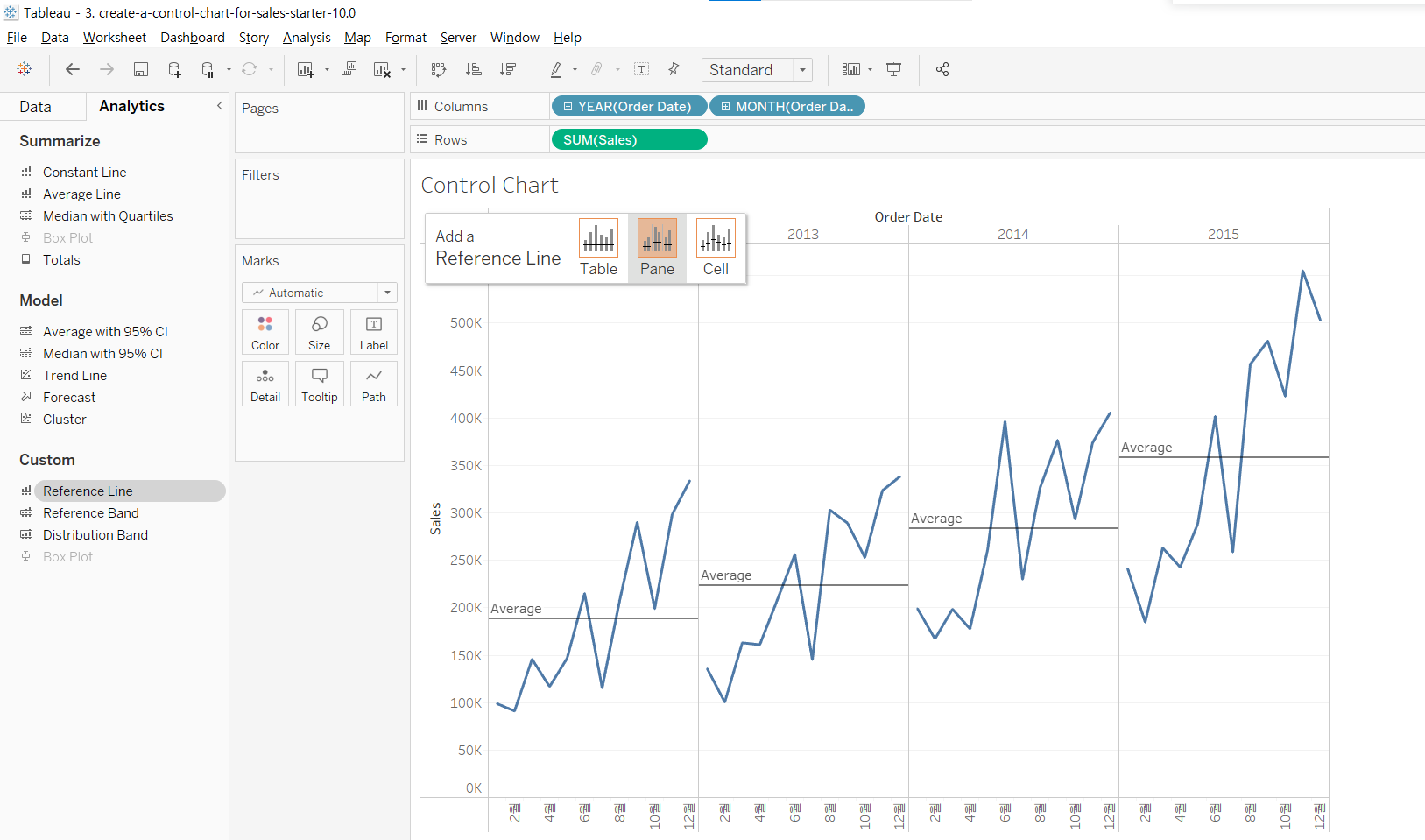
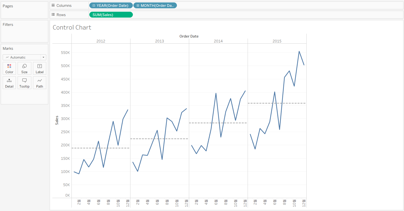
[STEP 1] Create the base line chart that showing sales over the order date
[STEP 2] Add a reference line for average sales by pane
-
[Analytics] Pane --> Drag [Reference Line] to the view --> Drop it on [Pane]
-
Set the mean reference line:
- Value: SUM(Sales) set to Average
- Label: None
- Line: Gray dashed line
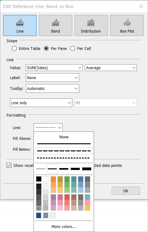
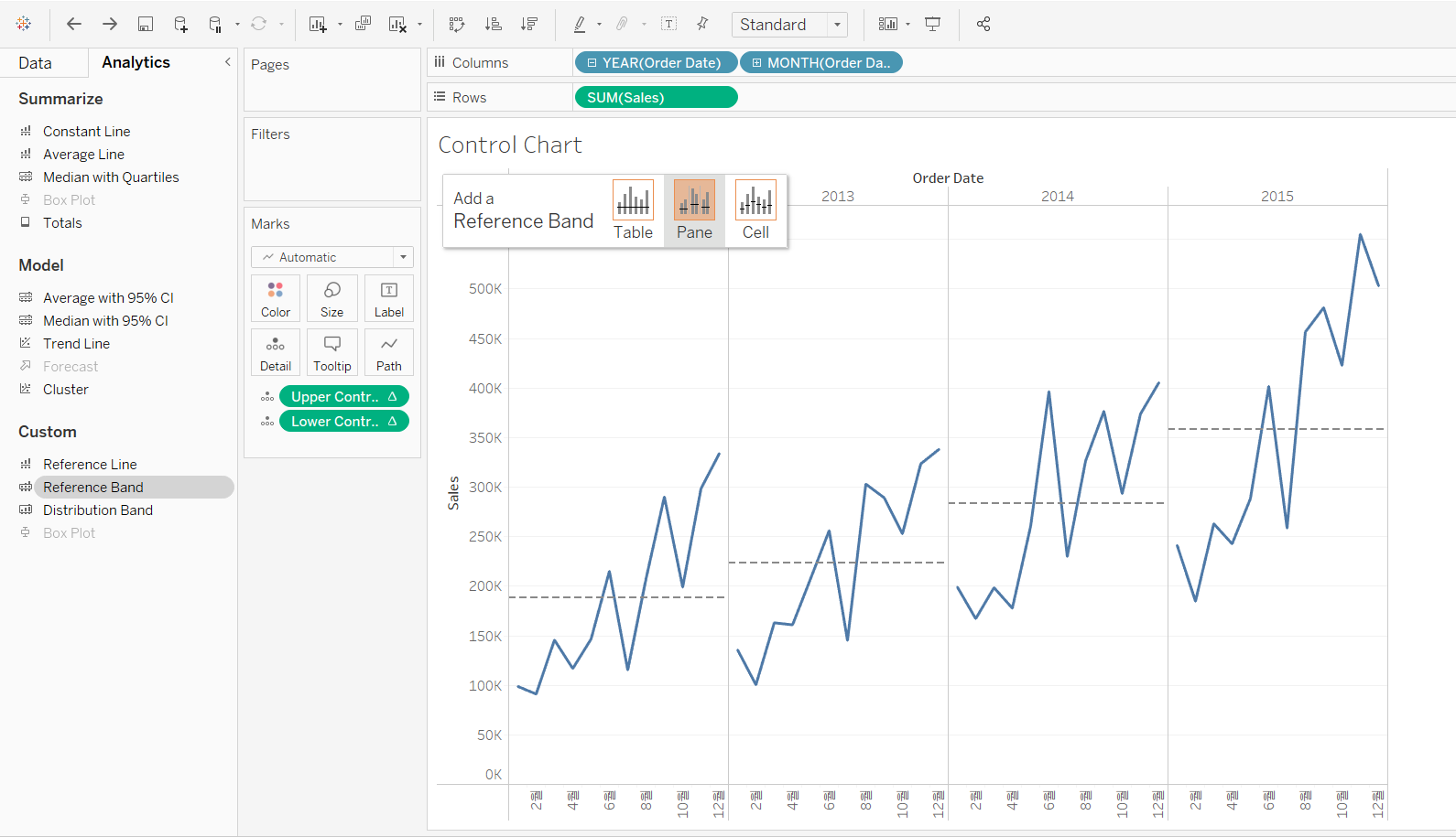
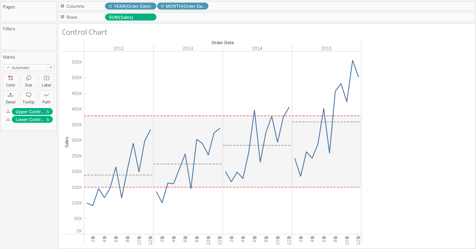
[STEP 3] Add the upper and lower control limits line by pane
-
Calculate the upper and lower control limits using a window standard deviation:
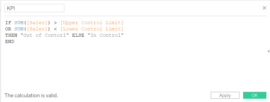
Upper control limit:
WINDOW_AVG(SUM([Sales])) + WINDOW_STDEV(SUM([Sales])) Lower control limit:
WINDOW_AVG(SUM([Sales])) - WINDOW_STDEV(SUM([Sales]))
-
Add the control limits band to the view
-
Add the Upper and Lower Control Limit fields to Detail
-
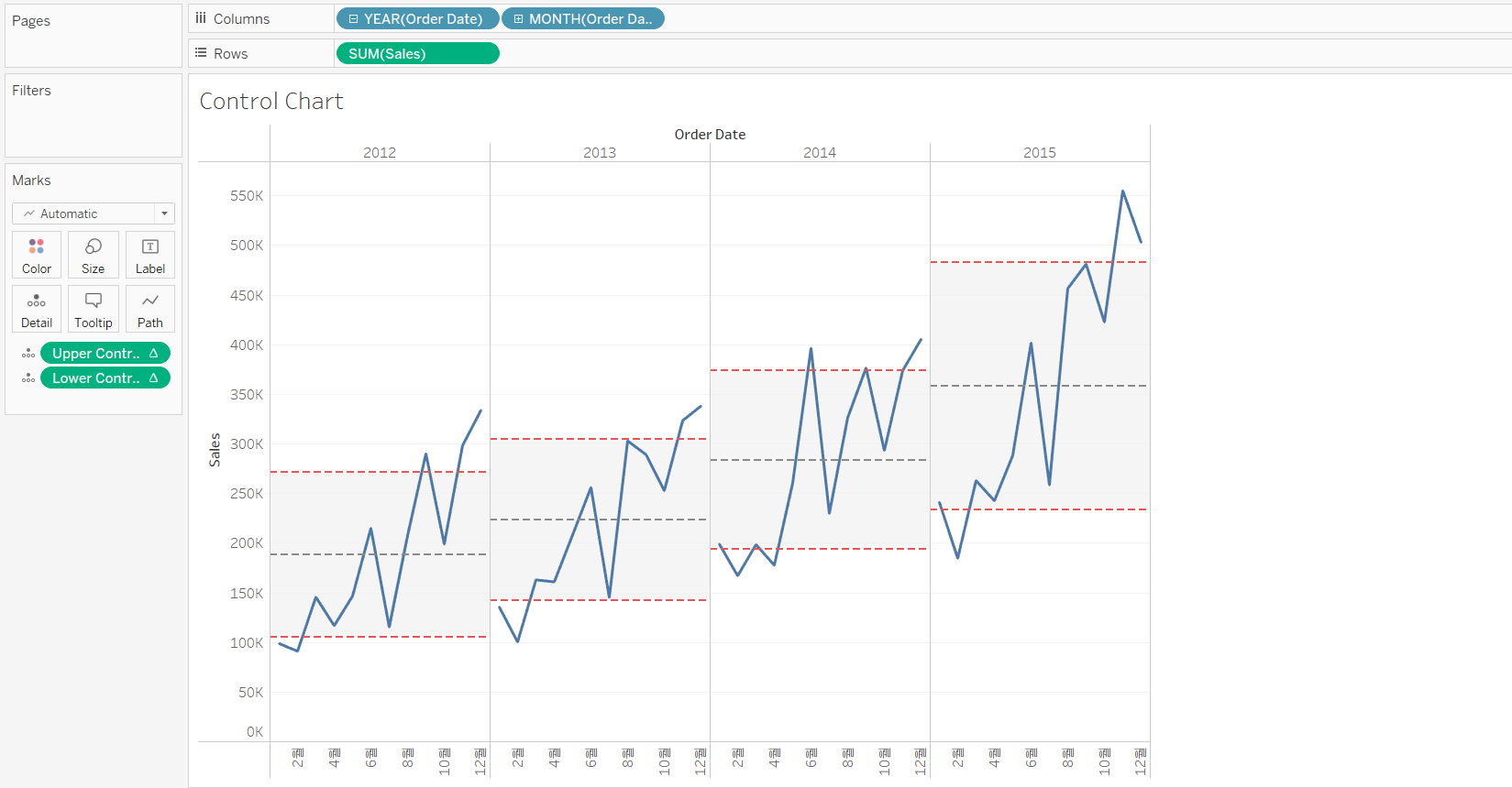
Add a reference band using the control limits as boundaries
- [Analytics] Pane --> Drag [Reference Line] to the view --> Drop it on [Pane]
- Set the reference band:
* Band From Value: Lower Control Limit set to Minimum
* Band To Value: Upper Control Limit set to Maximum
* Label: None on both
* Line: Red dashed line
* Fill: Light gray
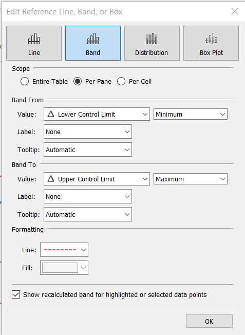
-
-
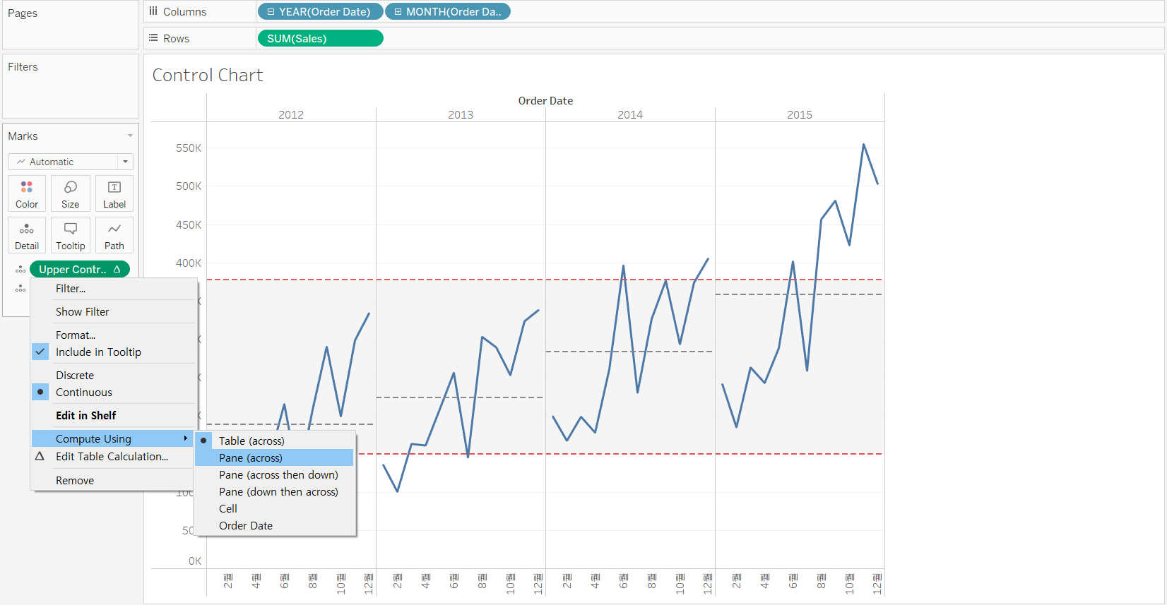
Set the Upper and Lower Control Limit fields to Compute Using: Pane (across)
[STEP 4] Highlight the points out of the control boundaries
-
Create a synchronized dual axis using another instance of Sales on Rows, and hide the right axis
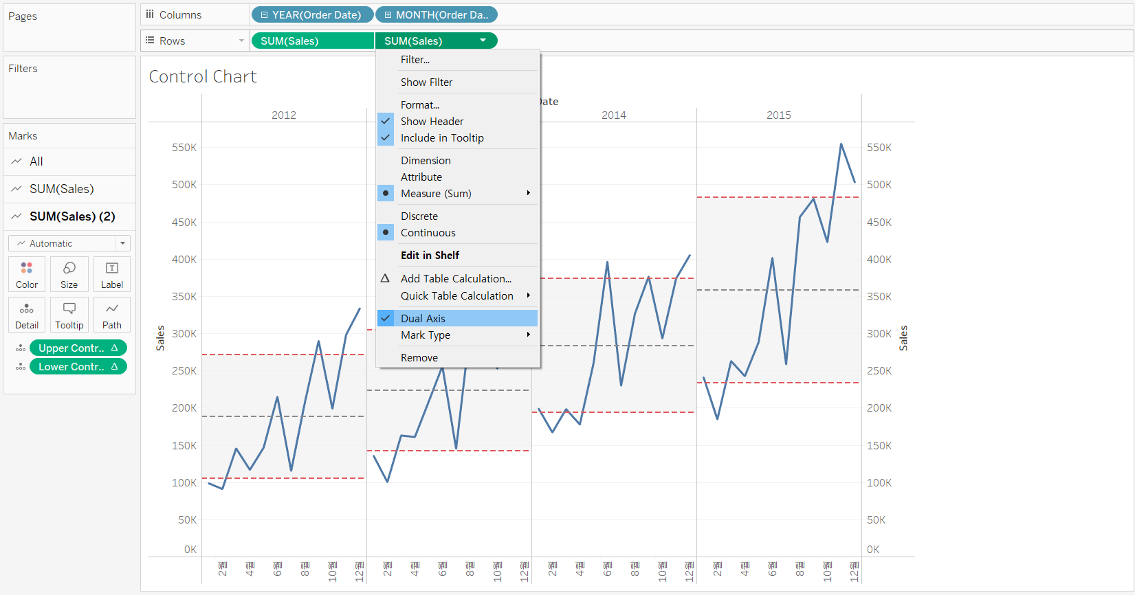
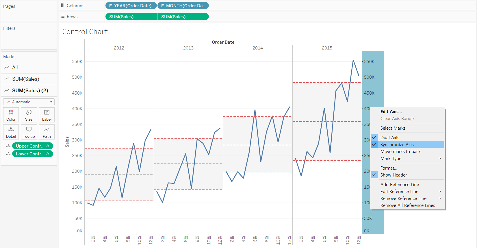
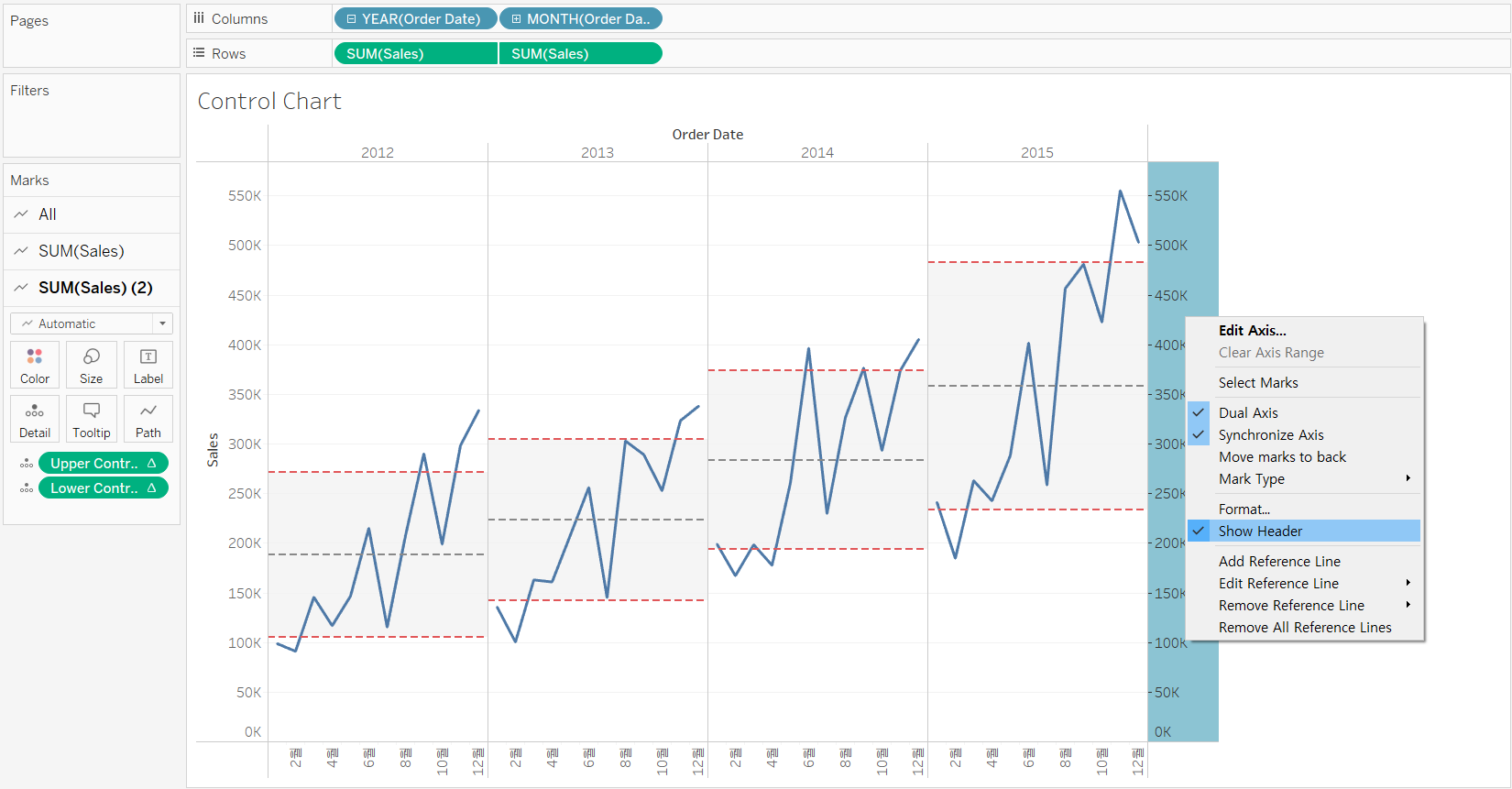
-
Remove the [Lower Control Limit] and [Upper Control Limit] fields under the [SUM(Sales) (2)] Marks card, and change the mark type to Circle
-
Create a calculated field named “KPI” to highlight marks outside of the control boundaries, and rename the color legend to “KPI”