Basics of Reading Data
- 1. Understanding Basic Data Concepts
- 2. Understanding Data Structure Details
- 3. Reading Common Chart Types
1. Understanding Basic Data Concepts
1-1. Data Sources
>> Common types of data sets
- Spreadsheets:
- e.g.: Excel, Google Sheets
- the records are stored as single rows of data
- Relational Databases:
- store data in multiple tables
- “relational”: logical connection between tables
- users pull data from different tables using SQL
- Cloud Data:
- e.g.: AWS, Microsoft Azure, Salesforce
- Other Types:
- .kml, .shp, created in R
1-2. Data Field
>> A field = A column
>> Data Field automatically assigned a Role and a Type
- Role: “Dimension” or “Measure”
- Dimension: qualitative fields / (categorical data) * blue in tableau
- Measure: quantitative fields / (numerical data) * green in tableau
- Type: String, Integer, Date, Date&Time, Boolean, Geographic, Mixed or cluster
2. Understanding Data Structure Details
2-1. Granularity and Aggregation in Tableau
>> Data granularity(数据粒度): the level of detail for a piece of data
- Less granular: describe as an aggregation / aggregated data
>> move dimensions & measures in /out of a view --> level of details changes
- Dimensions: break down aggregated total by category
- Measures: aggregated as SUM (default), or average, median…
>> “SUM(Profit)/SUM(Sales)” VS "Profit/Sales"
Caution the trap of granularity when aggregating
- “SUM(Profit) / SUM(Sales)” [correct]
- first sums the profits and sales to whatever the granularity of the view is
- then computes the ratio at that aggregation
- “Profit / Sales” [incorrect]
- first compute the profit ratio at the lowest level of granularity
- then sum the ratio to the requested aggregation of the view
2-2. How data is represented in Tableau
1. Dimensions & Measures
-
Measures: aggregations
- aggregated up to the granularity set by the dimensions in the view
-
Dimensions: categorical fields
- set the granularity, or the level of detail
2. Discrete & Continuous
| Discrete | Continuous | |
|---|---|---|
| Value | have distinct, separate values | take on any value in a range |
| Color | Blue | Green |
| Label vs Axis |
Label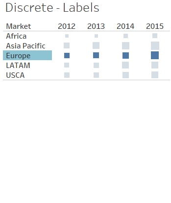 Market(discrete) |
Axis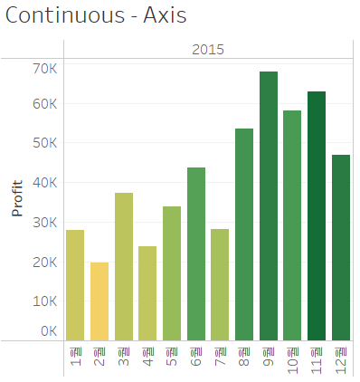 profit (continuous) |
| Color | Color Palette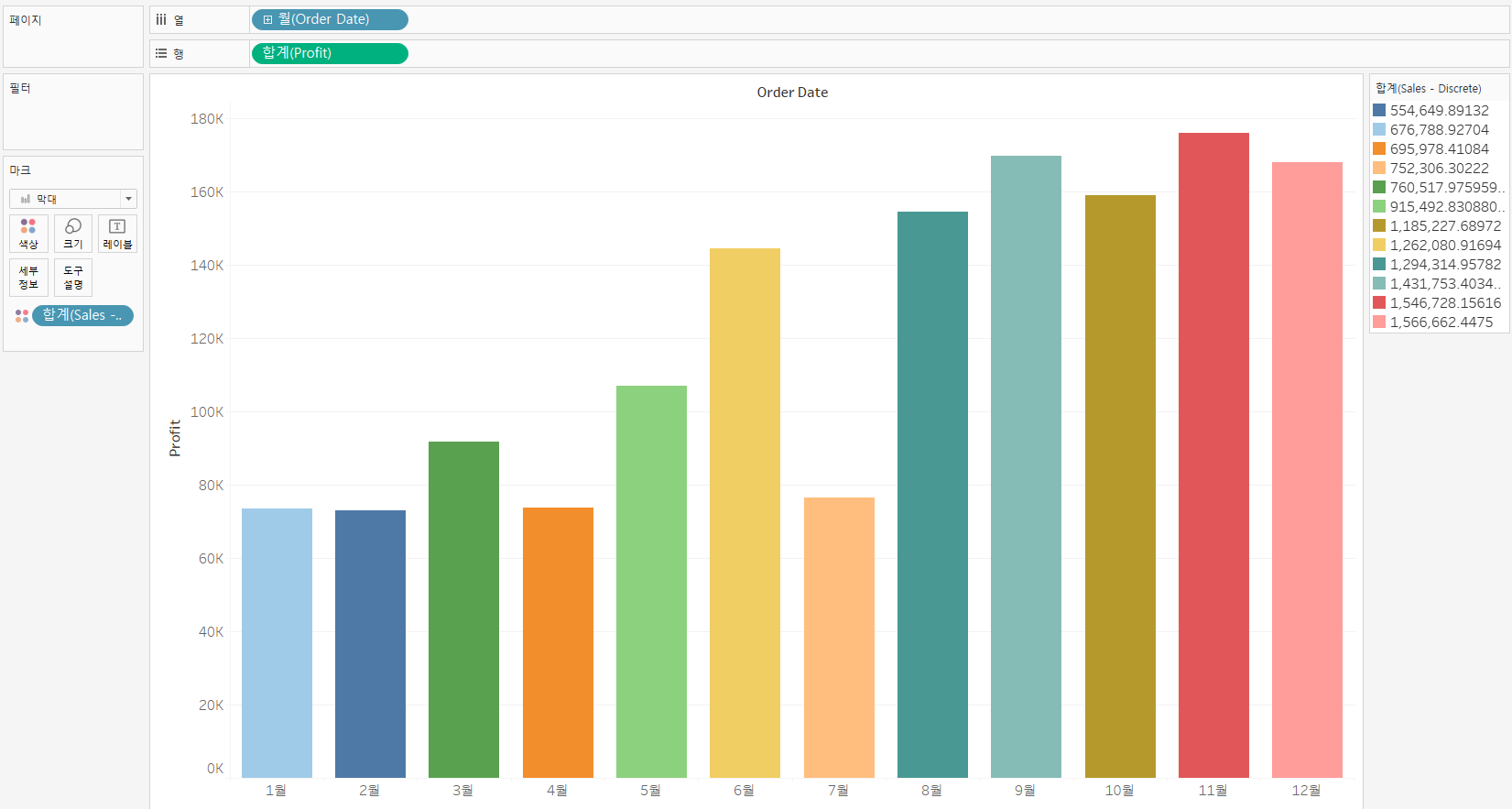 SUM(Sales - discrete) |
Color Gradient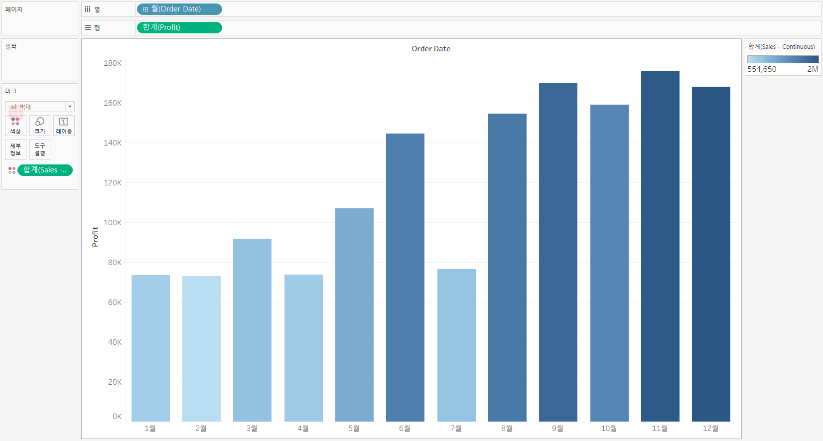 SUM(Sales - continuous) |
| Color & Maps |
A Dimension on color – "Symbol Map"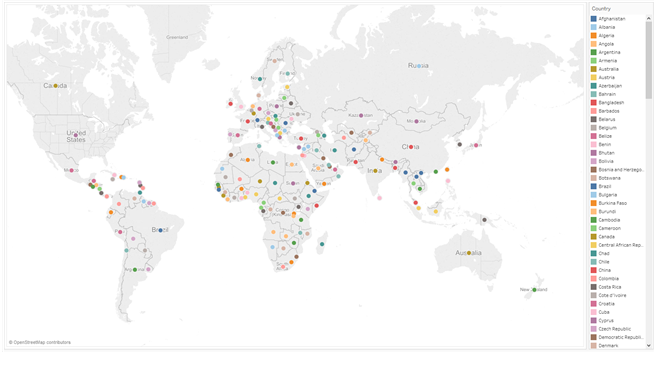 A Measure on color – "Filled Map" 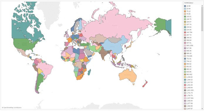 |
A Dimension on color – "Symbol Map"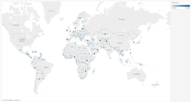 A Measure on color – "Filled Map" 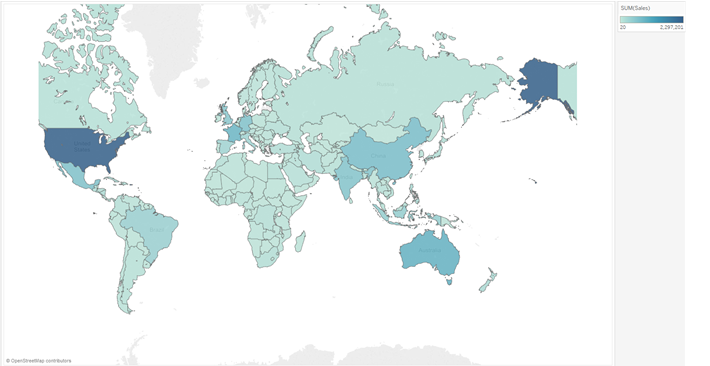 |
| Dates | 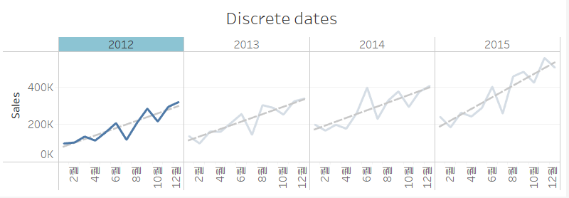 |
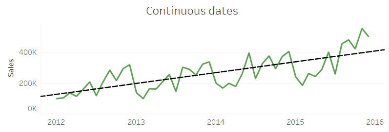 |
| Filtering | List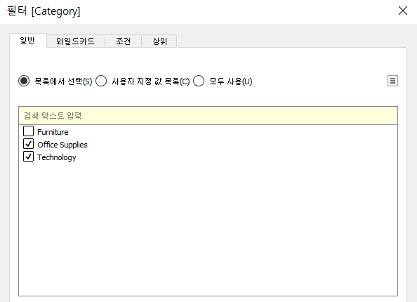 |
Range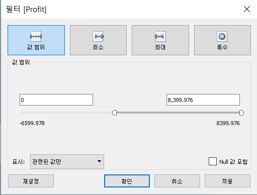 |
3. Reading Common Chart Types
3-1. Overview to reading charts
>> Elements of Charts
- Quantitative Axis / Qualitative Axis
- Marks (View화면에서 Data를 표현하는 도구)
- Labels (축에 표시되는 값)
- Filter (Side bar)
- Legend (Side bar)
- Tooltip (show details about the data when clicking a mark)
>> Appropriate Purpose
-
Bar Charts: Comparing categories of data
-
Line Charts: Viewing data over time
-
Scatter Plots: Viewing data relationships and outliers
