Using Crosstabs
- 1. Creating and Editing Crosstabs
- 2. Working with Totals and Aggregation
- 3. Creating Highlight Tables
- 4. Creating Heat Maps
1. Creating and Editing Crosstabs
>> Create a Crosstab (Data table)
-
Drag [dimension] to [Columns] / [Rows]
-
Drag [measures] to the [View]
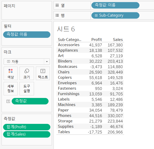
- Automatically brings in [Measure Names], [Measure Values] and [Measure values shelf ]
>> Edit the gridline
-
right-click on a value in the crosstab
-
select [Format]

2. Working with Totals and Aggregation
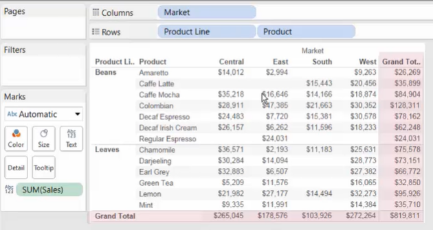
>> Add totals and subtotals
-
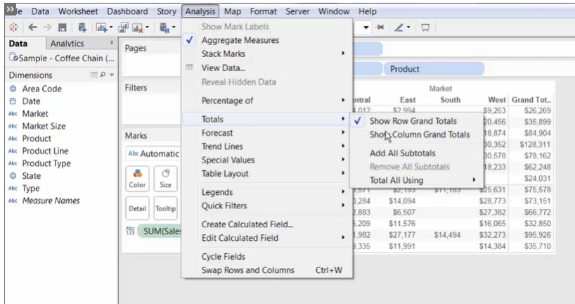
Form the Analysis Menu:
[Menu] - [Analysis] -->
[Totals] -->
[Show Row Grand Totals] / [Show Column Grand Totals] / [Add All Subtotals]
-
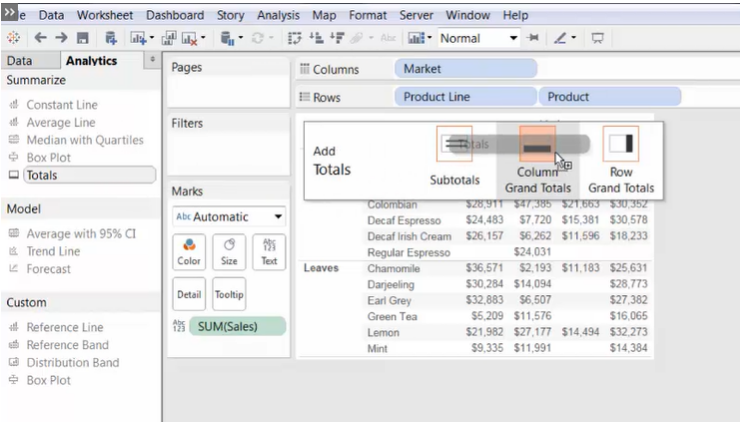
From the Analytics Pane
>> Change the aggregation type of the view
When calculating [Average] for total, be careful with the difference between [weighted average] and [average]
-
For weighted average, change the aggregation on the measure field
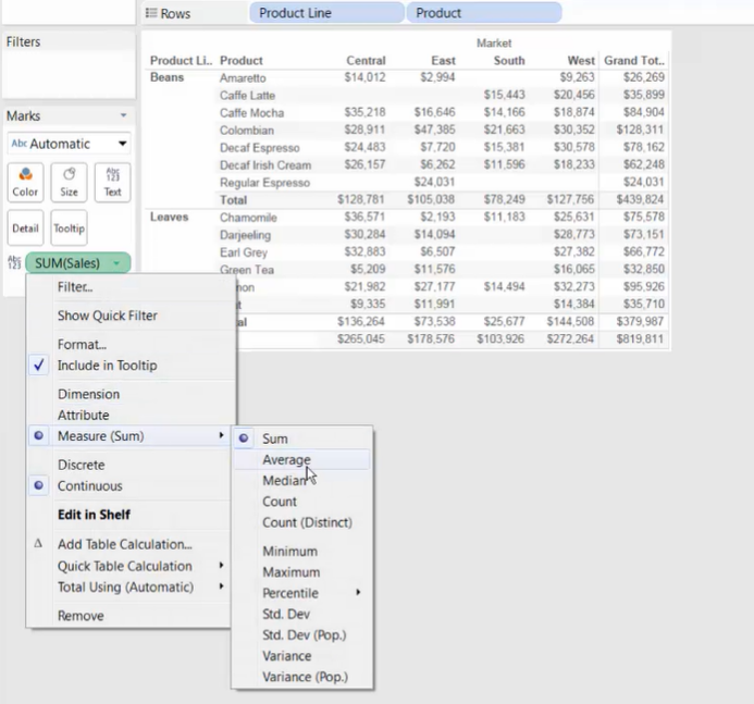
-
For average of the values showed in the view, change the aggregation from the Analysis Menu.
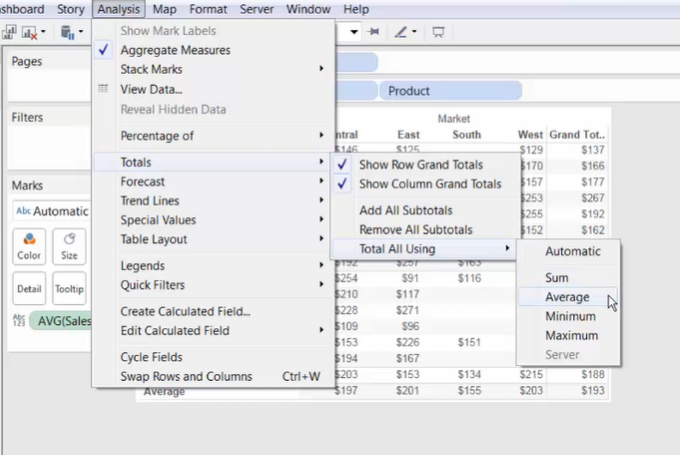
3. Creating Highlight Tables
>> Why building highlight tables?
Crosstabs is difficult to find outliers or make comparisons across categories.
However, with highlight we can easily emphasize outliers and trends.
>> How to build a highlight table?
-
Method 1: Normal Way (use Marks)
-
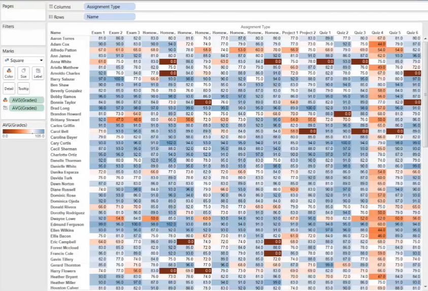
A highlight table encodes the measure on Text and Color
- Drag the [measure] field to [Text] Mark
- Hold [Ctrl] and drag the [measure] [Text] Mark to the [Color] Mark
-
Set the mark type to [Square]
-
Set the [Columns] dimension and [Rows] dimension
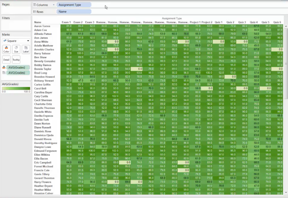
-
Edit colors to highlight outliers
-
If you want to distinguish data that below or above a particular value by color:
choose a color palette with white in the center first
then set the particular value as the midpoint ( [Center] ) of the color gradient
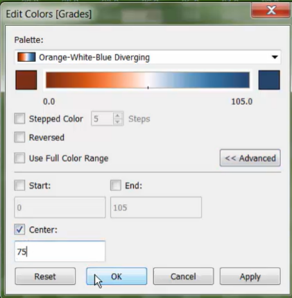
-
-
-
Method 2: use [Show Me]
-
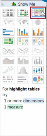
select the measures and dimensions you’re interested in
-
click the [highlight table] icon in the [Show Me] menu
-
4. Creating Heat Maps
-
Create a heat map:
- Need 1 or more [dimensions], and 1 or 2 [measures]
- can create by using [Color] and [Size] marks or use the [Show me]
-
Adjust the view:
-
Edit Color:
- For color-blindness, [Orange - (White) - Blue] palette is a good choice
-
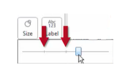
Adjust Size:
- Two small tick marks on the slider indicate the best range for the mark size
-
