Dashboarding
1. Swapping Sheets and Refining the Layout
>> Sheet Swapping
Sheet swapping is where sheets are hidden/displayed (i.e. swapped) depending on user dashboard selections.
This is a very helpful and efficient way for us to share numerous views in a single dashboard, which can avoid squeezing in too much information or linking to several dashboards.
To swap sheets, we need a parameter used for selecting a view and collapsing containers to show the corresponding view.
Let’s look at how this works through the following example:
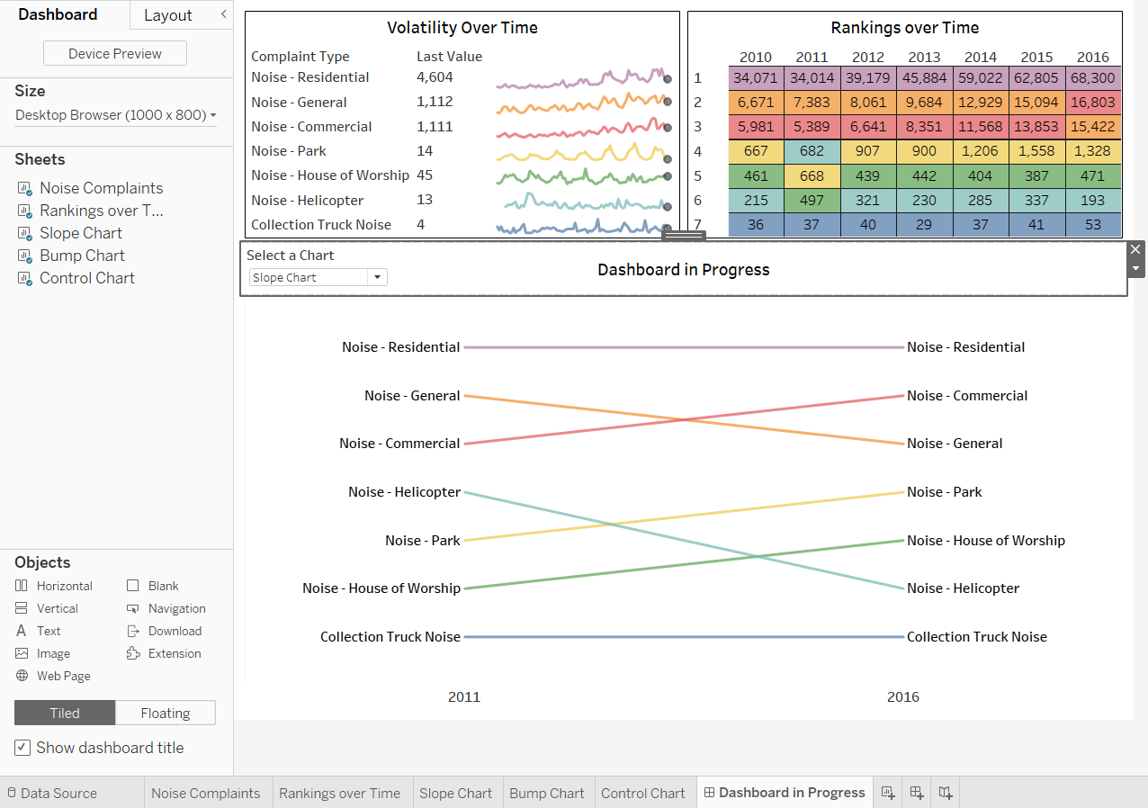
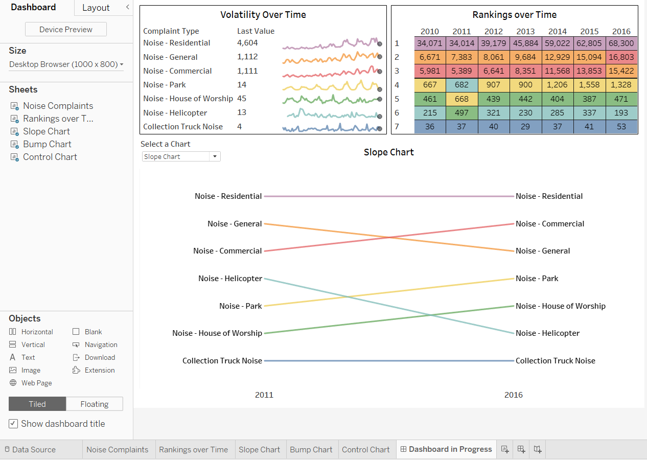
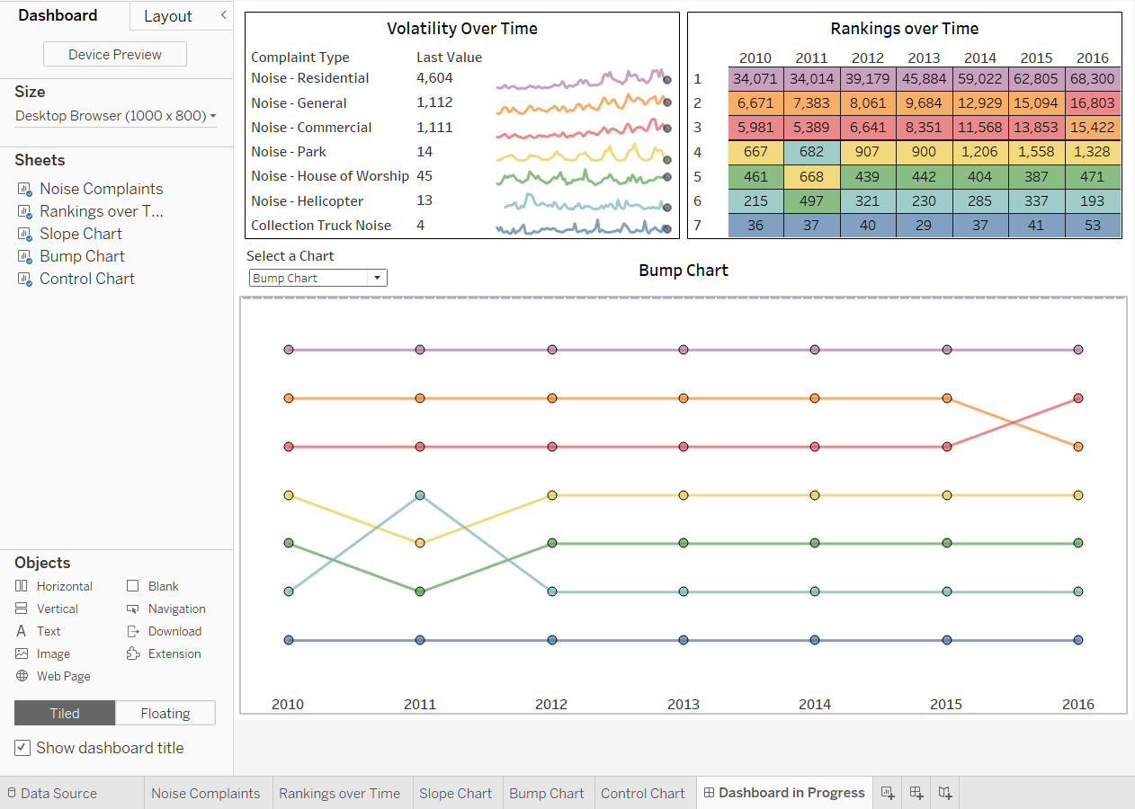
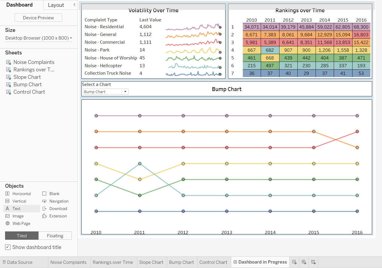
<< Goal >>
For a study about environment noise in Brooklyn, we want to include rotating views that show noise rankings (Slope Chart & Bump Chart) and control-chart data in the dashboard. Let’s use a parameter to swap these views and employ layout and titling options.
<< Process >>
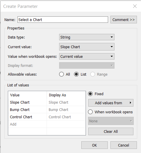
[STEP 1] Create a parameter for swapping the slope, bump, and control charts in the dashboard
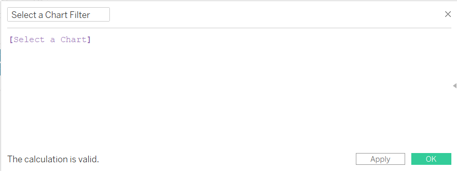
[STEP 2] Create a Select Sheet filter calculation to apply a filter to each view, which will enable the correct view to show, and hide the other views
- Create the filter calculated field based on the parameter
-
Use the calculated field as a filter for each swapped view, show the parameter control and test the parameter
-
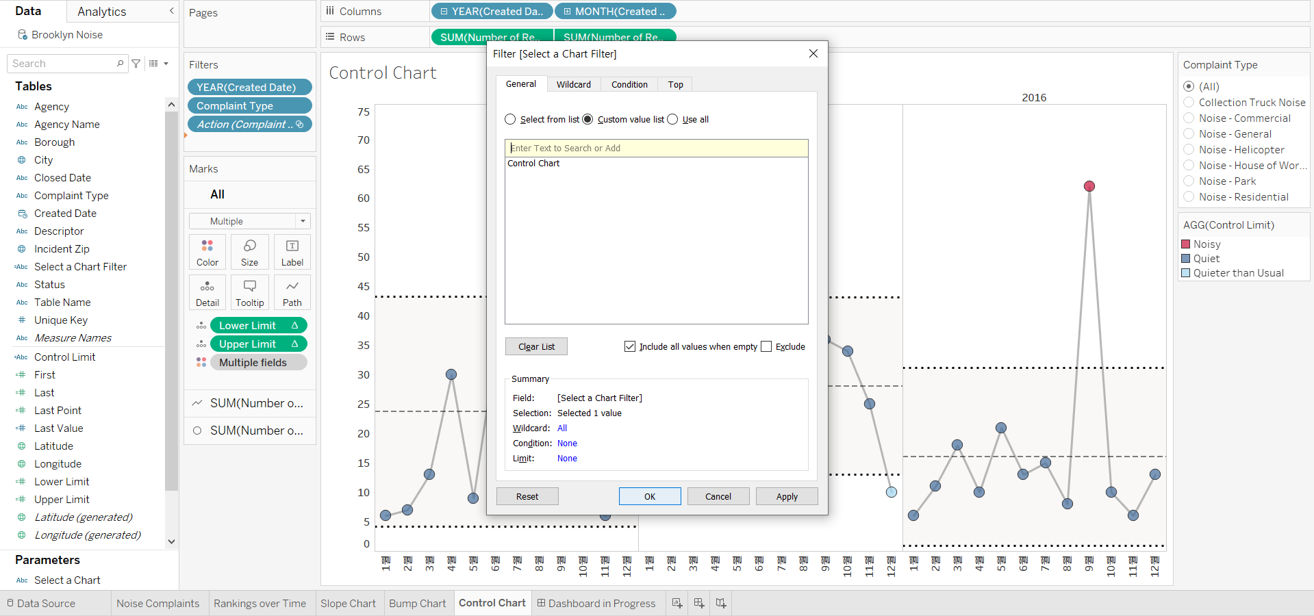
Display the [Slope Chart] sheet, drag the [Select a Chart Filter] field to [Filters], dropping it below [YEAR(Created Date)]
-
In the dialog box opened,
- select [Custom value list],
- type [Slope Chart] in the text field,
- click “+”
- and then click [OK]
-
Do the same work with [Bump Chart] and [Control Chart] . (P.S. The view will disappear at the end of this step)
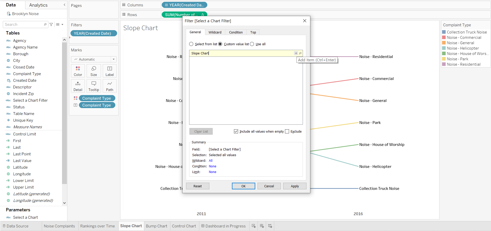
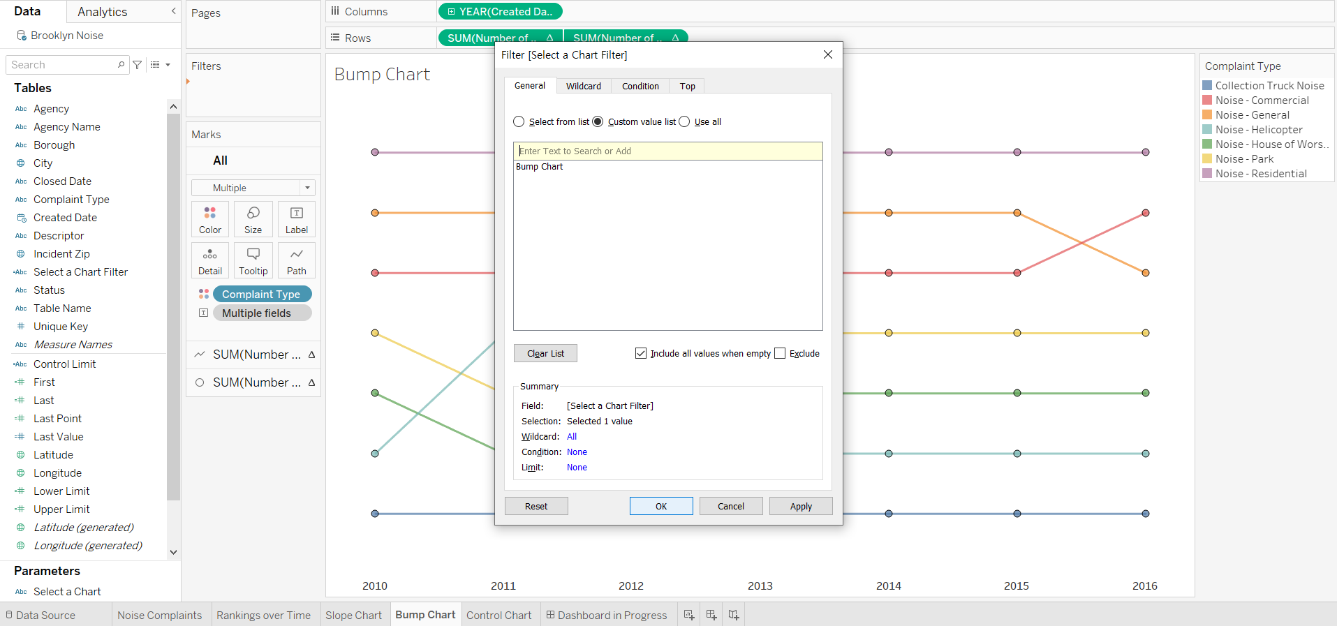
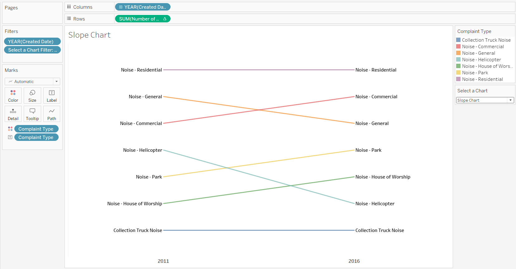
- Return to [Slope Chart] sheet, show the parameter control and test the parameter. End with the Slope Chart selected and displayed
-
[STEP 3] Drag the swapped views into the dashboard, and hide their titles
-
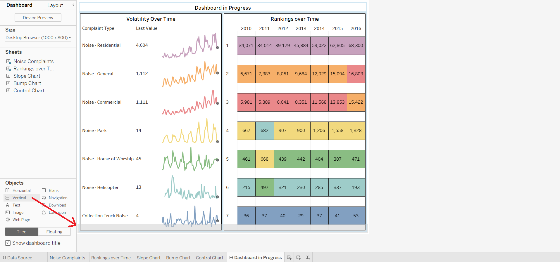
Use a container to contain the views to swap. This will allow the views to share the same space, rather than be tiled separately.
- Drag a Vertical container into the view and drop it below the existed views when the horizontal gray band is shown
-
Drag the three charts into the container
- First drag in the slope chart, the view that is currently displayed in the parameter control
- Drop it when the container border appeared and highlighted in dark blue
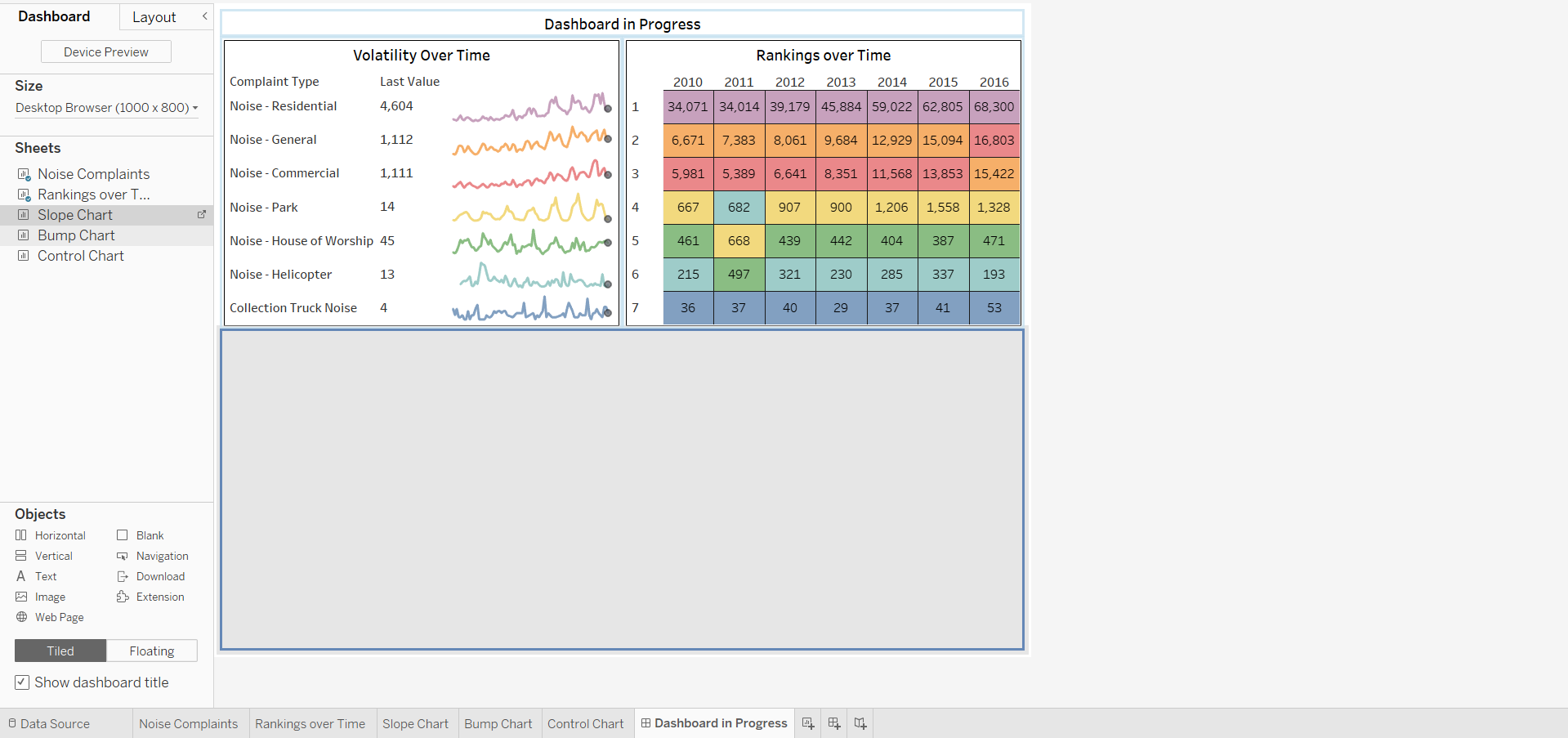
- Next, drag in the Bump Chart, being careful to drop it only when we see the horizontal gray band and the blue container border.
- Finally, do the same thing for the Control Chart

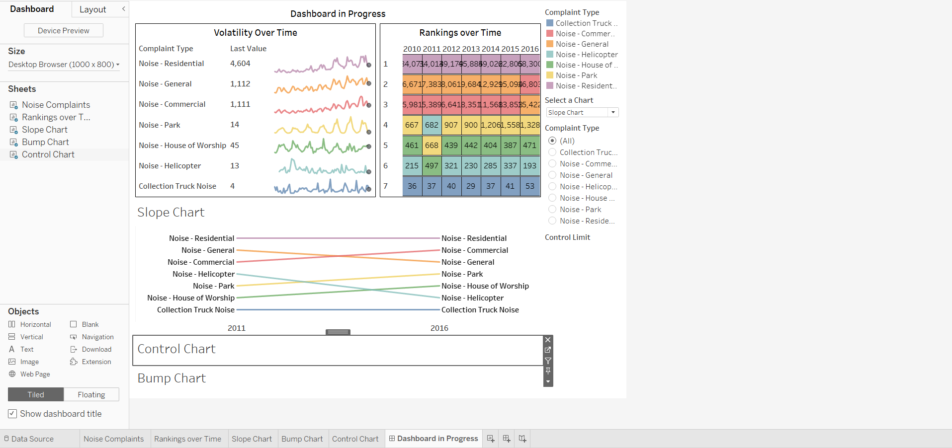
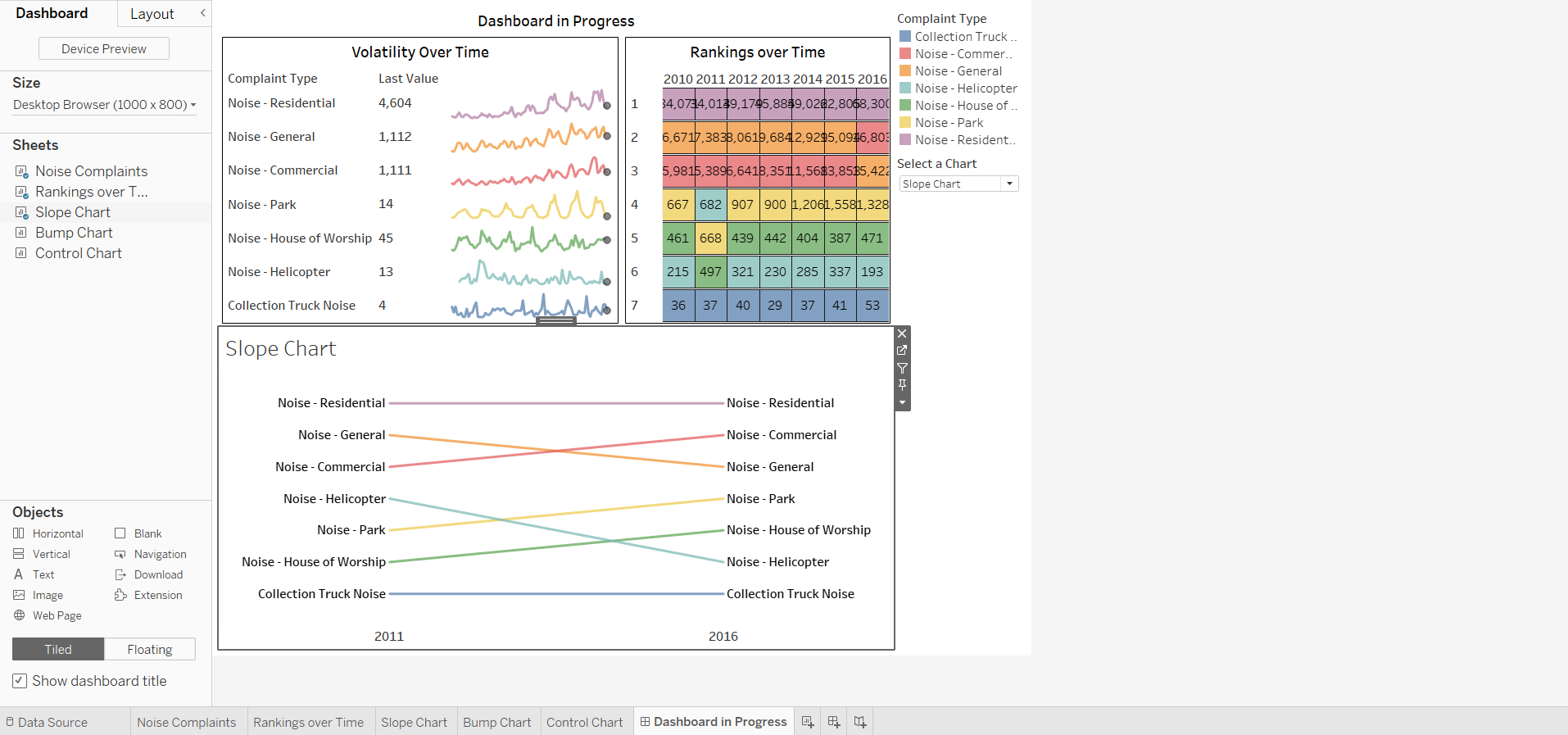
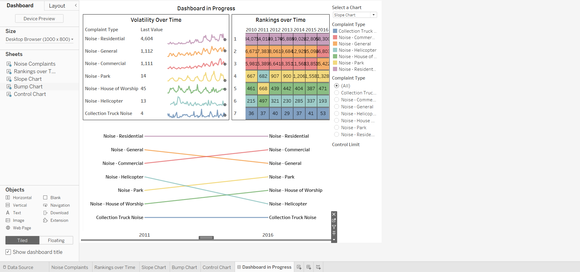
This view brings in the parameter control, because the Slope Chart is the worksheet that we showed the control on.
And, note that only the Scatter Plot view displayed in the dashboard, based on its selection in the control.
-
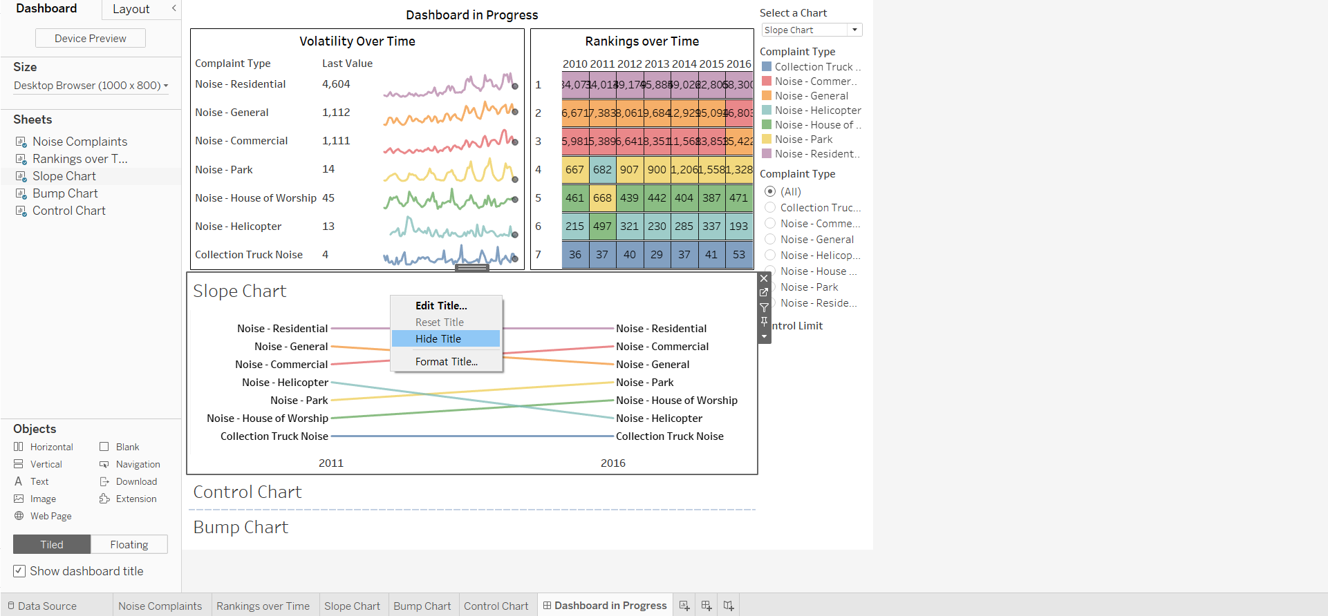
Hide the view titles for each of the swapped views
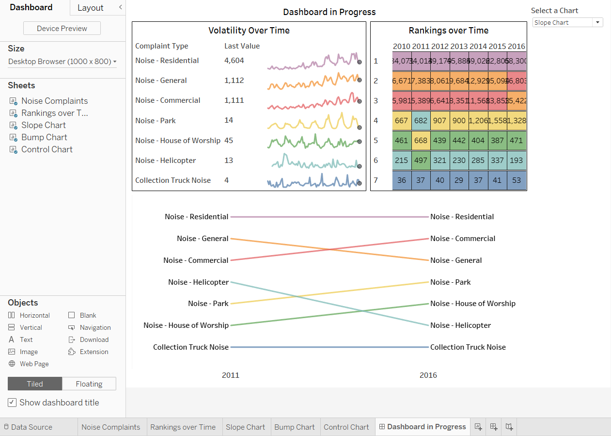
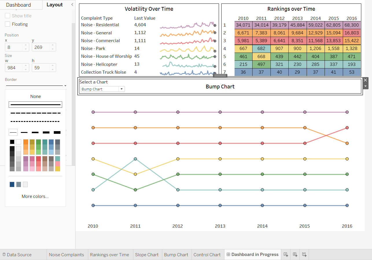
[STEP 4] Remove all controls except the parameter control, move the dashboard title, and make the title dynamic
-
Close all controls and legends except for the parameter control
-
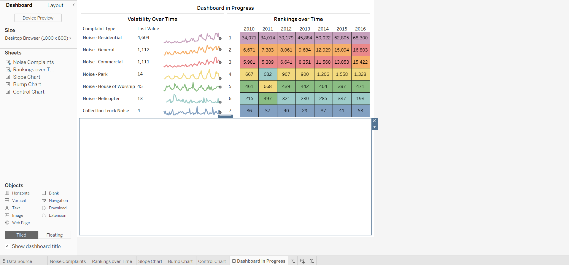
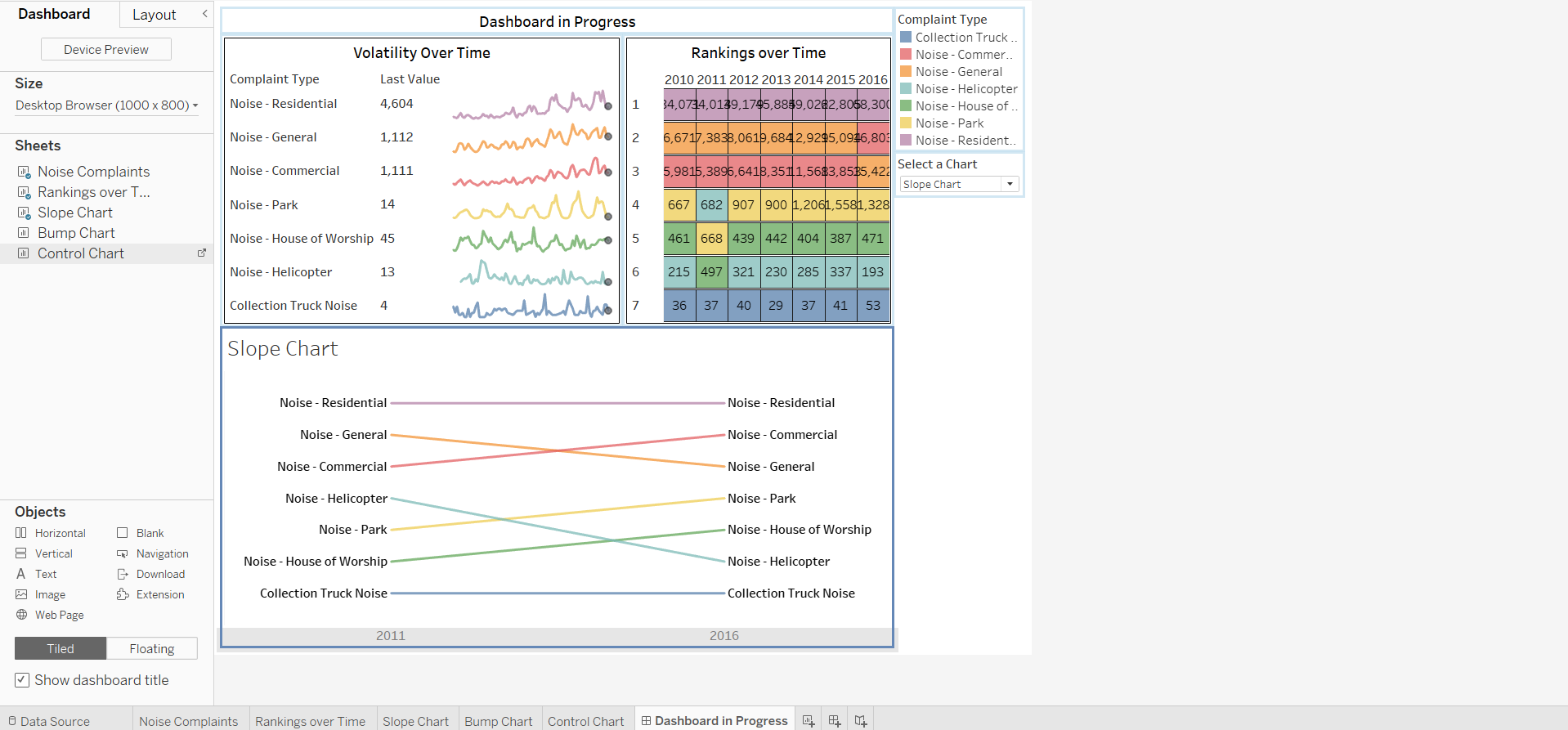
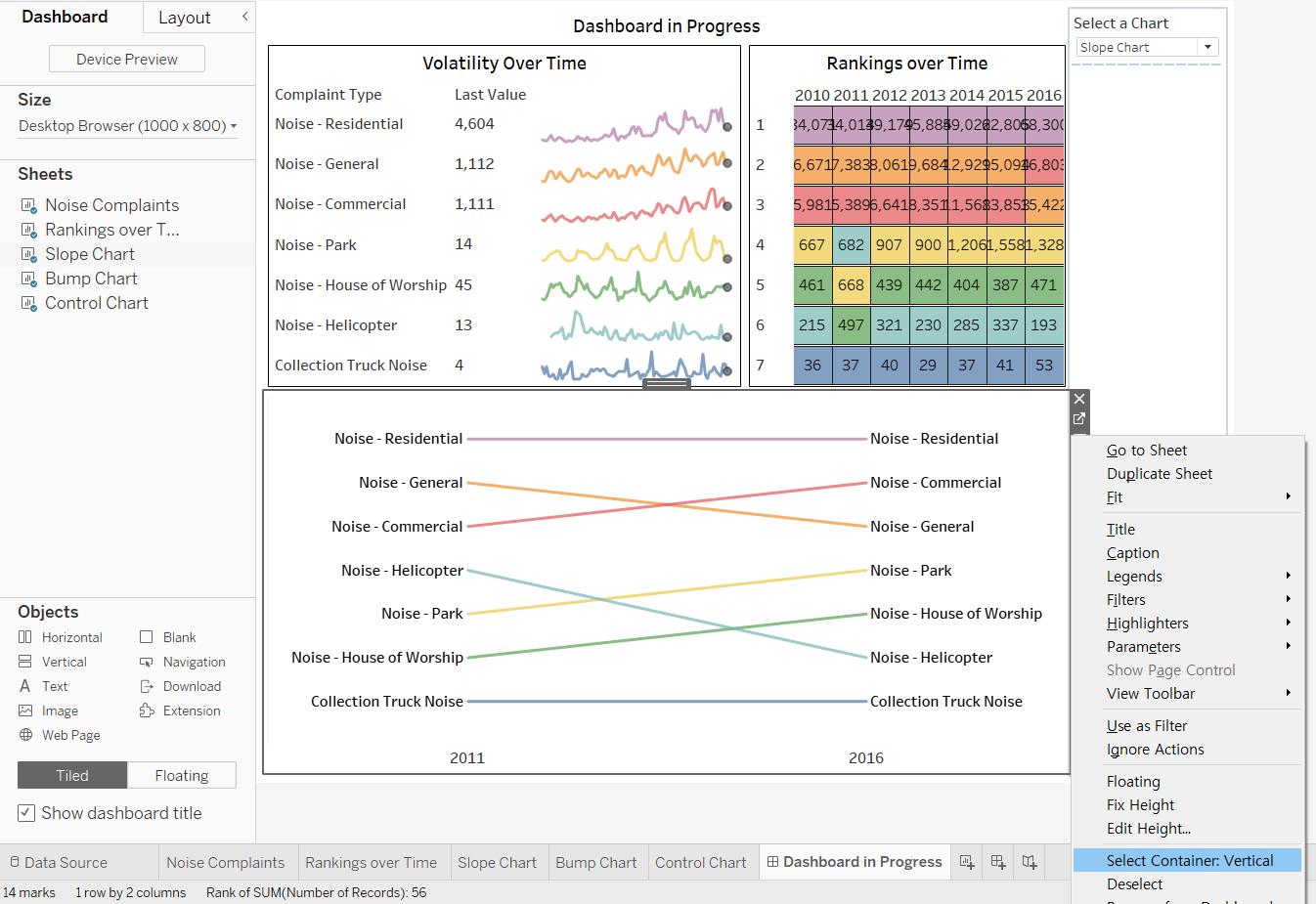
Enlarge the container with the swapped views:
- click it
- display its menu
- click [Select Container: Vertical]
- on the container’s top border, drag the sizing handle upward to enlarge it
-
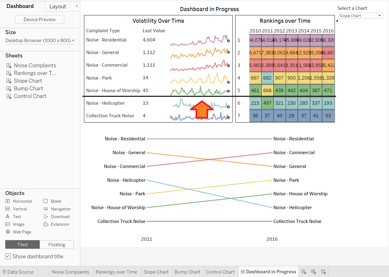
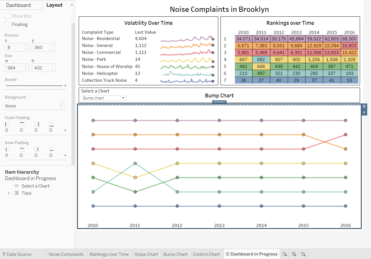
Reset the location and size of the title container
- click the title container to select it
- drag its handle to place the container between the top two views and the swapped-views container
- on the title container’s bottom border, drag the sizing handle upward to make the container smaller
-
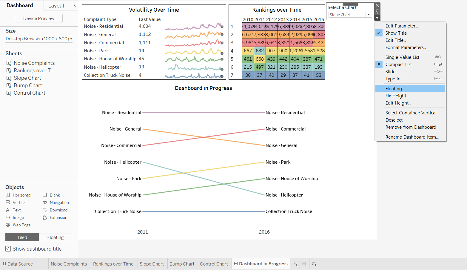
Move the parameter control:
- click the parameter control to select it. display its menu, and click [Floating]
- position the control at the left end within the title container
- drag up its container border to fit within the title container
-
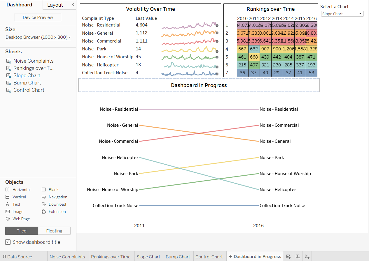
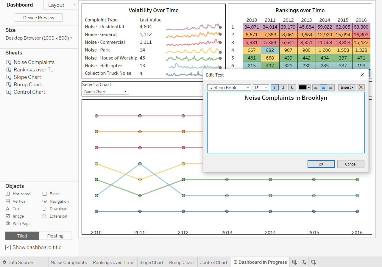
Edit the dashboard title
- open the [Edit Title] dialog box
- remove the existed title
- on the [Insert] menu, select [Parameters.Select a Chart]
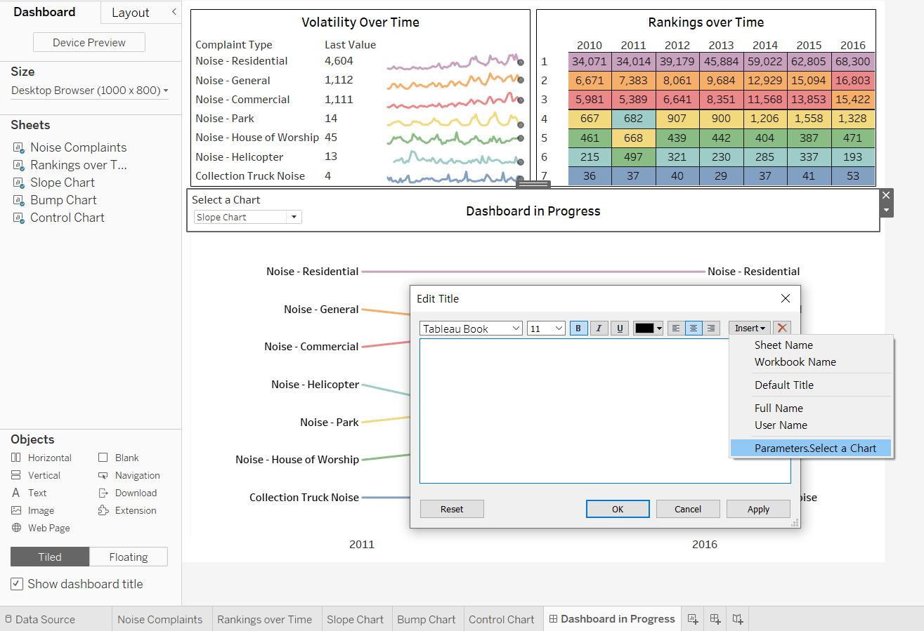
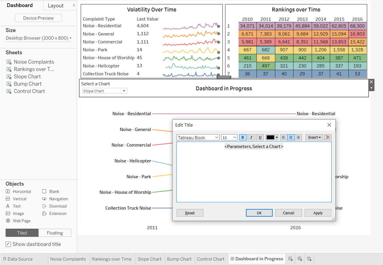
- The title now updates with each view
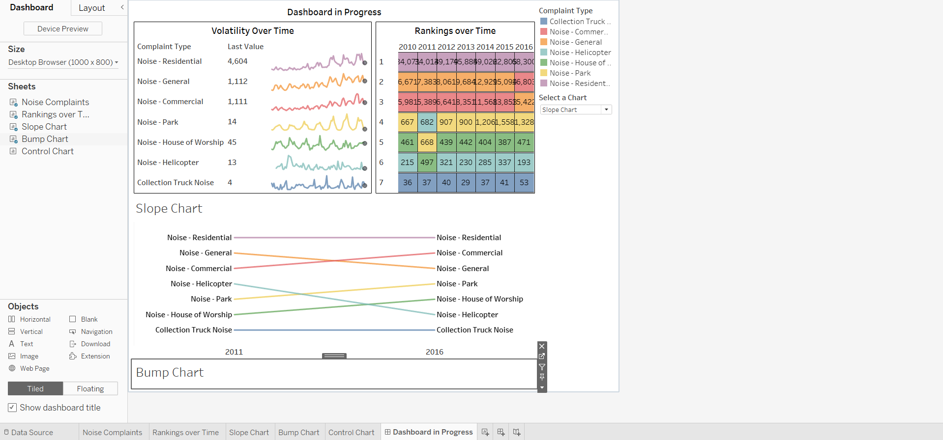
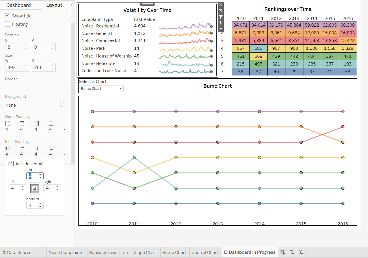
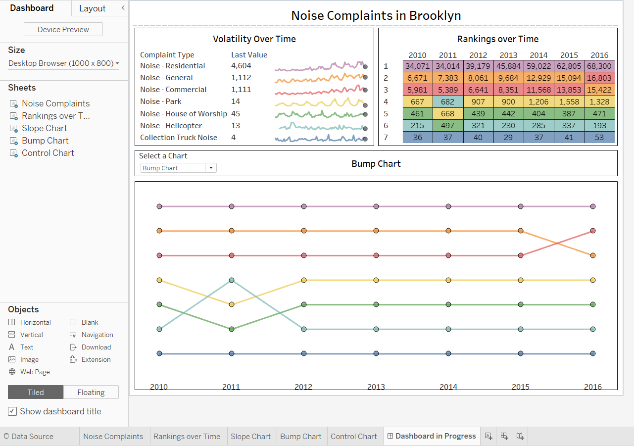
[STEP 5] Add container borders, padding, and a text container for an overall title, then make sizing adjustments
-
Add a border to the title container
- click the title container to select it
- click the [Layout] tab --> [Border] --> select a solid black line at a minimal thickness
-
Add a similar border to the swapped-views container
- click it
- display its menu
- click [Select Container: Vertical]
- add the border
-
Add padding
- For example: select the sparklines view and add four points of Inner Padding
- do the same with the highlight table
-
Add an overall dashboard title
- from the [Dashboard] tab, drag a [Text] container onto the dashboard
- drop it at the top when the horizontal gray band above the two top views appears
- type the title and edit it
- drag up the text container border for the ideal height
2. Adding Context to Dashboard Filter Actions
>> Context Filter
By default, all filters set in Tableau are computed independently, which means that each filter accesses all rows in the data source without regard to other filters. However, by setting one or more categorical filters as context filters, we can make other filters as dependent ones that process only the data that passes through the context filter.
We can create a context filter to:
-
Improve performance –
If we set a lot of filters or have a large data source, the queries can be slow. We can set one or more context filters to improve performance.
-
Create a dependent numerical or top N filter –
We can set a context filter to include only the data of interest, and then set a numerical or a top N filter.
>> Use Context Filters to Control Filter Actions
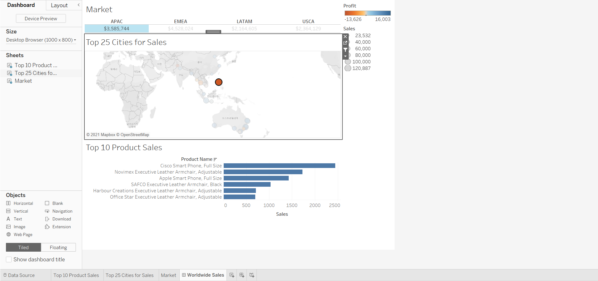
<< Goal >>
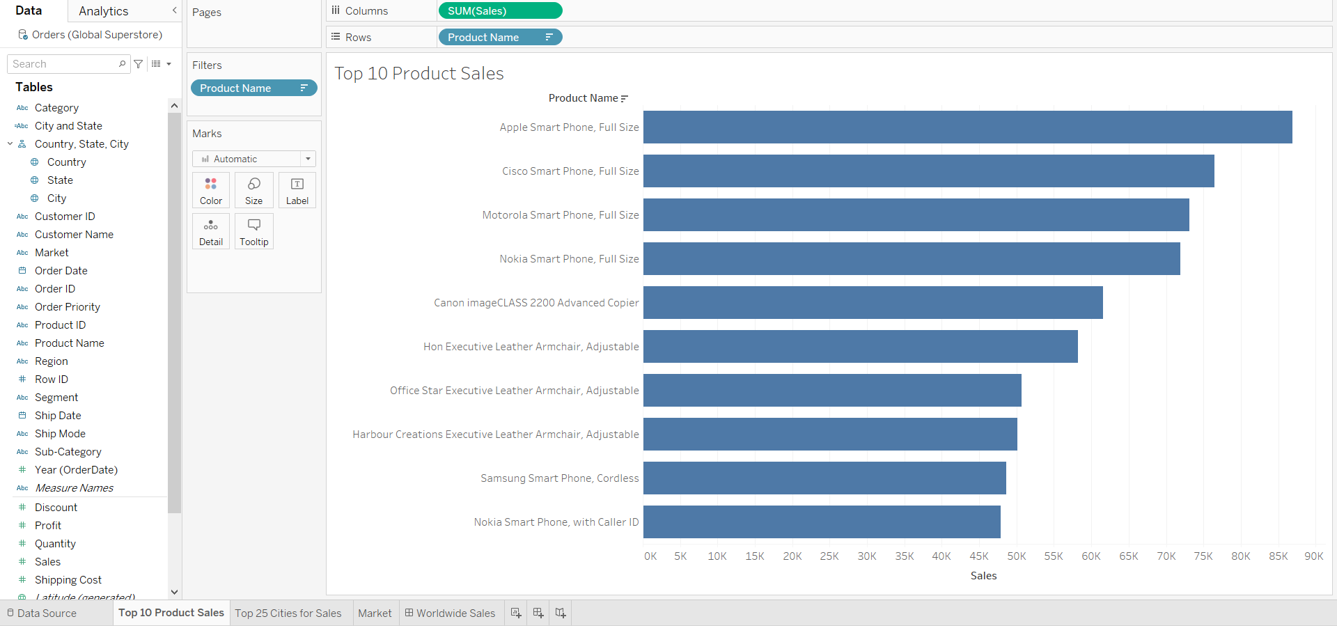
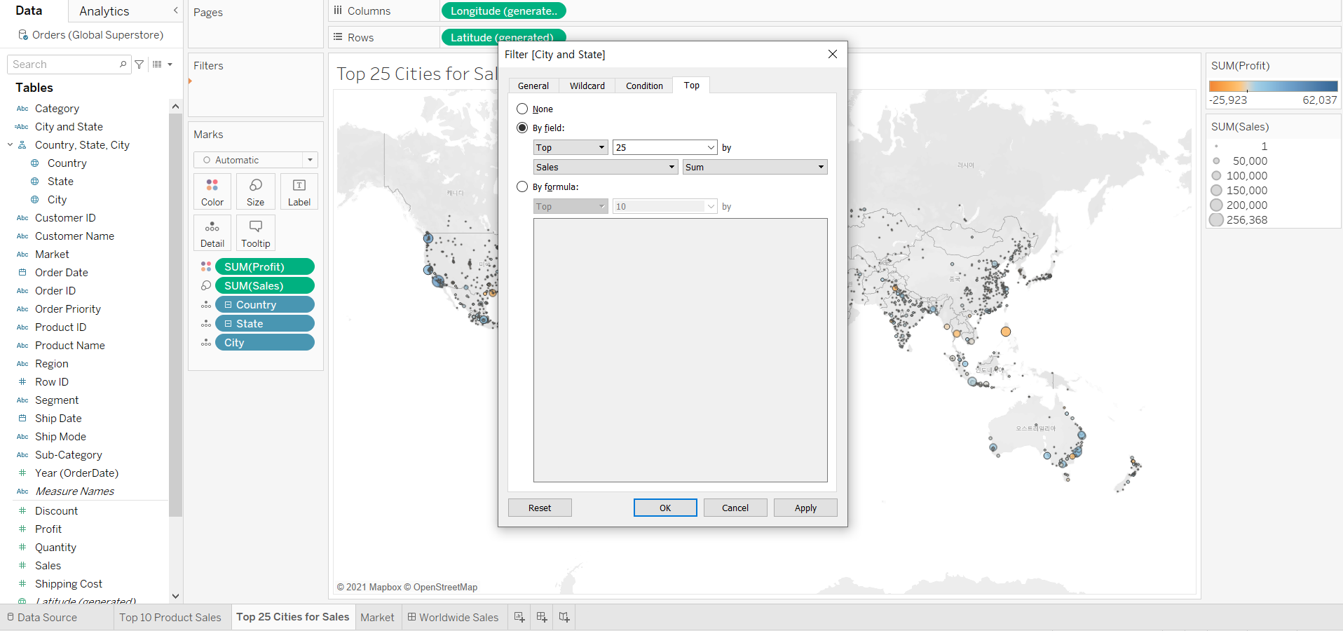
For the main markets that use Superstore, we want to help users see only the top 25 cities for sales by Market and the top 10 products for sales by Market - City.
<< Process >>
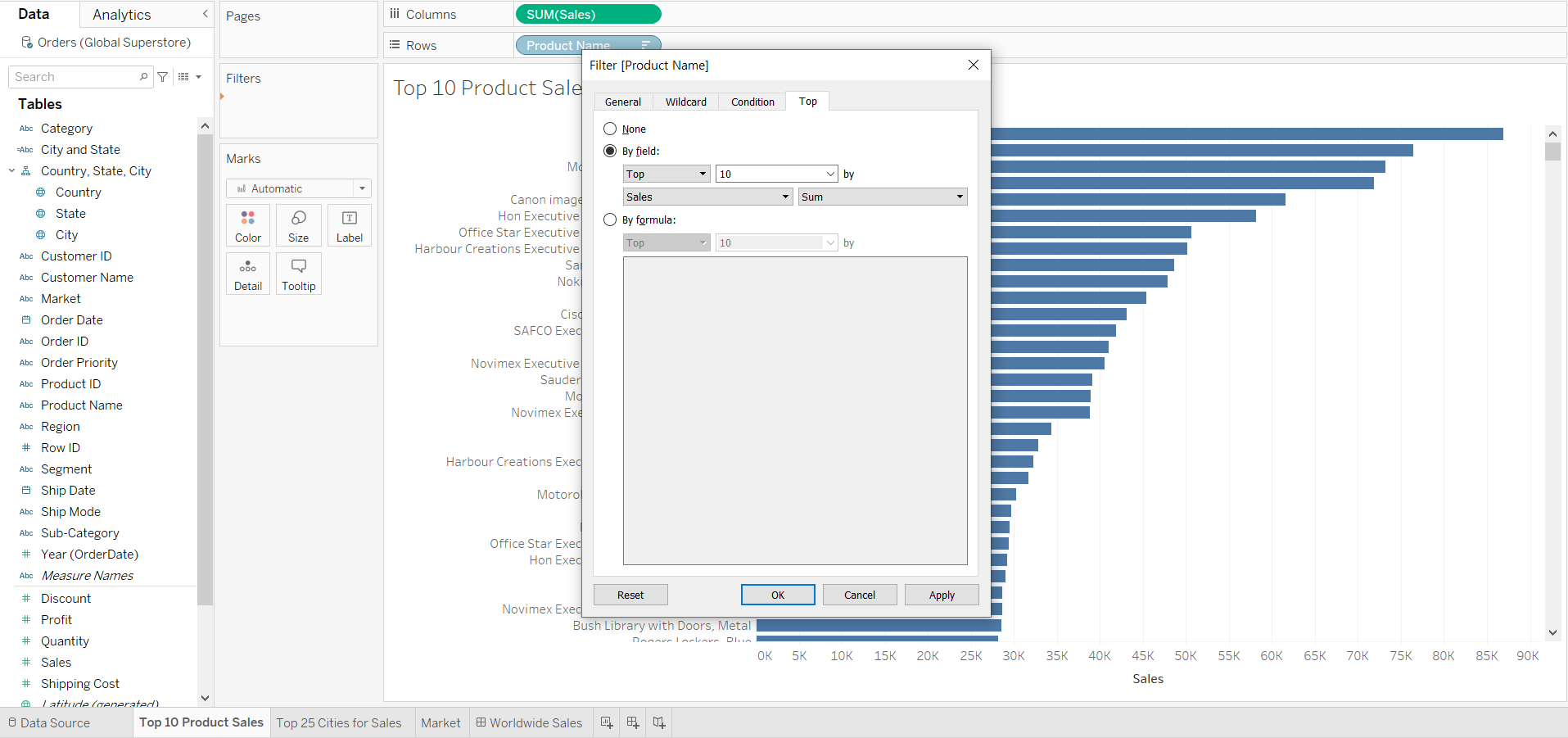
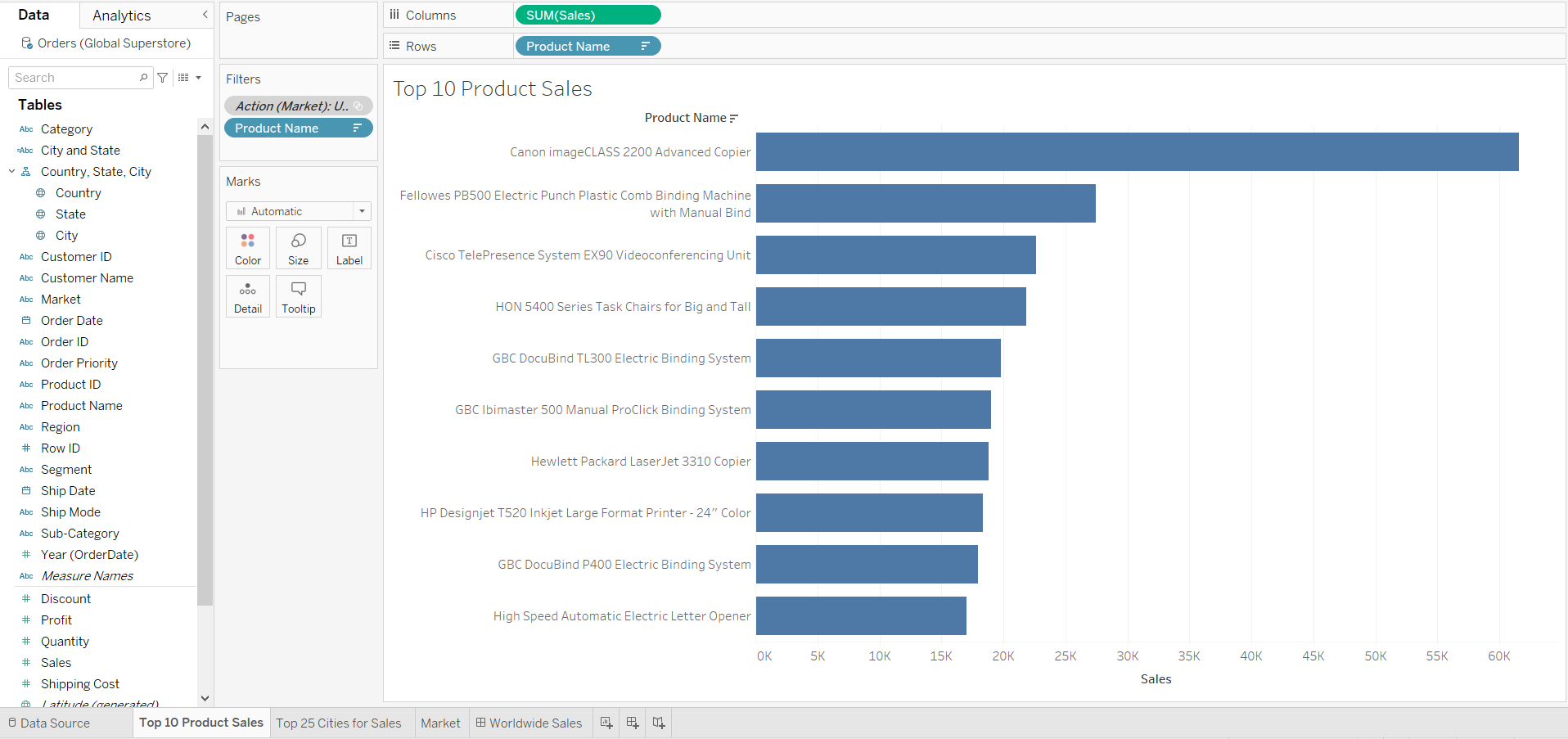
[STEP 1] On the Top 10 Product Sales worksheet, add a filter for the top 10 Product Names by Sales
-
Drag [Product Name] from Dimensions to the [Filters] card
-
In the dialog box opened:
- click [Top] --> [By field] : [Top] [10] by [Sales] [Sum]
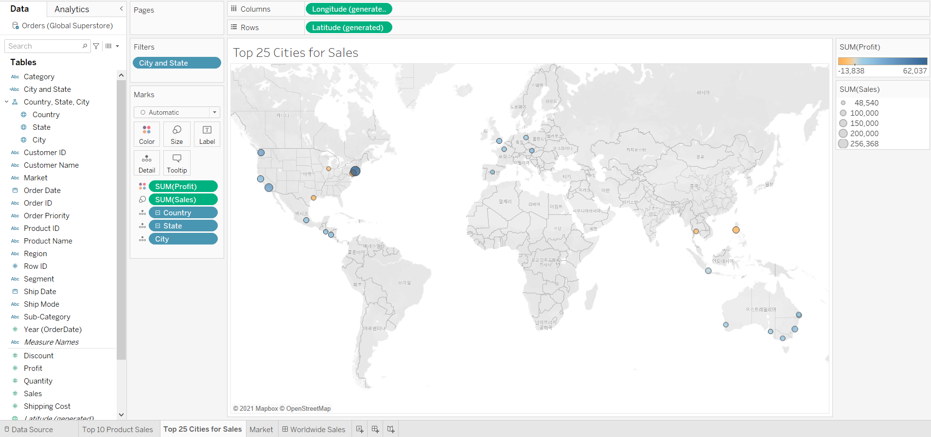
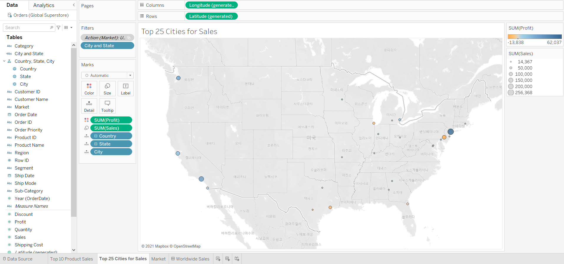
[STEP 2] On the Top 25 Cities for Sales worksheet, add a filter for the [City and State] field for the top 25 by Sales
-
Drag the [City and State] field to [Filters] card
-
In the dialog box opened:
- click [Top] --> [By field] : [Top] [25] by [Sales] [Sum]
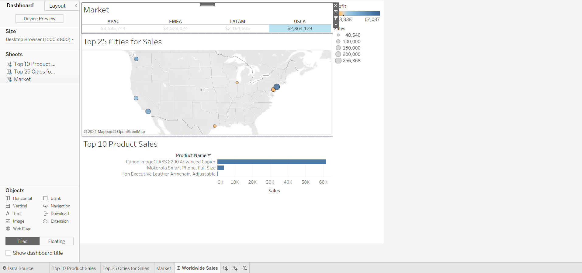
[STEP 3] On the Worldwide Sales dashboard, use the Market sheet as a filter, then test it to observe the results

-
When we click a market to filter to its top 25 cities and top 10 products, the results are not what we are expected.
-
USCA market shows only 7 cities and 3 products
-
The reason is that without using market as a context filter, the Top 25 Cities filter and Top 10 Products filter access all rows in the data:
When we see 7 cities from the USCA market, that means seven of the top cities overall happen to be in the USCA market
-
To get each market to show its top cities and top products for sales, we need to add context to the filter action
-
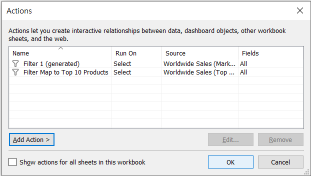
[STEP 4] On the product and cities worksheets, add the Action (Market) filter to context
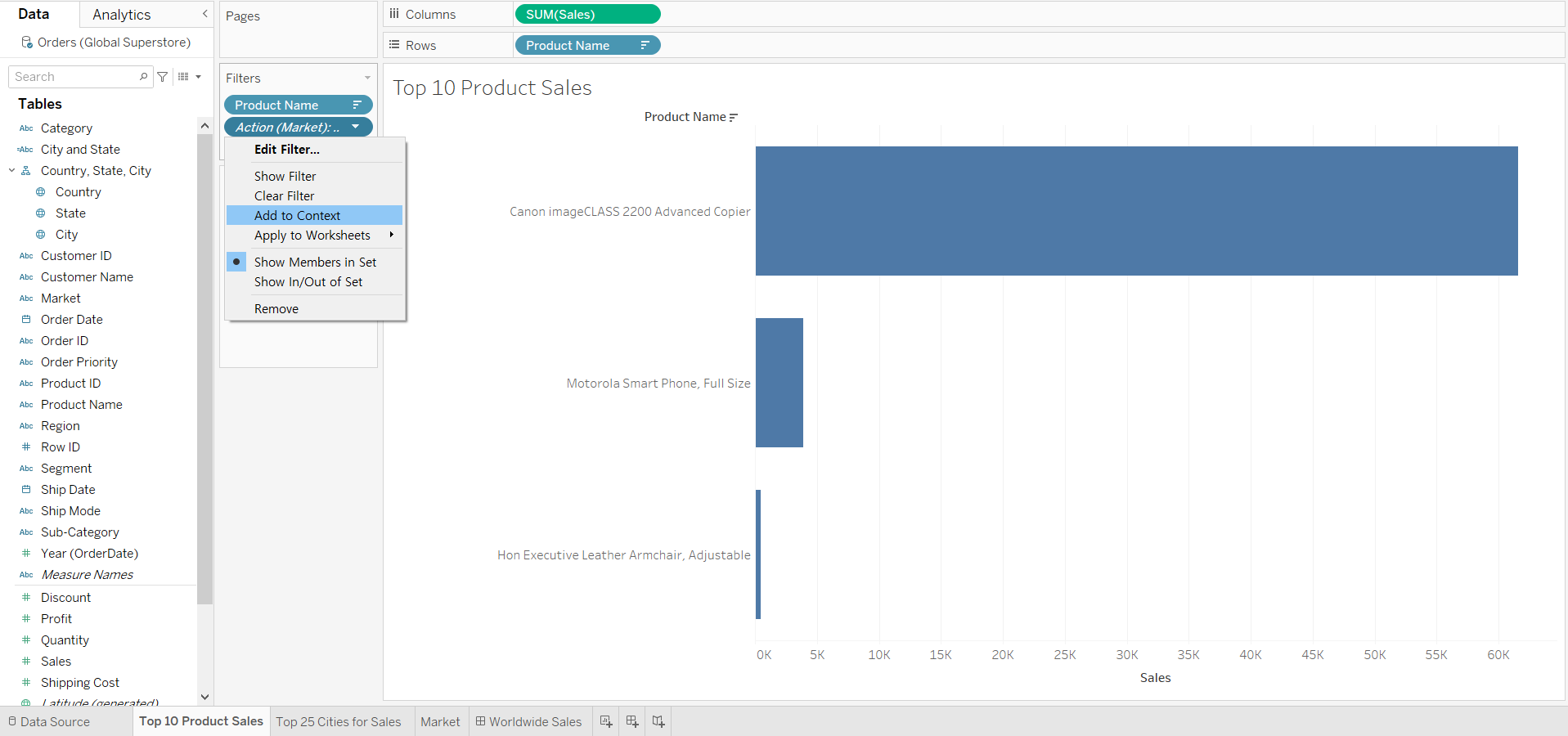
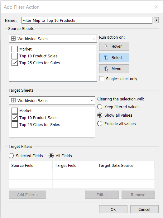
[STEP 5] Create a dashboard filter that shows the top 10 product sales for the selected city on the map
-
In the dashboard, make sure no markets are selected
-
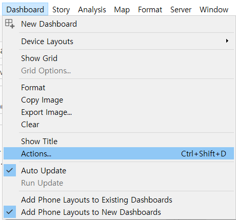
Create a filter action: [Dashboard] menu --> [Actions] --> [Add actions] : Filter
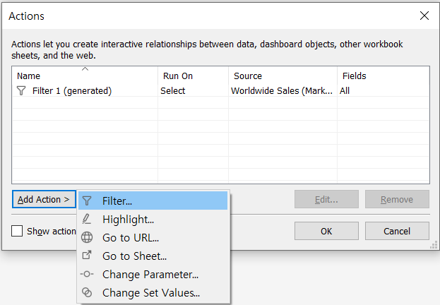
-
Edit the filter action like follows and click [OK] --> [OK]
-
Test the filter on the map view, we find that the list of product names never has 10 entries.
We want the filter action we just cerated to apply in the context of the city
-
In the Top 10 Product Sales sheet, add the action filter to context
Now, the result is what we want.
[STEP 6] Add the dashboard title
- Click [Show dashboard title] to display the title, Worldwide Sales