Comparing Measures Against a Goal
1. Building Bar-in-Bar Charts
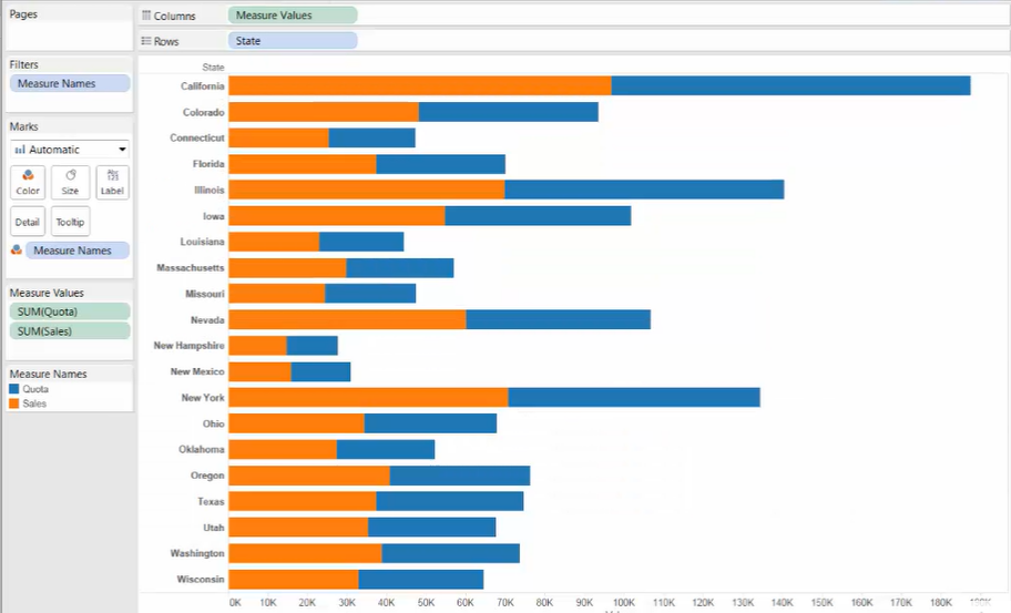
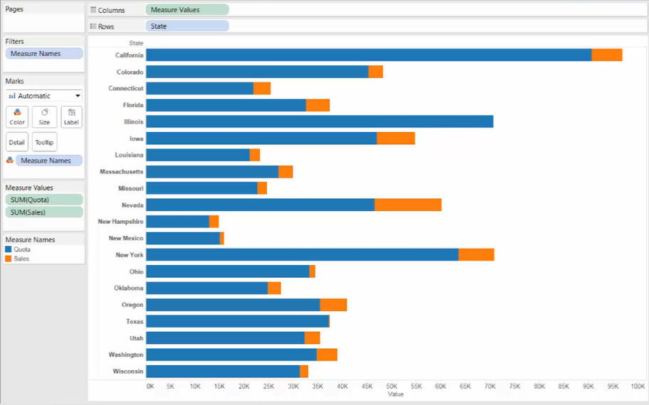
Bar-in-bar charts are useful for comparing two measures as overlapping bars in the same space.
Making the bars different sizes can avoid that the bars bidden underneath the others
Process to build a bar-in-bar chart
-
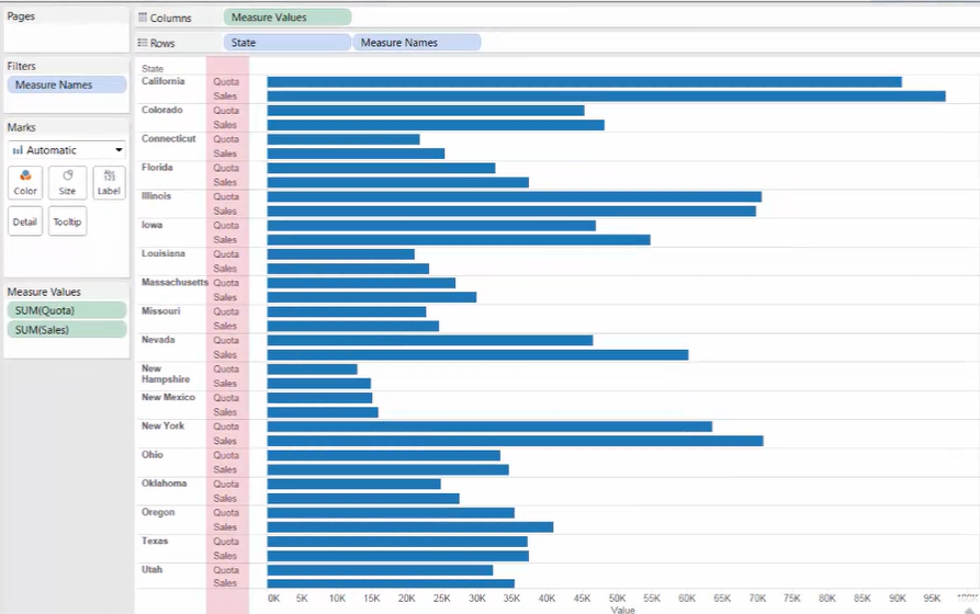
Add [dimension] to [Rows]
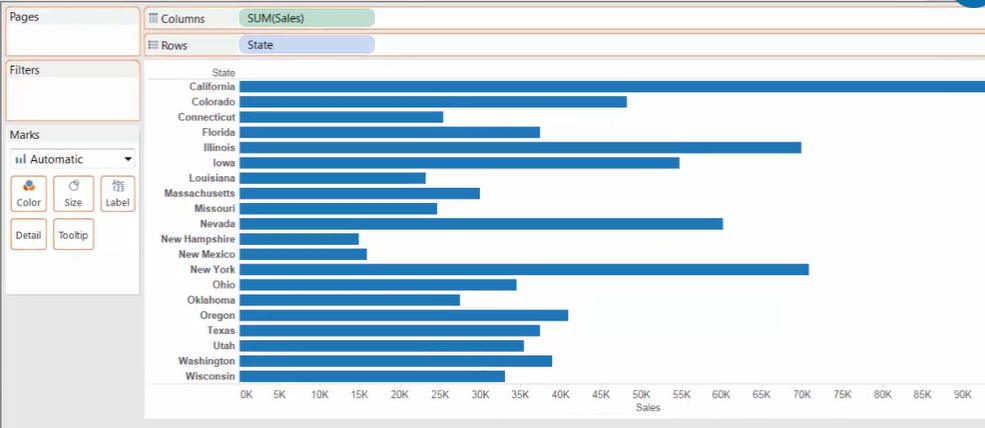
Add the 1st [Measure] to [Columns]
-
Drag the 2nd [Measure] to the view, dropping it on the x-axis when two green bars appear.
-
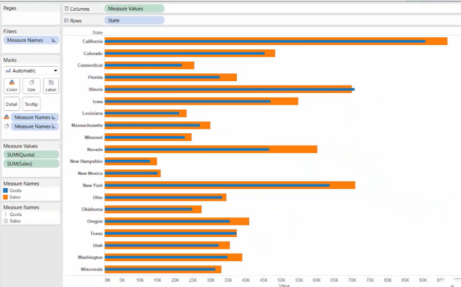
Side-by-side bars for two [Measures]
-
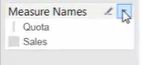
Move the [Measure Names] from [Rows] to [Color] mark
-
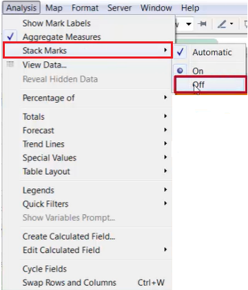
Unstack bars
[Analysis] menu --> [Stack Marks] --> [Off]
-
Make the bars different size
-
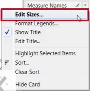
Hold [Ctrl] and drag [Measure Name] to [Size]
-
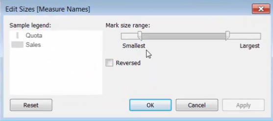
Edit size:
- Smallest : controls the size for the thinner bars
- Largest : controls the size for the thicker bars
-
2. Building Bullet Graphs
Bullet graphs can be useful when you want to see how far a measure has progressed toward a goal. (i.e. comparing a measure against another measure)
>> Methods to create a bullet graph
[Method 1] In the Data Pane
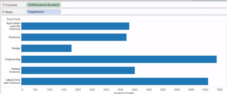
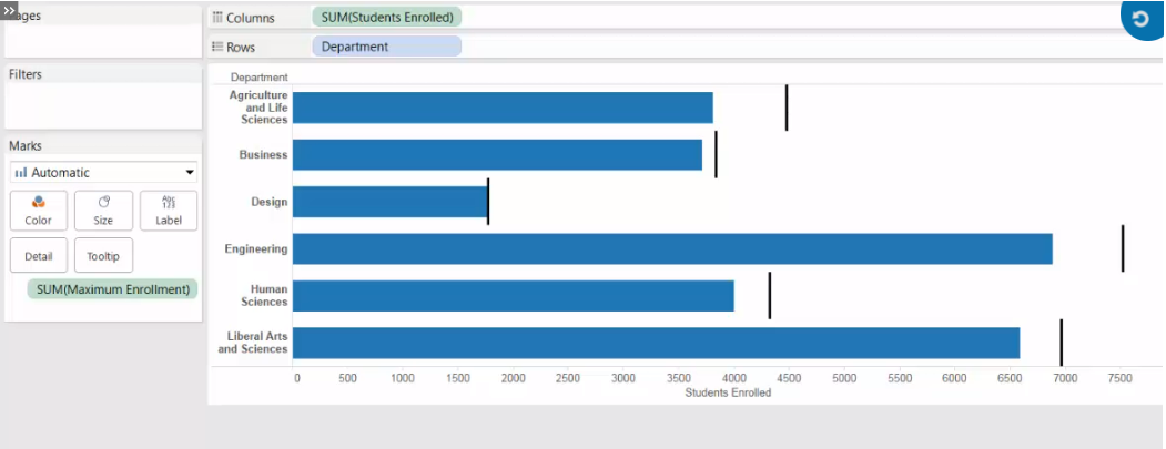
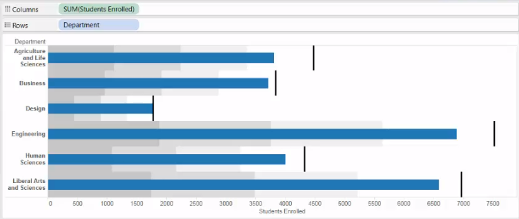
[Question] How far enrollment has progressed towards the maximum enrollment that would be allowed
-
Build a view that shows current enrollment by department
-
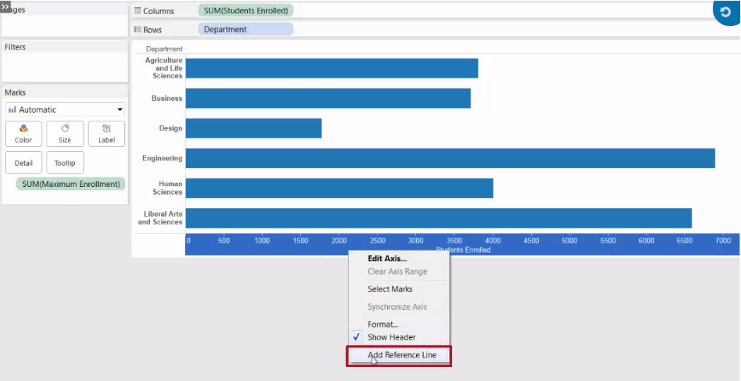
Use Maximum Enrollment as a reference line
-
Add [Maximum Enrollment] to [Detail]
-
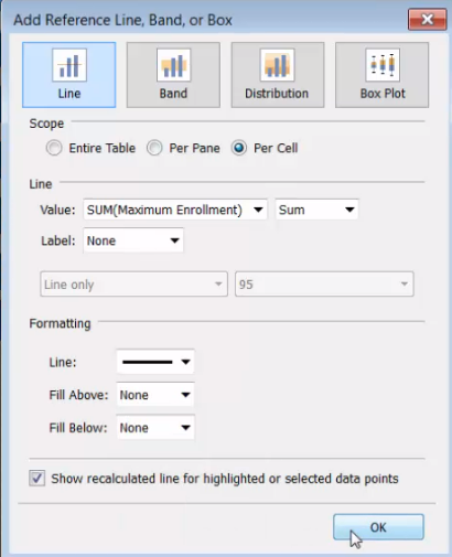
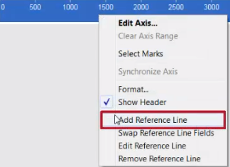
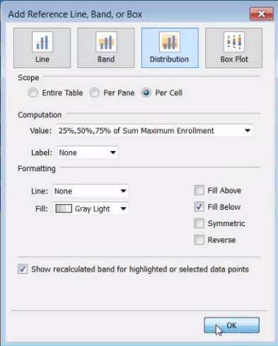
Right-click the x-axis (Students Enrolled axis), and choose [Add Reference Line]
-
Edit the reference line with [Scope], [Line] and [Formatting]
-
-
Add distribution areas to show stages of process
-
Right-click the x-axis (Student Enrolled axis), and choose [Add Reference Line]
-
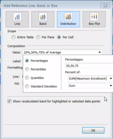
Edit the distribution
- Scope: [Per Cell]
- Computation: [Percentages] 25, 50, 75 — [Percent of] Sum(Maximum Enrolled) / Sum
- Label : [None]
- Formatting : check [Fill Below]
-
-
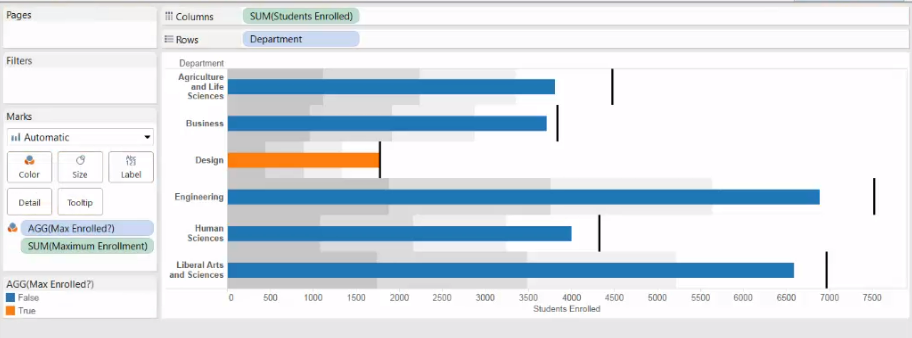
Use color to distinguish whether a department has reached its maximum enrollment
-
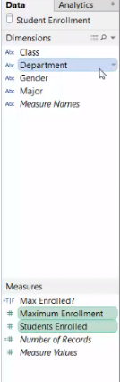
Create a calculated field “Max Enrolled?”
SUM([Students Enrolled]) >= SUM([Maximum Enrollment]) -
Drag [Max Enrolled?] to [Color]
-
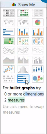
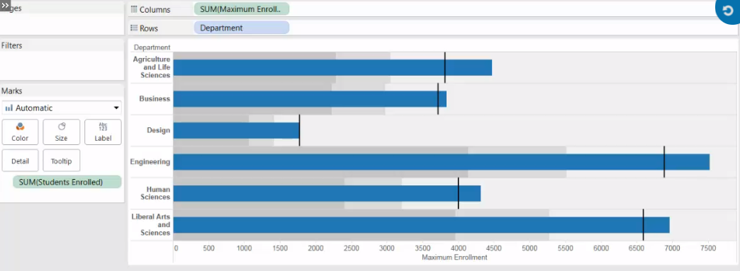
[Method 2] Use the Show Me
-
Select two measures we want to compare, and any dimensions we want to include
-
Click [Show Me] and select the bullet graph icon
-
Here, Tableau uses
- the Maximum Enrollment for the bars and
- current enrollment for the reference lines and distribution
-
-
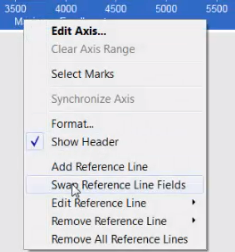
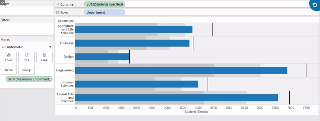
Swap how the two measures are used
-
Right-click the x-axis (Maximum Enrollment axis) --> [Swap Reference Line Fields]
-